Saturday, October 31, 2009

Completed commissions #1

I am wrapping up the last of the equine sculpture commissions in my studio, and more photos of the remaining pieces will be posted over the next few days.  All are limited-edition resincasts.

Here are the first two, both for K. Martin:

"Flitwick" - jumping pony sculpted by M. Kilborne in polyresin.
Approx. 2.5"h x 3.5"l.  Painted to red silver [dapple] minimal blanket appaloosa - a common color seen on minature horses. 


"Galena" - trotting Arabian mare sculpted by German artist B. Eberl.
Approx. size 8"h x 10"l.  Painted to medium shaded bay [based on photo of the Arab Ali Jamaal] Oils with base in acrylic.


These were both taken using a small photocube set that I picked up for a good price at one of the "lots" stores in the area.  It's a lot more convenient than the home-made one I was using (with limited success) and will work very well for small pieces.  The 20W lights that came with it aren't enough to do much, but the 500W halogen worklamp worked perfectly for the left side.  I still had to run the images through a photofilter to correct the color balance, but it's a lot less tweaking than I've had to do in the past.  Even still, the photos never do these pieces justice.  Studio photography is clearly not my forte.

Tuesday, October 27, 2009

Local Fall Colors - part II

Fall is such a short, fleeting season in this part of the country.  Colors are changing constantly, and the tree that was in its full fall crimson splendor last week may be completely bare after a weekend storm with high winds.  This past Sunday, it was a beautiful fall day, and instead of staying inside, I went out for another photo shoot around my neighborhood while I still could.  These photos encompass the range of abstract and close-up perspectives that I have a strong affinity for, as well as the more familiar landscape scenes most people readily identify with.  Below are my favorites from this shoot that I hope you'll enjoy:


A Cascade of Color
Standing under the maple and looking out provides a somewhat unique perspective.  The bright afternoon sun provides backlighting while peeking directly through under some leaves. 


Sassafras Still Life
The bold, simple form of this distinctive sassafras leaf is emphasized by the dark background and adjacent cast shadow.


Scarlet Oak Abstract
The position and veining of the foreground leaves lead the viewer in, while the rich colors and varying shapes invite you to stay for a bit.


Norway Maple abstract
The small areas of negative space from the sky add some small islands of contrast from the brilliant yellow-orange sea of leaves.


Fall Color Continuum
The bare branches of adjacent trees allow the peaking foliage to play center stage for a few days.


Maple Network - from Below
A relatively large aperature (f/8) emphasizes the intricate branching patterns and leaf shapes of the closest layer while providing a sense of depth and keeping the higher branches from becoming a distraction.


Road with Fall Shadows
This was one of about 12 captures, in both portrait and landscape views, taken while walking down this two-lane dirt road.  I still haven't decided which is my favorite, but this is one of the best in a thumbnail shot.  It gives some emphasis to both the leaf-covered road and the trees above.

Photo specs and discussion:  With photography, sometimes trade-offs and compromises must be made, simply because of the inherent limitations of the camera sensor and physics itself.  This was shot in aperature mode and metered off of the middle-value trees.  This results in a sky (clouds) that are blown out but at least maintains appropriate color and value of the elements that are the focus of the image.  It is also at the widest angle (18mm) on the lens, which works very well for this portrait format (wide angle on the landscape intruduced adjacent telephone lines and other elements that detracted from the composition).  An ideal landscape photo, in addition to having a pleasing composition and good lighting, is also tack-sharp.  This photo is less than ideal in that regard because I did not bring my crummy tripod along.  This necessitated shooting at a wider aperature (f/11) to allow for a faster shutter speed that is necessary for hand-held shots.  This results in a limited depth of field along with the inevitable blur from movement.  One adjustment that would have helped would have been to change the ISO equivalent from 200 to 400.  Just like with standard film speeds, this would intruduce some noise, but the faster ISO may have resulted in the ability to stop down to  f/18 or f/20 at the same shutter speed and allow more of the distal areas to be in sharper focus.  I hope I remember this next time I'm out shooting in low light conditions without a tripod!


Maple Crown at Sunset
The beautiful pale purples harmonize with the deep burgundy-reds of the tree in the fading light.

Specs:  This was shot with a tripod from my back deck of the front yard maple.  Shutter speed was approximately 2 sec., and the caerma's 10-second shutter delay setting was used to further reduce any blur from manually depressing the shutter.  It was also cropped remove the roof, but could probably stand some additional cropping to remove a bit of the sky. 

Saturday, October 24, 2009

Captain's Row - pastel painting


Fall Colors along Captain's Row
Pastel on sandpaper, 9x9"

I wanted to do something different from all the same scene challenge paintings I've been doing, so last weekend, I went through the photos I had recently taken, and decided on this particular one.  The original photo you'll reconize from an earlier post this week.  I asked for some input on the first version on WC, and after making those small (but important) changes, I think the final painting is definitely improved.  I will probably continue with a series of fall color pastels while everything is still fresh in my mind.

Thursday, October 22, 2009

Weekly challenge paintings - week 3

I ended up doing all four of these in the same sitting last week.  I'll keep doing this particular challenge for another week, and move on to another scene that offers more versatility as far as the sky and landscape elements go.  This has really been an excellent learning experience and has given me the chance to try different palettes and color combinations, including some that are clearly not in the realm of possibility of an actual landscape but fun to do nonetheless. 

Weekly challenge paintings collage
#09 - Fall colors redux.  Canson pastel paper, 6x8"
#10 - Greens, both warm and cool.  600-grit sandpaper.  5.5x8"
#11 - Complementary colors:  orange and blue.  Canson, 6x8"
#12 - Pinks and purples, aka the "candyland palette".  Canson, 6x8"

Wednesday, October 21, 2009

An assortment of critters...

I haven't been able to get final photos of some recent paintings this week, so I thought I'd put up an assortment photos of non-human, non-botanical living things that I've taken recently and that are not up on my Picasa gallery albums.   Again, you are welcome to use these for any personal use if you'd like.

In general, most of the photos I've been able to take of animals and invertebrates has been either been due to random luck, or more often, because the subject in question was either oblivious or unconcerned about my presence.  Until I am able to get a telephoto lens for my camera, these circumstances will have to do.   All shots are hand-held, and settings vary from aperature-priority to macro and sport (fast shutter speed).

Here are a few photos of crittters that I hope you'll find as amusing, odd or interesting as I did:


Waiting for a handout
Ducks just never fail to make me laugh when I see them - they always seem so carefee and happy.  This duck (unidentified species) is one of many residents in a duck pond located in the outdoor shopping village where I work.  He is poised and ready for quick action when the next handful of food gets tossed into the water. 

Moon Jellyfish along the Mystic River Shore
These graceful marine invertebrates travel upriver almost 2 miles.  This one was slowly pulsing along, and with luck, will head out to deeper water and survive.

Monorail Fly
Most of my creature photos are of insects, simply because there are many of them in my backyard.  This unidentified fly was resting on the edge of a tomato cage in our backyard and for whatever reason, didn't fly away.  I took several photos of it for this reason, and I'm both fascinated and a bit creeped out by it.  It is not a greenhead fly, but it has a pair of sharp mandibles and I'm pretty sure it likes to dine on blood. 


Pigeon Gang of Nine
Okay, pigeons are commonplace, messy and annoying at times.  But, seeing these pigeons (photo is cropped) standing on the public dock along Mystic River, I wondered why they were all facing the same way.  I also liked the variety of plumage they are sporting.  A variety of amusing narratives are possible here.


Yellow-legged Meadowhawk (Sympetrum vicinum)
I have to admit that dragonflies and damselflies are probably my favorite insects.  Not only are they living fossils, but they are the good guys:  they eat mosquitos!  They are also notoriously difficult to photograph because they seldom sit still and are amost impossible to get close to, thus requiring luck and a good telephoto lens.  I saw this one resting on a granite boulder last week on my fall colors photo shoot.  The choice of background isn't ideal, but that's just the way it goes when photographing wild things.

Saturday, October 17, 2009

Fall colors of eastern CT

This past Monday, I spent about 4 1/2 hrs. on a photoshoot, in an effort to capture the local fall colors which are currently at their peak.  I brought along my tripod, but ended up not using it most of the time - it is inexpensive and cumbersome to use, especially when doing a lot of walking, which I was doing.  At aperatures/exposures used for most landscape photos, it's difficult to get tack-sharp photos without the use of a tripod, even with excellent lighting.  Unfortunately, as the day went on, the sky became increasingly overcast, making it even more difficult to capture the brilliance of the fall foliage.  However, despite these shortcomings, I still managed to take some photos that capture the essence of fall in the southeastern corner of CT.  Below are are a select group of photos that you might enjoy.  Viewers are welcome to use these photos for personal use only, please and fellow artists are welcome to use them as reference sources for your own original artwork.  If you share, please credit me with the photo.


Pond with geese
location:  Hwy 169, near Pomfret, CT. 
This [very noisy] flock of Canadian geese enjoy a crisp fall afternoon on this otherwise tranquil pond


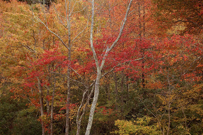
Birch and maples
location:  Waterford, CT 
The focus here is on the interesting tree forms and range of colors of the foliage


Captain's Row along the Mystic River
Taken from the Mystic drawbridge, this shows a section of some of the early 19th-century homes built along the west shore of the river, originally occupied by ship captains.


Tree top with blue sky
location:  Along New London Rd, west Mystic.
The strong, linear forms of the branches contrasts with the background leaf clusters against a late afternoon sky.


Fall complements
The bright afternoon sun provides backlighting and shadows for this brilliant orange Norway maple against the clear blue afternoon sky.


Fall leaf duo
location:  along Mystic river, west shore
The more muted colors on these leaves reveal an intricate mottling pattern and colors when viewed up close.


Boats and fall foliage - Mystic river harbor
The bright orange, red and dark green foliage provides a colorful backdrop to the row of white boats along the west side of the river

Thursday, October 15, 2009

Four seasons - a photomontage

Photos:  4x6".  Total size of composite image:  12x15"
Dates taken:  January 2; May 10; July 17; October 12

This pond and stand of trees, in Waterford, CT, is across the road from a large field and series of rock walls that I drive past every few weeks when I go shopping.  I've been intrigued by the area and always enjoy driving by it.  This past winter, I decided that I would begin to document both the field, rock wall, and this pond and tree stand throughout the seasons.  The primary reason was to obtain references for future paintings, so the photos were planned around my shopping trips, usually mid-day, rather than times that would perhaps result in a superior photo taken for its own sake.  As a result, the individual images are pretty average, and I was at the mercy of unfortunate cloud cover (welcome to New England) for the summer and fall photos.  However, when placed together, I think these four photos provide a far more interesting and compelling image than any individual photo could.  I also took some early fall photos on Sept. 25.  For symmetry sake, I did not include the photo in the montage above, but here it is for additional comparison.  It is quite remarkable the change that occurs in just 2 1/2 weeks:
Pond, tree stand with field of Canada goldenrod

Wednesday, October 14, 2009

Two more challenge paintings

Final two pastel paintings for this weeks' challenge:

Moonrise after sunset
soft pastel on Canson Mi-Tientes paper, 6x8".
The sky, moon and foreground colors were based on a photo I took a few months ago on our trip back to the southwest, along Hwy 180, just north of Flagstaff.  I really like the original photo, and plan on using it as the basis for a full painting some day.  This was a useful study for colors to use (and not to use). 


Split complementary study
pastel on Mi-Tientes sienna paper, 6x8"
For this, I chose purple as my starting color, and used colors adjacent to its complement (yellow) on the color wheel:  yellow-green and yellow-orange.  I like the palette, but I'm not keen on the final result.  There are many things I'd change if I did this again.  Despite various post-processing attempts, I was unable to get color accuracy for the purple used on the right side of the mountain; it is not maroon, but a darker blue-violet purple. 

Sunday, October 11, 2009

Paint the same scene - week 2

Here are three of the five "challenge" paintings for this week.  Very different!  Have a favorite?  I'd love to hear what you think.


#4 - Winter, after storm
pastel on Mi-Tientes creme paper, smooth side.  6x8".


#5 - High-chroma palette
pastel on 400-grit sandpaper. 5.5x8"


#6 - Purples and earth-oranges
pastel on sienna-colored Mi-Tientes paper, 6x8"

I've always admired artists that were able to break free of traditional "paint what you see" conventions and use bold, unexpected colors, or interpret the landscape as an abstracted form - both of which are much harder than one would think.  An exercise such as this - re-creating the same scene from a simplified b/w photo or value study sketch - is a great way to help break free of those creative constraints.  Even after this particular challenge is over, I'll definitely do this again with other subjects. 

Friday, October 9, 2009

Photos of fall - the small things

Fall is well upon us here in CT; the air is cool and dry and the days are rapidly growing shorter.  Mystic actually gets a pretty decent showing as far as fall colors go, so I went on a photo shoot yesterday afternoon.  While most people think of the "big picture" fall landscape, I'm also drawn to the smaller happenings of fall and nature - things that I suspect most people never see.  Here are a select few photos from around my neighborhood.  All shots are hand-held and using auto settings (macro and landscape):
Seed release
f/8, ISO 360
The seeds of a spent vine await their turn to ride the breeze.


Last of the season
f/5.6, ISO 560
Normally a mid-summer flowering plant, this roadside chicory flower adds a small splash of blue to the fall.

Fall grass solo
f/5.6 , ISO 560
B/w conversion and pleasing bokah turn the terminal end of a strand of fall grass into a study of curves and reflected light, making it seem anything but ordinary.


Fall reflections
f/8, ISO 400
Perfectly still water gives a hint of the bright leaf colors from the tree above.


Berry branch
f/8  ISO 200
The colors and soft shapes in the background offer a nice frame for this strand of berries lit by late afternoon sun.

Maple leaf understudy
f/8, ISO 250
The underside of this maple leaf takes on an abstract form that is enhanced by the bright green background.


Wednesday, October 7, 2009

Paint the same scene challenge

Recently, pastel artist Deborah Secor suggested a painting challenge in the WC pastel forum, inspired by artist Marla Baggetta.  Ms. Baggetta did a series of 100 paintings of the same scene that was a featured article in the most recent issue of The Pastel Journal.  The idea sounded great; it's been 10 years since I've worked in pastel, and I found myself unsure about what was the best way to get back into them again.  After thinking about it, I realized it was ideal for me:  using the same subject repeatedly would allow me to experiment with papers, endless color schemes and themes, practice and experiment with different techniques and be able to put them side by side for comparison.  It is easy to see what works and what doesn't.  So, I signed up. 

First, I chose a reference photo to use - in this case, a crop of a photo of Hermosa Creek north of Durango, CO this summer.  The photo itself was pretty unremarkable; shot in late afternoon sun, the sky was completely blown out.  But, when cropped, it suddenly had more appeal.  So, I went with it.  To distill it into more simple shapes and values, I first posterized it.  And while the original photo has been cropped of all sky, I decided to convert the upper middle part (mountains IRL) to sky.  It works.

Here is the "digital notan" version:


Challenge notan/value study

I decided on a size of approx 6x8" and allotted 30 min. for each study, in order to keep them loose and not make them too "precious".  I am going to do 5 per week, for basically as long as I am getting value from the challenge.  I am keeping a notebook of the materials, time, and notes about each of the studies.  As I state in my "about me" section, I promised to post the wins *and* the fails.  We learn from our mistakes and failures. 


Challenge #1 - monochromatic study in green
soft pastel on neutral grey Mi-Tientes paper, 6x8"
This went quickly and I was pleased with the end result.  This shows that if you've got the correct values, the colors really don't matter so much.  Completed 10/5


Challenge #2 - spring colors
soft pastel on 400-grit sandpaper.  5.5x8"
The surface is wet/dry sandpaper available at your hardware store.  It has the advantage of being:  1) inexpensive; 2) readily available.  I don't mind tossing it out if things don't work.  The pastels lay down nicely on the surface, and it has enough tooth to hold a few layers.  I didn't spend as much time choosing colors, and we've got warm and cool going on.  At least I did keep the cooler ones confined to the distance. 


Challenge #4 - fall colors
soft pastel on MT creme paper, smooth side.  6x8".
This is awful.  I didn't take the time to choose proper values or colors that harmonize well with each other, and it shows.  Plus, the pastel would not lay down well on the paper.  I don't mind seeing some paper through the pastel, but it wasn't my intent in this case.  I might keep it for a while as a reminder of "what not to do again" before I throw it out.  The fact that I was really tired and had a headache didn't help.

I will continue to post these as I go, but may begin to select the more interesting ones as time goes on.  This is a great exercise and I will undoubtedly do it again with different subjects and with oils as well.

Monday, October 5, 2009

Nelson as poster art


Digital image, full size - 20" x 8"

I'm one of the 38 million+ people in the US who is a personal servant to a domestic feline.  I've owned several cats over the past 23 years, but none were quite as special as Nelson, my 8-year old grey tuxedo DSH.  He is a special cat for many reasons, and as a reflection of my ongoing adoration of him, he is frequently a photography subject.  Most are snapshot type photos, given his lack of interest in posing or staying still for very long.  But, occasionally, one turns out better than expected. 

I had fun coming up with various colorized versions of this cropped, posterized photo using custom gradient filters.  I will continue to pay homage to my beloved feline companion in future drawings, paintings and perhaps a sculpture...and of course - photos!


Sunday, October 4, 2009

A splash of color


Anna's Hummingbird with Hummingbird Sage
graphite and colored pencil on 300 series smooth Bristol, 9x12 in. 

Just finished this morning, this is several "firsts" for me:  first time working on Bristol paper; first time drawing a bird; first time I've ever incorporated elements from different sources to form a drawing.  The reference photo for the bird was one of the subjects on WC's "weekly drawing thread", and I knew I just had to draw him.  I also knew that a standard graphite drawing wasn't going to be particularly eye-catching, so I decided to add just a splash of color using a few layers of Prismacolors to bring attention to his glorious throat feathers.  I also did some quick charcoal sketches of a zebra and koala that I posted there, but aren't worth posting here.  

After I finished the bird, I was quite pleased with the way it turned out; it's by far the most detailed drawing I've done in over 15 years.  However, it was just a "bird on paper", and essentially nothing more than an illustration.  The photo was superb; tack-sharp and with excellent bokeh (artistically pleasing background blur in a photo), but I felt that wouldn't translate so well to the drawing, as it would likely obscure the wing detail and shape.  So, this morning, I decided that adding a botanical food source of the species might be fun and add some interest to the drawing - in this case, "hummingbird sage" [Salvia spathacea].  It is a composite drawing; I had one photo that I used for the actual plant; another to make sure the plant was in scale to the bird, and another to use for lighting.   Looking at the photo of the drawing, I think I need to go in and darken up the foliage a bit.

Other neat facts about Anna's hummingbird:
- habitat is all along the west coast, including AK, and as far east as southern NM
- eats insects as well as nectar
- can be mistaken for ruby-throated hummingbird; the white splash behind the eye is indicative
- males perform a singing and dramatic diving ritual to attract a mate


Friday, October 2, 2009

Equine bas-relief pieces

I have been working on these on and off for a while now, and finally declared that they were finished:
"Bjorn" - Fjord pony bas-relief sculpture.  Artist oils on resincast sculpture.  Approx 4x4 in.

Original sculpture done from Chavant NSP medium, and was the first soft clay sculpture I did.  It was also my first experience with making a silicone mold and doing my own castings - quite a learning experience!  This piece was done in a variation of the common brown/bay dun [aka "brunblaak"] that this breed comes in, with darker facial masking.  Available for purchase. 


"Buster" - resculpted version of "Bjorn" bas-relief sculpture.  Artist oils on cast resin.  Approx. 4x4 in.
#2/9 limited-edition resincast.

"Buster" was a re-worked version of the "Bjorn" clay original that I did for an article on sculpting, molding and casting bas-relief pieces for the RESS Technique Booklet IV.  The mold was actually made from a tube of silicone kitchen caulk available at your local Walmart.  I wanted a generic-breed pony with a slightly whimsical edge - hence, the tongue and teeth.  I purposely left the base/background as a blank "canvas", primarily as I have begun to incorporate more landscape elements into my bas-relief pieces when I can.

I probably should title this piece "Pictures don't lie", because it wasn't until I took this photo and looked at it in PS that I noticed the problem with it:  the cloud line is tilted!  I honestly am not sure how I missed this, but I did.  The pony was done as an Icelandic in red silver dapple [a very common color in this breed]  and the mountains, foothills and foreground meadow were loosely based on photos of Iceland that I had in some reference books.  I really love clouds, so I had to add a patch of cumulis to the mini-landscape.  I clearly was not using the bottom edge of the base for a reference when painting the clouds (and the foothills could stand to be a bit more level as well).  This is a reminder to me to be more mindful of such things.   After I do the requisite touch-ups, this piece will also be available for purchase. 

Related Posts Plugin for WordPress, Blogger...