Showing posts with label oils. Show all posts

Monday, May 9, 2011

Paint your fruit and vegetables - still life paintings in oil, 6x6

Salsa Lessons #2
6x
 oil on 1/4" wood panel

Everyone remembers the reminders from mom to "eat your vegetables", and "an apple a day keeps the doctor away", right?  Maybe the same applies to painters:  painting vegetables is good for you, for challenging one's observational skills, color mixing abilities and compositional eye.

This weeks' DailyPaintwork Challenge is "Paint Your Vegetable", hosted by Diane Mannion (see a link to her blog in my blogroll list).  

This painting was probably harder than any landscape I've ever done, which probably sounds absurd, but it's true.  The fact it is difficult means it is pushing me outside of my comfort zone, which is a good thing.  I have been humbled by vegetables - the onion in particular.  

And, since the vegetables weren't enough of a beat-down, I followed up with dessert:

Cantaloupe Cross-section
6x6 inch
oil on 1/4" wood panel

I love the patterns formed by cut sections of fruit and vegetables, and this cantaloupe was sitting in the refrigerator, beckoning.  The fruit itself was easy to paint; it was the cast shadow and reflections on the wooden box that were a bear.  I'm not very happy with them, but this was literally as good as I could get them.  

One of the frustrating parts of the whole "learning curve" process is when your finished result falls short of your expectations and your abilities.  But, it's the reason we all keep plugging away.  

Palette used here:  alizarin crimson, brownish madder, cadmium yellow light, cadmium red medium, cadmium red dark, yellow ochre, ultramarine blue, sap green and a new Grumbacher "soft white", which is a mix of titanium and zinc whites.  


Wednesday, May 4, 2011

Mortar and Pestle still life - oil, 6x6"

Mortar & Pestle in Marble
6x6"
oil on 1/4" wood panel

Every serious cook needs a mortar and pestle in his or her kitchen!  This one, made of white/gray marble, doesn't get as much use lately as it did in the past, but I will never part with it.  I will say that it was a challenge to paint, but it was a great exercise in doing ellipses - something I haven't painted or drawn in ages.  And, of course, being able to really observe the true values and subtle colors and reflected light that photos seldom capture accurately.  

Another limited palette here - burnt sienna, ultramarine blue and white, with a touch of yellow ochre.  I constructed a 3x3" viewfinder out of a piece of foamboard to assist with composition, and actually taped it to my small tabletop easel.  Worked great.  

I tried to keep the strokes on this loose, but I keep having issues with my paint getting tacky during the painting process.  I've been using M. Graham walnut oil as a medium, and am wondering if that is the problem - it is fine immediately after mixing with the walnut oil, but then gets sticky and doesn't spread well after about 5 min.  Exasperating, to say the least.

One thing I did discover that was the best way to clean my brushes is simply on a bar of Ivory soap after wiping as much paint off as possible.  I have tried removing paint with unrefined linseed oil, followed by washing with dish soap, but that often left the bristles stiff after they dried, indicating I didn't remove all of the oil or paint.  I do have Turpenoid, but I'd prefer not to use it if I don't have to, and it seems to drive paint up into the ferrule, which I have always had a problem getting out.

Monday, May 2, 2011

Daisy floral painting in pastel - 11x14

Family Gathering
11 x 14 inches
pastel on black matboard

Another floral painting, on a new surface: black matboard.  Our local frame shop carries pre-cut 11x14 pieces of their archival matboard for $2, so I picked up a piece to experiment with.   The nice thing about  working on this surface is that it simplifies framing as no mat or mounting is needed.  It was perfect for the project I had in mind.

I love daisies - they are so cheerful and even though they are a non-native flower, I still enjoy seeing hem in large meadows up in the mountains.  This painting is based on a photo I took on some hike last year.  I  realized that I really liked the simple design.   The individual flowers are interesting to me because they are in all different planes, and have these wonderful cast shadows, adding to the depth and dimension of the image.  And the out-of-focus background is the perfect abstract accompaniment to keep the focus on the flowers.  

Here's how it looks in a small gold frame, unmatted (complete with regular glass and part of my arm, face and camera lens in the glare):


I decided that I didn't care for the intense blue sky on the Hollyhocks painting, and was able to make adjustments yesterday.  I grayed the sky down a touch, and added another layer to the flowers, making some value adjustments along the way.  I think it is much improved.

Hollyhocks, redux - in gold crackle frame from Dick Blick

I decided to try some of the pre-made Simpleton plein air frames that Dick Blick carries.  They are affordable and since I try to paint in standard sizes, I can easily swap out the paintings for exhibitions and to show what a painting for sale looks like in a frame.   I got a Logan point driver and some other framing supplies, and now I can do framing at home.  For someone a limited budget, it's a good option.

-----
Sunset from 2 nights ago:

Tuesday, March 22, 2011

Coneflower, Approaching Sunset - floral series - SOLD


Coneflower, Approaching Sunset
6x6 
oil on wood panel
SOLD


I'm really enjoying this informal floral series, I must say.  Flowers are much trickier than landscapes to paint (for me, anyway) because of their distinct shapes and structure, and they allow me to dig into my collection of oils and use colors not found in the arid landscapes, and challenge my color-mixing and matching skills.

And, I like paring these essentially realistic flowers with simple, abstract backgrounds.  A good balance for the direction I'm trying to head with my work.  Purple coneflowers (Echinacea purpura) are a popular perennial found throughout the east and midwest, but they don't grow out here.   

The palette for this was cadmium orange, cadmium yellow, thalo violet, alizarin crimson, Van Gogh cobalt blue and white.  I mixed most of these colors together for the "mother color" to use in the background.  Creating a mother color is one of the easiest ways to harmonize a painting.

On an unrelated note, I recently set up a shop on Etsy to sell some of my work.  I don't think that many viewers and followers are buyers, but I thought I'd mention it, or if other artists like to do trades.  There is a widget for the store in the links column.  

---
On the theme of sunsets, here is a photo from one of last week's sunsets.  The sky has been cloud-covered since Saturday, so nothing since then.  

March 18


Sunday, March 20, 2011

Hibiscus Nocturne - floral series

Tags:  floral painting - oil painting - alla prima - fine art - orange flower - 6x6 - hibiscus flower

"Hibiscus Nocturne"
6x6 inches
oil on wood panel

Another floral, this time using a square format*.  Mother Nature figured out that orange and fuchsia pair up beautifully together with this variety of hibiscus.  It's based on a photo I took last year in Tucson the day before I returned to CT.  In mid-April, the home gardens in the desert are exploding with glorious color.  

The bright color of the flower suited itself well for a darker background, which decided it needed to be a nocturne.  Moonlight is filtering through some clouds up there in the corner, I think.


*Inspired by the large number of daily painters utilizing this size to paint on, I recently made up a batch (32, to be exact) of panels on a lightweight wood panel I found at our local Home Depot.  Unlike the MDF boards I've been using (and still like), this light-weight plywood-composite type board doesn't flex.  It is 1/4" thick, making it nice for frameless display as the edges can be painted almost like a mini gallery wrap canvas.  

I used a utility knife to carefully score and cut the 12x12" panels I had cut at the hardware store into the 6x6" size.  I used wood putty along the sides to give them nice, smooth edges and then used 2 coats of alkyd primer on each, hitting them with a quick sanding after they were dry.  I have begun applying a clear polyurethane sealant to the back of both the MDF and these plywood panels to protect against moisture issues and improve durability.  

Thursday, March 17, 2011

Iris Portrait

Tags:  floral art - iris - blue flower - surrealism - oil painting - 6x8 - alla prima - original art
------

Back to oils and florals for a bit....

Pale Blue Iris & Pink Sky
8x6 inches
oil on board

I love irises.  They are probably my favorite flower, and I developed somewhat of an obsession with them during the time I was living in CT.  In late May through early June, I would cruise both my neighborhood and the downtown home gardens with my camera, taking photos of every beautiful variety I could.  Bi-colors, bearded, dwarf, native, cultivated....I love them all.  

As luck would have it, a neighbor a few doors down from us also seemed to have an obsession with iris, and each spring, his garden would have new cultivars to photograph and enjoy.  His wife told me that he had a special fondness for purple iris varieties.  This particular iris is from his spring garden last year.

I knew this would be a challenge to paint - all those creases and folds and subtle variations in hue and value could result in a major frustration.  I just approached it as nothing more than a series of abstract shapes.  A limited palette worked perfectly - cadmium yellow light, alizarin crimson and Van Gogh cobalt blue.  I mention the brand here because Talens/Van Gogh is actually a student-grade oil.  I didn't know this when I bought it, and the pigment is actually ultramarine blue.  However, its low tinting strength - normally a negative and one reason I don't use student-grade oils - turns out to be its best feature.   

It turned out better than I thought it would, and I purposely tried to keep blending and excessive brush-strokes to a minimum.  The background was done as the suggestion of a landscape - looks a little bit like a mesa...hmm.


Monday, February 7, 2011

Painting from memory

Memory Sky
8x6 inches - oil on canvas panel
SOLD

After the last two paintings, both of which were a bit labor-intensive, I decided to take a short break and go back to loose and fast.  I spent a few hours yesterday with my sketchbook doing small studies of photos I've taken, including desert animals, some cloudscapes, Utah landscapes and even a few from my imagination. 

For this painting, done last night, and at least one other I plan to do today, I decided to try something different:  to try and work from memory, rather than relying directly on a photo during the painting process.  I did a thumbnail sketch, made mental notes about the clouds, their masses and color nuances, and the basic colors of the land.  The photo is one I took on our summer '09 trip to Durango, along the venerable Hwy 160, near Kayenta, during our drive to Phoenix.  The sky was filled with beautiful monsoon type clouds - very Maynard Dixon-like.  I took this photo, knowing I'd paint it one day.  

My goal for this study was to work quickly and not get caught up in an exact "likeness", but to rely on my memory studying the photo and experience painting skies to see if I could make it work.  After I'd finished the painting, I went back and looked at the reference.  There were a few things I didn't like about my memory version, so I adjusted those quickly.  Then, it was done.   No fussing or tinkering.  

I found it a great exercise, and I'll be doing more in between the regular paintings.  Good to mix things up in the studio; it helps prevent stagnation and the inevitable periods of burn-out.  Another thing I did differently for this was to use the tip of a disposable wooden chopstick to sign my name in the wet paint - worked like a charm!  


Monday, January 31, 2011

Across Mormon Lake

Finally finished just a bit ago, with a less-than-optimal photo from a jury-rigged indoor photo set up, this is the next in the Impressions of Winter series.  There is some slight glare on the left side of the painting...my apologies for that!

Last year, during my winter stay in Bisbee [we were still living in Mystic at the time], I drove up to Flagstaff to visit friends.  The most direct route from Phoenix is I-17, which is how I drove up.  On my way back, however, I took the scenic route.  It heads out of Flagstaff to the east and continues in southeastern direction along Lake Mary Road for about 80 miles until it intersects Hwy 87.  Hwy 87 crosses over the Mogollon Rim before winding down through the Mazatzal Mountains and into the Phoenix valley.  It is a spectacular drive, and should you find yourself needing to head either to or from Phoenix and Flagstaff, it is well worth the extra time for the drive.

About 30 miles south of Flagstaff is Mormon Lake - popular with fishermen and wildlife.  Small clusters of homes line the forested area along the road, and scattered cabins are also found in the open meadows near the edge of the lake.  As the road curved around the southern edge of Mormon Lake, I was struck by the expanse of snow covering it, and the San Francisco Peaks in the distance.  Pulling over and climbing up a snow berm, I took several photos.

This one is a closer crop of a wide-angle shot.  I loved the contrast of the log cabin and barn against the ponderosa-covered hill behind it, and the SF Peaks in the far distance.  I chose to leave a lot of white - most of which is the lake - in this painting.  I feel it is necessary to give the sense of space and scale to this scene, and to show that man's presence is still subordinate to the land and sky here.

Across Mormon Lake
9x12 - oil on board

----

From yesterday afternoon:

Lenticular-type cumulus foreshadow the coming arctic storm

This purchase of a $100 box for my cat Nelson included a free pair of running shoes.  Thankfully, the box met to his approval.


Wednesday, January 26, 2011

Shadow Crossing - winter landscape

original oil landscape painting - snow - winter landscape - 9x12


Next in the Impressions of Winter series is this painting, which is based on a series of photos taken last year when I was on my way up to Flagstaff to visit friends during my AZ winter stay.    In a recent post, I included a link to the pastel "Winter Stream" I did last year, also based on the same area.

This is what I'd describe as an "intimate" landscape, one that focuses on a discreet element of the land.  I was drawn to the organic shape of this small section of open stream, its reflections, and the colors, curves and shapes cast from an unseen ponderosa pine across the untouched banks of snow.  A nearby tree line marks the end of this mountain meadow that this stream traverses.  

Shadow Crossing 
9x12 - oil on board

I had it mostly finished last night, save for the top section of trees, which I finished this morning.  This was another one of those paintings where I wasn't sure it was going to work, but after pushing the paint around and continued finessing of various areas, it came together, and I can honestly say I'm quite pleased with it, especially since it's the first time I've done water reflections in oils.  

On a completely unrelated note, I wanted to take a minute and give a huge THANK YOU to those of you (and you know who you are ;) ) who have been so kind to link my blog on yours.  Seriously, it means a lot to me.  I wouldn't have known about half the wonderful art blogs I follow had it not been for links other bloggers have, which is one reason I enjoy having links to your work and others on my blog.  Thanks again - you all are the best!


Monday, January 24, 2011

Final Light [of the decade]

The latest, and maybe the last, of the Impressions of Winter paintings based on northern New Mexico references.  I may revisit them at some point, but now I'm going to move on to some different locales for winter paintings.

This painting depicts the late afternoon sun shortly before it dips below the horizon, but also as it is partially obscured by a distal winter cloud.  The trick, or challenge, was to try and capture that in the painting without it appearing contrived.  The cloud's edges act like an aperture of sorts, causing some of the sun's rays to form a radiating pattern of light.  It's an effect I quite like in photos when it is expertly done, and I've seen many painters pull it off as well.

So, I thought I'd give it a shot.  This is also the first time I've done anything approaching a sunset in oils.  This really didn't photograph as well as I'd hoped - it looks better in person.  As I look at it now, the small dark scattered clouds in the upper left are bugging me...enough that I'll probably re-do that area when the painting is dry.

It's titled as such, with the portion in brackets, because this was indeed the last sunset of the first decade of the new millennium:  Dec 31, 2010 - 6:20:13 PM, according to the EXIF data on the reference photo.

Final Light
9x12 - oil on board


Friday, January 21, 2011

Winter's Light on the Mesa

Next in the Impressions of Winter series is this painting, depicting more juxtaposition of light and shadow on the land via the nearby hill and distal mesa.

Winter's Light upon the Mesa
9x12 - oil on board

Plenty of challenges in this painting, including trying to suggest groups of pinyon/juniper on the distal sun-covered slopes.  Not easy, especially working wet-in-wet.  And using very slight value shifts to give convincing depth to the foreground.  I'm not sure if it reads well to viewers, actually, or is just plain bizarre.  It was still enjoyable to paint, despite the frustrations of those distal greens...


Thursday, January 20, 2011

Encroaching Shadows

Back to oils for a bit.  This piece was started before the pastels, but I decided to split it into two sessions, which turned out to be a Good Idea - I was able to fix several things that were bothering me in the first session.

More sandstone, shadows and snow.  And those glorious clouds!  In my computer room/office, the view faces east, and there is a large rocky hillside slope about 200 meters away.  It is currently covered with snow, and in the late afternoon, I watch as the shadows lengthen behind the pinyon and juniper and the full shadows gradually creep up, replacing the pale pinks, yellows and lavenders with cooler, darker blues.  This is of course what caught my eye and prompted this photo along the drive.

Encroaching Shadows
9x12 - oil on board

For this piece (and the next one coming up), I decided to pull out another of my seldom-used colors from my equine art days:  Indian yellow.  It is a very dark, intense transparent pigment that tints with white to a brilliant earthy yellow - just perfect for the yellows of these sunlit sandstone cliffs.  It's probably a more practical color for southwestern landscapes than the cadmium yellow light I had used in the past as my primary yellow.  It's also in the clouds and the juniper scrub.  Indian red, yellow ochre, purple lake, pthalo and ultramarine blue round out the palette here, along with white.   The biggest challenge here was to try and define the changing planes of the slope via subtle color shifts and brush strokes.  The shrubs help as well.

---
And, here are some photos from this morning's sunrise  moonset, taken just after I got out of bed.  Another 10 minutes, and I'd have missed it.  Isn't she a beauty?

Approaching the horizon
70mm - shot with 18-70mm f/4.5 Nikkor zoom lens

Full moon morning glow
200mm - shot with 55-200mm f/5.6 Nikkor tele zoom

Full moon going...


...almost gone


Monday, January 10, 2011

Hillside Shadows - first in new series SOLD

After minimal consideration (and indications that people were getting bored with the sky series), I've switched gears again!  I had been debating between beginning a series of portrait studies, based primarily on copying of Master's works, or another landscape series.

What ultimately inspired my choice, however, was Don Gray's post today on his blog Daily Art West, entitled "Below The Mountain".  It is a marvelous winter landscape depicting the light hitting the face of a mountain with the land below cast in shadows.   It immediately reminded me of the photos I took on our Dec 31 drive back from AZ, along the section of Hwy 550 north of Albuquerque, beginning around the Zia Indian reservation.

The light was in the "magic hour",  producing a beautiful pink glow on the sandstone cliffs, hills and distal Jemenez Mountains to the east as we headed north.  Much of the land was cast in deep blue shadows from cliffs and mesas to the west, and residual snow clouds were also catching the late afternoon light of the sun.

I went back through my photos of that area and knew that I'd found my next series, which I'm calling Winter's Presence, for lack of a more creative name.  I've found at least 10 photos out of this batch that I could easily paint.  Plus, there are photos I took last year, this year in the La Platas, and no doubt more to come.  So, it could be a long series.  I did two snow paintings last year, in pastel, which remain amongst my favorites, and I knew I would be painting more snow/winterscapes.  You can see them here: Winter on the Ridge Trail and Winter Stream.  I'm actually really excited about this new series, and am off to work on another piece in a bit.

Hillside Shadows
oil on board - 6x8"
SOLD

I never got around to posting photos from that section of the trip, which is just as well, but here is a panoramic shot I took when we stopped to switch off driving duties,  showing how beautiful the combination of sandstone cliffs, snow, and afternoon light and shadow are:

Mesa on the Zia Reservation


Sunday, January 9, 2011

Uncertain Skies

Another, perhaps next-to-last, in the Southwest Sky series.  Another with the highway - the interstate this time, with its smooth black asphalt - visible.  View is due west, heading towards Flagstaff.  Titled such because it's not clear what the weather will be like as we climb to the 7,000' elevation of Flagstaff.  Clearing, rain or snow?

One observation that I've made regarding cloud-filled skies, is how intensely blue the sky patches are compared to how the sky seems on a sunny day.  From an optical perspective, I'm not sure how it is explained, so I am assuming it is more of a phenomenon of contrast:  the grays of the clouds, as they absorb, reflect and scatter light from the sun and the surface of the earth, make the colors of he sky seem so much more pure and intense.  The gradations of color are so striking and beautiful in the negative areas where sky shows through.

Even looking out my window as I type this, I notice the effect.  Stratocumulus snow clouds are drifting by, in lovely shades of yellows, purples and blue-grays, and the sky seems so much more intense in areas surrounded by cloud vapor.

Uncertain Skies
oil on MDF oil primed board
9"x12" 

The snowshoeing post with photos of Andrews Lake will be a separate post, perhaps tomorrow, but here are some photos of today's walk down the Animas river trail:

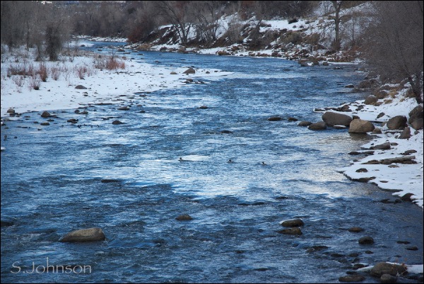
Looking upriver from the footbridge - intense blue reflects from the small patches of visible sky.  Some ducks enjoy the icy water.

Downriver from the footbridge -  hard to believe it's the same location.  Warm southerly light reflects in the river and a patch of willows on the embankment add some additional interest with the snow-covered river boulders.

Cross-section of life forms
  A front line of dormant reeds contrasts with the rock-strewn section of the river.  Can you find the Canadian geese?  

Saturday, January 8, 2011

Two more in Southwest Skies series

These paintings were actually completed on Wednesday, but too late to get photos.  An all-day snowshoeing trip on Thursday caused me to miss the opportunity to photograph them on that day, and yesterday, I just didn't get around to doing the planned blog post.

So, here they are, finally.  I'll probably do 1-2 more, depending upon what grabs me, and wrap it up.  I've been thinking about the next direction I want to head, subject-wise, and am starting to gravitate towards figurative work, both animal and human.  We shall see.  I may do a short series of winter landscapes based on some of my recent photos.

Along the High Plateau
oil on panel
9x12
SOLD

Painted Desert Sky
oil on canvas board
5x7

Both of these locations are along I-40 in Arizona.  Just west of Gallup, the Painted Cliffs form an unexpected addition to the land, tapering away near the AZ border to form wide, sweeping plains with pinion-juniper as the dominant vegetative zone.  The land is cut with washes and arroyos, the edge of which is seen in the first painting.  Near Holbrook, the Little Colorado river , on its northwestern path towards the Colorado, passes by, follows along the interstate, and takes its exit north at Winslow towards Leupp and Grand Falls.  The geologic make-up along much of I-40 east of Flagstaff is Chinle formation - Painted Desert.  Both the Petrified Forest and Meteor Crater are also right off I-40.

Both of these were again done with the limited palette of the two blues (phthalo and ultramarine), Indian red, yellow ochre and purple lake.  "Painted Desert Sky" was sort of an afterthought to do as a quick painting on these small 5x7 canvases I'd purchased shortly after I started my Four Corners roadtrip series.    Despite the extra layer of oil primer I used over the canvas, I really don't care for the texture at this small size.  Once the other two are used up, no mas - only MDF or Masonite panels.

The snowshoeing trip we did on Thursday was amazing on many different levels.  I was going to include some photos I took here, but I think they warrant their own post.  So, I will post that later today.

Tuesday, January 4, 2011

Back on track for 2011

A belated happy New Year to everyone!  Despite the fact we got back on New Year's eve from our 9-day holiday trip, and theoretically had plenty of time to work both in my studio, or write up a post reflecting back on 2010 and outlining goals for 2011, it just didn't happen.   Instead, because of the sporadic and limited time I had internet access during our trip, I simply slummed it around the house and caught up on blogging and other reading.

I actually did finally start working on a new piece - a large pastel of the local area - for a specific project, and it ended up being a dud right out of the blocks, and after spending one evening and part of yesterday morning on it, I decided to put it aside.  I'll probably toss it, but perhaps if I look at it later with a fresher attitude, I'll have the energy to rework and perhaps salvage it.   The other productive thing I managed to do yesterday was to finally construct a drying/storage rack for my paintings; I'll post pictures and a description of the tools and materials I used in another post.

I've given some thought to the direction I'd like to go with my art, as well as the blog, this year.  I will keep working in oils, definitely, and I'd like to work on some still lifes, which will be a good way to work from life when it's too cold to paint outside.   I also had another idea for a series of small paintings, based on a subject that is near and dear to my heart:  my beloved cat.  I also want, or need, actually, to dedicate more time to drawing.  Despite what some artists will say, I absolutely believe that good paintings come from good draftsmanship.  One can get away with limited drawing skills when painting landscapes, but there is little room for error when doing still lifes, and essentially none when doing portraiture.  And, finally, I'd like to resume playing with clay again; I've had ideas bouncing around in my head for both bas-relief pieces and some full sculptures.  I know myself well enough not to commit 100% to any of these, thus these are not "resolutions", but more of a mental "to-do" list.

I keep editing the layout of my blog, both adding, removing and changing elements there.  I'm sure I'll continue to do so, all to make it more streamlined and adding new links as I come across them.  As a primarily "self-taught" artist, I spend a great deal of time reading.  This includes instructional and technique-oriented books and articles, as well as those profiling specific artists.  As I always enjoy reading such information that other bloggers share, I will probably start incorporating more of these sources of information and inspiration in some blog posts.   I hope readers will get something out of the shared information as well.  I'm currently reading a book on Sargent from our library, so that will perhaps be my first discussion topic.

In the meantime, I finally sat down and painted in earnest today, going back to some of the 9x12 panels I prepared.  I'm not sure how many more in this Southwest Sky series I'll do, but I'm probably over half done.  I was drawn to the reference photo for this because of the sweeping gesture of the center cloud - its drama contrasts with that of the land, which like much of the region along Hwy 491, has a wide-spanning and grass-covered foreground with distal plateaus and mesas.  I really don't tire of this landscape.  Due to poor weather, we took the same route down during our Christmas trip, and I enjoyed seeing the locations of the paintings I've done thus far, and with a new perspective.

Towards the Heavens
9x12 - oil on board

As is usually the case, I always see things I could change when I look at the photo:  a few awkward shapes in the clouds, primarily.  The color correction is a bit off in this; it's a tad too green, and the colors within the clouds aren't as apparent as they are in the actual painting.  I'm still confounded by working alla prima and trying to keep those sky/cloud edges from becoming messy.  

Another experiment here was replacing ultramarine blue with phthalo blue.  One of the stores we went into while in Bisbee had some Van Gogh paint 1/2 off, including a tube each of cobalt and phthalo blues, and I ask you:  who could resist buying art supplies on clearance?  Not me, and I bought them both!  This brand is quite chromatic, a strong tinter, and very much leans towards turquoise, but I loved it.   It will be part of my permanent palette for sure.  I used a limited palette here of the phthalo, yellow ochre, Indian red and purple lake.

I am hoping that this now fires up my energy in the studio to resume daily paintings, and a productive year.  

And, here are two photos from yesterday afternoon.  Temperatures have just recently warmed to above freezing for the day, so the 1' of snow that fell last week is slow to melt.

Altocumulus over Smelter Mtn. and Perins Pk.

Smelter with winter tree silhouette

Sunday, December 26, 2010

Winter in Old Forge, NY - #2

Last week, on impulse, and based on the webinar lectures given by Johannes Vloothuis, I decided to try a snow scene in oils, based on an image provided in the December challenge on the landscape forum of Wet Canvas.  Normally, I prefer to work from my own reference material, but as I've done a few times in the past, I was charmed by one of Paula Ford's photos of Old Forge, NY.  In fact, last year, I used another one of her photos as a reference for a pastel landscape, that can be seen here.  It sold almost immediately.

Winter scenes with snow may be my next series after the Southwestern Skies is completed, so this was a good experiment.  I started it last week, and after watching a live demo this past Sunday, where Johannes painted a snow scene, I rushed down and finished the painting that evening.  There are things I would change on it, like toning down the blue of the water - it's cerulean, but a tad too chromatic.  Johannes was kind enough to critique it for me during the Monday night webinar, and we discovered it looks even better with most of the foreground cropped away.  

It is painted on a reclaimed painting from the Four Corners series.  

Winter in Old Forge, #2
9x12
oil on canvas board


Wednesday, December 22, 2010

Light and Shadow on Rt 491

Each of the paintings in this Southwest Skies series have increasingly challenged me, primarily as they have become more complex and require more time to paint and consider how to best render the clouds.  These were definitely not easy, but with oils, one has the luxury of moving, adding and manipulating the paint for extended periods.  I tried out some new techniques here, all based around creating pleasing lines, abstract shapes and harmonious colors, but I still see things that bother me in these categories that I will address when I get back home.  I think after I have 100 cloudscape paintings under my belt I will be able to execute them with far less effort.

Hard edges, soft edges, lost and found edges are all found in these clouds and their amorphous forms.   Some crepuscular rays add to the drama of the clouds as they silently move across the landscape of northern New Mexico.

Light and Shadow along Rt 491
12x16
oil on panel

Monday, December 20, 2010

North of Gallup

Here is #3 in the Southwestern Sky series.  I had Johannes critique my last painting, and based on his suggestions, I tried to incorporate many of those into this piece.  It's done in a single session, and I find working alla prima to be a bit challenging when it comes to doing the edges of clouds against a blue sky - it's all too easy to get things smeared and over-blended.

North of Gallup
12x16 
oil on board

Looking at the painting, I could have probably pushed the yellows in the sky a bit more, and I think the blue is a bit too chromatic.  One of the beauties of working with oils is the color harmony that comes with using a limited palette.  Here, I pulled some of the purples and blue-grays of the sky into the grasses, and what had been discordant suddenly improved.  I also experimented with Torrit Gray, made by Gamblin, that is free with the purchase of two of their tubes.  I know some artists like Kevin McPherson use mixing grays in their work, and I see why.  It may be on the regular palette line-up.  

We are leaving in a mere two days for AZ to spend the holidays with family, and will be gone over a week.  I am going to try and have at least a few blog posts set to post while I'm away so there isn't prolonged radio silence.  Probably mostly photos of places and things I didn't have time to share when I first took them.   I will probably have limited internet time while we're gone, but will try to get in my blog reading fix when I can.


Monday, December 13, 2010

New series - Southwestern Skies

Finally something done in the studio!  For the past week, I've been totally absorbed in listening to daily 3+ hr. webinar lectures  from landscape artist and instructor Johannes Vloothius, who has been graciously sharing his extensive knowledge for free to anyone interested.  The information has been invaluable, and is probably the equivalent of 3-4 artist workshops.  In addition to critiquing participant's work, he has also used the work of top landscape artists Clyde Aspevig, Jim Wilcox and Scott Christenson.  My head is exploding with all the information I've learned and it has almost totally changed the way I look at paintings.
He will be holding these daily webinars through Dec 22, along with live videos of painting demos on Sundays (I believe).  Here is a link to his artwork, and for anyone interested in attending the webinars through Dec 22, here is the link to his cyber art learning website.  Click on the yellow bus to register for and join the webinar (starts at 5 p.m. EST).  Follow the instructions for registering, and you're in.

In the meantime, I have been cogitating on what to begin as my next series.  I kept coming back to the photos I took during our Thanksgiving trip, so I decided that they will be the basis for the new series, which I've informally titled "Southwestern Skies".

The emphasis will be on the clouds and the patterns and abstracted shapes they form in conjunction with the desert landscape of southern NM and northern AZ.  No particular order - just what suits my fancy at the moment.  These all have one thing in common:  Drama.  Uncertainty.  Nothing cozy or predictable.

Clear Skies Ahead
11x14  
 oil on canvas panel

There is definitely a challenge to working wet-in-wet with abrupt value changes, such as those of the highlighted cloud edges against the sky.  It's also a challenge to prevent mechanical, contrived edges and produce nice abstract shapes with melodic lines, as Johannes says.  Experimenting with a different palette here - Indian red, purple lake, cad. orange, yellow ochre and ultramarine blue, with titanium white.  I will probably re-work the clouds and reduce their value; it's a bit too close to the land, and see if I can get improved edges by drybrushing the edges.

And - some sunsets from a few days ago:

Dec 9 - pink cumulus gang
Dec 10 - to the northwest

Dec 10 - over Perins Peak

Related Posts Plugin for WordPress, Blogger...