Showing posts with label cloudscapes. Show all posts

Wednesday, February 29, 2012

Road trip series: Monsoon skies, oil, 6x6

Paintings from today and yesterday evening...

Cumulus Tower Over Black Mesa - #6
oil on wood panel - 6x6
© S.Johnson
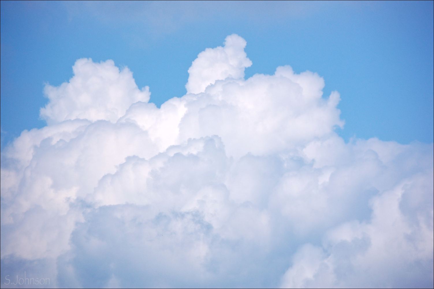
A composite of two photos taken moments apart - one for the land and the other for the more dramatic cloud.  If there is one thing that never ceases to amaze me, it's how rapid the build-up of these summer monsoon clouds happens.  When a cumulus cloud is taller than it is wide, it is known as a "cumulus congestus".  Next stage:  cumulonimbus (raincloud).

This view is to the west, approaching Kayenta, around noon.

Cumulus to the South - #5
oil on wood panel - 6x6
© S.Johnson
These clouds are nowhere near those in the above painting; they are building up miles away to the south, probably over Second Mesa and the Hopi reservation.  The landscape itself is different as well; orange sandy dunes lead to a tilted slab of white Navajo sandstone, with more pink dunes and a wide, sweeping plateau.

Friday, September 2, 2011

Cloud studies

Clouds - for something different, and because:

1. I have heaps of reference photos
2. Something simple was in order
3. It's been a long time since I've painted clouds as a sole subject

Cloud Study #1
12x9" - Strathmore 500-series paper

Cloud Study #2
9x12" - Strathmore 500-series paper

Wednesday, August 3, 2011

Late Afternoon Storm - plein air, pastel, 12x12 inches

Late Afternoon Storm
12x12" - pastel on Strathmore
©2011 S.Johnson


Yesterday was a restless sort of day, and my intentions to paint in the morning, or at least before the storms were due to kick in, yet again didn't materialize.  By the time I made the decision to go out and paint, clouds were filling the sky, and painting outdoors seemed like a dicey proposition.

But, no matter - I headed down to my favorite location along the Animas, intending to paint the river rapids, or maybe the cottonwood tree across the way.   Nothing was working, even my nice shaded location right along the river:  no sooner did I set my chair down, than some large red ants started crawling on my shoes, clearly perturbed.  When one stung me, that was it.  Gear slung back over my shoulder, I wandered aimlessly around, and even crossed the river to a small singletrack trail that looks down upon it from the east.

By this time, the problem wasn't insect-related, but that the impending storm was closer and I was now hearing thunder.  With some reluctance, I decided my trip was for not, and started back to Santa Rita park.

Upon reaching the grassy (and ant-free) area of the park, I looked back and saw this most glorious cloud!    It was in a shape resembling the African continent, and all sorts of fun things were happening with it.  The car was about 30' away, so getting out of the rain in a hurry wasn't a problem, so I threw down my chair and got busy painting.

Needless to say, by the time I was finished, the cloud had morphed into a huge mass, having long since merged with the cloud on the left.  One of these days, I'm going to set my tripod up and get a series of photos of these clouds to turn into an animated .gif file.  It's really something else to watch them change.

When painting clouds from life, I have pretty much abandoned any idea of getting something that is compositionally very good; the clouds just don't wait for anything.  But, the neat thing is that you can keep changing things about your painting as you go - like adding the virga - which lasted for maybe 5 min.
-----------

Some photos shot today:

From the deck

Perins Peak from the deck

From the flower bed across the street...


------
We are leaving for AZ tomorrow morning - Phx to visit family and then Flagstaff to visit friends.
A day trip to the Grand Canyon is planned...
Occasional internet access, maybe, but no ability to post to the blog.  So, I'll try and do a couple to post while I'm gone, of photos from recent outings and such.

Thursday, July 7, 2011

Summer Hillside, pastel, plein air, 9x12

A late afternoon trip down to my favorite location along the Animas River....

Summer Hillside
9x12 inches, pastel on black Strathmore
©2011 Sonya Johnson

...with a different view.  The river, despite its flow continuing to drop, is producing some remarkable rapids that were tempting to paint.  But, after doing many mountains and lots of water, I decided I liked this view from the bank, looking up the small hillside to the south.  

It is filled with summer grasses of assorted colors of greens and yellows, along with small patches of an unknown yellow wildflower are scattered across the red earth.  The trail leading down to the river, and my location, is seen in the lower right corner, partially obscured by a patch of yellow clover.  

Trees were first, clouds were last.  The top blue is a new one of my Mt. Visions that is just dandy for skies.

It was a bit breezy, due to the clouds.  Some kayakers came and put in right in the same location, owing to the good wave action.  So, we all practiced our craft on a wonderful Durango afternoon, our souls  nourished by the Animas river - the River of Lost Souls.  

----
The sky off our bedroom deck, taken right before I posted this:


Tomorrow, the local Friday plein air painters are meeting at an old hotel downtown.  If I can manage to drag my unit out of bed, I'll hopefully be joining them at 8 a.m.   We might all have something to chuckle over as I maybe attempt to paint linear structures on location.  

Saturday, June 4, 2011

Juror's Choice Award and the juror's statement

At last night's reception


After yesterday's blog post was sent, I hustled down to the DAC reception.   There were already many people there, including the show juror, Chad Colby.  I had a moment to chat with him before the show kicked into high gear.  He is a very down-to-earth man, friendly and completely unpretentious.  I am sure he is a hugely popular instructor with the students at FLC where he teaches art.

We chatted briefly about the show, and he explained he was looking for a well-rounded representation of work, which I told him he clearly accomplished.  He said the jurying process was a fun challenge, and I can imagine how difficult it might have been.

I also had a great time chatting with some artists I have recently met through my volunteer work at DAC, as well as some more of our area's pastelists.  I found out more about the Four Corners Plein Air group, and am excited to get together with them for some upcoming paint-outs.

For this show, only 5 awards (not counting the People's Choice award) were handed out:  HM, Merit Award, Juror's Choice 2D and 3D, and BoS.   So, you can imagine my utter surprise when my name was announced for the Juror's Choice 2D award!  Talk about gobsmacked!  In addition to the personal accomplishment for me, this also came with a $250 check.  Now, I can finally add some more pastels to my collection.

As he promised to do, Chad gave a brief talk about the show and his responsibilities as the juror.  Since my experience with shows and even interacting with other professional artists is quite limited, I was very keen to listen to what he had to say.  I wanted to share it with readers here, as I think it is valuable advice for all artists, and certainly any who enter juried shows.  

-First, he thanked all the artists who entered, regardless of whether their work was accepted.  He said their participation was valuable and important to the success of the show, and of course, to DAC.

-He then went on to say that the process of jurying is "human and flawed", just as art is...in other words, he is not perfect, and is doing the best he can.  He said at one point he worried that he hadn't selected enough pieces and that the show would look too sparse.  In fact, however, it was perfect - just enough breathing room and space for each piece.  The show has a very contemporary feel to it as a result.

-He reminded everyone that the juror's opinions are just that:  a single subjective opinion, of a moment in time.  Nothing more.   He apologized for the "ruffled feathers", of which there were [I learned that there are some artists in the community who are very vocal about not getting into these shows...].

He then went on to explain the criteria he used to select the pieces, which I found very enlightening.  He said they are essentially the same he uses when evaluating his student's work.

-Originality:  for common subjects, like landscapes, how did the artist handle it to make it unique and less ordinary?

-Technical skill and rendering:  how well did the artist handle the media?

-A quality he describes as the "play" within a piece.  This transcends technical skills and he described it as the playful element in a work.  He used the term "serious playfulness", seemingly contradictory, but as he explained further, I realized I knew exactly what he is talking about.   It's somewhat intangible, but yet, looking at the pieces in the show, they all have that element as a common thread.

I can think of several artists whose blogs I follow where their work is consistently engaging, compelling, and popular with both peers and collectors, and I realize it is this exact quality that makes it so.   Media, painting style, and subject are immaterial.

Anyway, I came away with more than the gift of a $250 check from this show.   Chad gave me some valuable things to think about for my work.  In addition, he puts the whole jurying process into perspective, and now I will have much more confidence to enter more juried shows in the future, and won't take any rejection as a discouragement (which, let's face it:  is easy to have happen if you aren't a seasoned artist).

I really respect the job he did on this show.  He said he had no agenda, and I'd have to agree.  The process was truly blind:  names were taped over and no other identifying information was available to him.  As an instructor at the college, he's a bit removed from the non-academic art scene of Durango, and thus, any politics or favoritism.  I hope DAC will continue to select jurors like Chad for their shows; not only does it lend more credibility to the show itself, but those who are selected and receive any type of award can feel good that it was honest and well-earned.

I hope everyone has a wonderful weekend.  We are heading up to hike the Purgatory Flats trail, and I'm hoping to come back with a load of photos of green aspen, wildflowers and perhaps some butterflies and dragonflies.

Wednesday, March 23, 2011

Yesterday's Storm - 6x6 landscape

Tags:  plein air landscape painting - original oil painting - 6x6 - clouds - Durango - southwestern skies
--------


Does it qualify as "plein air" if you didn't leave your house?

Spring storm over Twin Buttes
6x6 inches 
 oil on wood panel

We had a snowstorm come through our area yesterday.  It didn't provide any accumulation, but temperatures dropped into the low 40's and it was windy.  At times, the snow obliterated the mountains we see from our windows to the west.

I worked on another floral painting, which I'll probably post later.  It's odd, and people probably won't like it but I'll throw it up anyway.  After I finished it, I looked out the window next to my studio and found the late afternoon storm clouds to be a compelling image.   It's been a while since I've painted clouds, so I pulled up another panel and quickly whipped this out....all from the comfort of my indoor studio.  Good practice, since the clouds move and change rapidly.  

A really exciting thing is that Wayne recently bought a condo near the downtown area, and we'll still have a view of Twin Buttes and Perins Peak.  Not as great for photos, maybe, since there are telephone lines that sort of pollute that view, but it has a large window facing west and a deck where I can go and paint sunsets.  Awesome.  And, it overlooks the Animas river to the south.  

----
Here are a few more photos taken during yesterday's storm:

Blowing snow cloud, looking like a cumulonimbus, west of Twin Buttes and Perins

This little guy was hanging out in the dumpster.  You can see snowflakes caught in the flash along with his quick assessment of our intents....

....and then he went right back to his nap again.  As of this morning, he's still in the dumpster, and we don't know how he will get out before the trash collection comes.


Monday, February 7, 2011

Painting from memory

Memory Sky
8x6 inches - oil on canvas panel
SOLD

After the last two paintings, both of which were a bit labor-intensive, I decided to take a short break and go back to loose and fast.  I spent a few hours yesterday with my sketchbook doing small studies of photos I've taken, including desert animals, some cloudscapes, Utah landscapes and even a few from my imagination. 

For this painting, done last night, and at least one other I plan to do today, I decided to try something different:  to try and work from memory, rather than relying directly on a photo during the painting process.  I did a thumbnail sketch, made mental notes about the clouds, their masses and color nuances, and the basic colors of the land.  The photo is one I took on our summer '09 trip to Durango, along the venerable Hwy 160, near Kayenta, during our drive to Phoenix.  The sky was filled with beautiful monsoon type clouds - very Maynard Dixon-like.  I took this photo, knowing I'd paint it one day.  

My goal for this study was to work quickly and not get caught up in an exact "likeness", but to rely on my memory studying the photo and experience painting skies to see if I could make it work.  After I'd finished the painting, I went back and looked at the reference.  There were a few things I didn't like about my memory version, so I adjusted those quickly.  Then, it was done.   No fussing or tinkering.  

I found it a great exercise, and I'll be doing more in between the regular paintings.  Good to mix things up in the studio; it helps prevent stagnation and the inevitable periods of burn-out.  Another thing I did differently for this was to use the tip of a disposable wooden chopstick to sign my name in the wet paint - worked like a charm!  


Monday, January 31, 2011

Across Mormon Lake

Finally finished just a bit ago, with a less-than-optimal photo from a jury-rigged indoor photo set up, this is the next in the Impressions of Winter series.  There is some slight glare on the left side of the painting...my apologies for that!

Last year, during my winter stay in Bisbee [we were still living in Mystic at the time], I drove up to Flagstaff to visit friends.  The most direct route from Phoenix is I-17, which is how I drove up.  On my way back, however, I took the scenic route.  It heads out of Flagstaff to the east and continues in southeastern direction along Lake Mary Road for about 80 miles until it intersects Hwy 87.  Hwy 87 crosses over the Mogollon Rim before winding down through the Mazatzal Mountains and into the Phoenix valley.  It is a spectacular drive, and should you find yourself needing to head either to or from Phoenix and Flagstaff, it is well worth the extra time for the drive.

About 30 miles south of Flagstaff is Mormon Lake - popular with fishermen and wildlife.  Small clusters of homes line the forested area along the road, and scattered cabins are also found in the open meadows near the edge of the lake.  As the road curved around the southern edge of Mormon Lake, I was struck by the expanse of snow covering it, and the San Francisco Peaks in the distance.  Pulling over and climbing up a snow berm, I took several photos.

This one is a closer crop of a wide-angle shot.  I loved the contrast of the log cabin and barn against the ponderosa-covered hill behind it, and the SF Peaks in the far distance.  I chose to leave a lot of white - most of which is the lake - in this painting.  I feel it is necessary to give the sense of space and scale to this scene, and to show that man's presence is still subordinate to the land and sky here.

Across Mormon Lake
9x12 - oil on board

----

From yesterday afternoon:

Lenticular-type cumulus foreshadow the coming arctic storm

This purchase of a $100 box for my cat Nelson included a free pair of running shoes.  Thankfully, the box met to his approval.


Monday, January 17, 2011

Roadside Decor - pastel - SOLD

Finished just under the wire with this painting, in terms of being able to get a photo of it for today's blog post [I take all my photos outside under shaded natural light - I hate using tripods and indoor lighting if I can help it].

It took me the longest time to come up with a title for this piece, and I changed it again as I was writing this part of the post.  And yes, it's another highway scene; I can't seem to stop painting them.

Roadside Decor
sold
12x16
pastel on Strathmore 500-series paper

The contrast of snow against this road-cut section of sedimentary rock slope caught my eye.   The snow forms delicate patterns down the face of the uplifted rock, helping to define the curves and grooves within the eroded facade of pink and red sandstone, decorating it.  I really like the juniper along the distal edge of the flat land plane, so I kept some there, as well as a few tenacious individuals residing on the slope itself.  Meanwhile, the sun awaits  the traveler just up the road and around the bend.   There is a quiet drama in this scene.  

Unlike the last painting, also on Strathmore paper, this time I decided to use blending.  The paper was a mid-value brown, and I didn't feel visible paper would enhance this painting.   In one of Johannes' live painting demos with pastel, he recommended the use of a styrofoam packing peanut to blend the pastel with.  I decided to try it, and it was great, giving me more control over blended edges than my fingers could.  Working in this paper definitely requires some finesse, as it doesn't accept nearly as many layers as sanded grounds do, and I see areas that could use some finessing of the snow lines.   I'm probably a sucker for punishment to keep using it, but it does keep me on my toes as mistakes aren't easily forgiven.

And, here are a few photos from this afternoon's sky, taken when I was photographing the painting.  Temperatures were warmer, and snow clouds were blowing through the mountain areas earlier in the day.  It was a good day for cloudspotting .


Saturday, January 8, 2011

Two more in Southwest Skies series

These paintings were actually completed on Wednesday, but too late to get photos.  An all-day snowshoeing trip on Thursday caused me to miss the opportunity to photograph them on that day, and yesterday, I just didn't get around to doing the planned blog post.

So, here they are, finally.  I'll probably do 1-2 more, depending upon what grabs me, and wrap it up.  I've been thinking about the next direction I want to head, subject-wise, and am starting to gravitate towards figurative work, both animal and human.  We shall see.  I may do a short series of winter landscapes based on some of my recent photos.

Along the High Plateau
oil on panel
9x12
SOLD

Painted Desert Sky
oil on canvas board
5x7

Both of these locations are along I-40 in Arizona.  Just west of Gallup, the Painted Cliffs form an unexpected addition to the land, tapering away near the AZ border to form wide, sweeping plains with pinion-juniper as the dominant vegetative zone.  The land is cut with washes and arroyos, the edge of which is seen in the first painting.  Near Holbrook, the Little Colorado river , on its northwestern path towards the Colorado, passes by, follows along the interstate, and takes its exit north at Winslow towards Leupp and Grand Falls.  The geologic make-up along much of I-40 east of Flagstaff is Chinle formation - Painted Desert.  Both the Petrified Forest and Meteor Crater are also right off I-40.

Both of these were again done with the limited palette of the two blues (phthalo and ultramarine), Indian red, yellow ochre and purple lake.  "Painted Desert Sky" was sort of an afterthought to do as a quick painting on these small 5x7 canvases I'd purchased shortly after I started my Four Corners roadtrip series.    Despite the extra layer of oil primer I used over the canvas, I really don't care for the texture at this small size.  Once the other two are used up, no mas - only MDF or Masonite panels.

The snowshoeing trip we did on Thursday was amazing on many different levels.  I was going to include some photos I took here, but I think they warrant their own post.  So, I will post that later today.

Tuesday, January 4, 2011

Back on track for 2011

A belated happy New Year to everyone!  Despite the fact we got back on New Year's eve from our 9-day holiday trip, and theoretically had plenty of time to work both in my studio, or write up a post reflecting back on 2010 and outlining goals for 2011, it just didn't happen.   Instead, because of the sporadic and limited time I had internet access during our trip, I simply slummed it around the house and caught up on blogging and other reading.

I actually did finally start working on a new piece - a large pastel of the local area - for a specific project, and it ended up being a dud right out of the blocks, and after spending one evening and part of yesterday morning on it, I decided to put it aside.  I'll probably toss it, but perhaps if I look at it later with a fresher attitude, I'll have the energy to rework and perhaps salvage it.   The other productive thing I managed to do yesterday was to finally construct a drying/storage rack for my paintings; I'll post pictures and a description of the tools and materials I used in another post.

I've given some thought to the direction I'd like to go with my art, as well as the blog, this year.  I will keep working in oils, definitely, and I'd like to work on some still lifes, which will be a good way to work from life when it's too cold to paint outside.   I also had another idea for a series of small paintings, based on a subject that is near and dear to my heart:  my beloved cat.  I also want, or need, actually, to dedicate more time to drawing.  Despite what some artists will say, I absolutely believe that good paintings come from good draftsmanship.  One can get away with limited drawing skills when painting landscapes, but there is little room for error when doing still lifes, and essentially none when doing portraiture.  And, finally, I'd like to resume playing with clay again; I've had ideas bouncing around in my head for both bas-relief pieces and some full sculptures.  I know myself well enough not to commit 100% to any of these, thus these are not "resolutions", but more of a mental "to-do" list.

I keep editing the layout of my blog, both adding, removing and changing elements there.  I'm sure I'll continue to do so, all to make it more streamlined and adding new links as I come across them.  As a primarily "self-taught" artist, I spend a great deal of time reading.  This includes instructional and technique-oriented books and articles, as well as those profiling specific artists.  As I always enjoy reading such information that other bloggers share, I will probably start incorporating more of these sources of information and inspiration in some blog posts.   I hope readers will get something out of the shared information as well.  I'm currently reading a book on Sargent from our library, so that will perhaps be my first discussion topic.

In the meantime, I finally sat down and painted in earnest today, going back to some of the 9x12 panels I prepared.  I'm not sure how many more in this Southwest Sky series I'll do, but I'm probably over half done.  I was drawn to the reference photo for this because of the sweeping gesture of the center cloud - its drama contrasts with that of the land, which like much of the region along Hwy 491, has a wide-spanning and grass-covered foreground with distal plateaus and mesas.  I really don't tire of this landscape.  Due to poor weather, we took the same route down during our Christmas trip, and I enjoyed seeing the locations of the paintings I've done thus far, and with a new perspective.

Towards the Heavens
9x12 - oil on board

As is usually the case, I always see things I could change when I look at the photo:  a few awkward shapes in the clouds, primarily.  The color correction is a bit off in this; it's a tad too green, and the colors within the clouds aren't as apparent as they are in the actual painting.  I'm still confounded by working alla prima and trying to keep those sky/cloud edges from becoming messy.  

Another experiment here was replacing ultramarine blue with phthalo blue.  One of the stores we went into while in Bisbee had some Van Gogh paint 1/2 off, including a tube each of cobalt and phthalo blues, and I ask you:  who could resist buying art supplies on clearance?  Not me, and I bought them both!  This brand is quite chromatic, a strong tinter, and very much leans towards turquoise, but I loved it.   It will be part of my permanent palette for sure.  I used a limited palette here of the phthalo, yellow ochre, Indian red and purple lake.

I am hoping that this now fires up my energy in the studio to resume daily paintings, and a productive year.  

And, here are two photos from yesterday afternoon.  Temperatures have just recently warmed to above freezing for the day, so the 1' of snow that fell last week is slow to melt.

Altocumulus over Smelter Mtn. and Perins Pk.

Smelter with winter tree silhouette

Wednesday, December 22, 2010

Light and Shadow on Rt 491

Each of the paintings in this Southwest Skies series have increasingly challenged me, primarily as they have become more complex and require more time to paint and consider how to best render the clouds.  These were definitely not easy, but with oils, one has the luxury of moving, adding and manipulating the paint for extended periods.  I tried out some new techniques here, all based around creating pleasing lines, abstract shapes and harmonious colors, but I still see things that bother me in these categories that I will address when I get back home.  I think after I have 100 cloudscape paintings under my belt I will be able to execute them with far less effort.

Hard edges, soft edges, lost and found edges are all found in these clouds and their amorphous forms.   Some crepuscular rays add to the drama of the clouds as they silently move across the landscape of northern New Mexico.

Light and Shadow along Rt 491
12x16
oil on panel

Monday, December 20, 2010

North of Gallup

Here is #3 in the Southwestern Sky series.  I had Johannes critique my last painting, and based on his suggestions, I tried to incorporate many of those into this piece.  It's done in a single session, and I find working alla prima to be a bit challenging when it comes to doing the edges of clouds against a blue sky - it's all too easy to get things smeared and over-blended.

North of Gallup
12x16 
oil on board

Looking at the painting, I could have probably pushed the yellows in the sky a bit more, and I think the blue is a bit too chromatic.  One of the beauties of working with oils is the color harmony that comes with using a limited palette.  Here, I pulled some of the purples and blue-grays of the sky into the grasses, and what had been discordant suddenly improved.  I also experimented with Torrit Gray, made by Gamblin, that is free with the purchase of two of their tubes.  I know some artists like Kevin McPherson use mixing grays in their work, and I see why.  It may be on the regular palette line-up.  

We are leaving in a mere two days for AZ to spend the holidays with family, and will be gone over a week.  I am going to try and have at least a few blog posts set to post while I'm away so there isn't prolonged radio silence.  Probably mostly photos of places and things I didn't have time to share when I first took them.   I will probably have limited internet time while we're gone, but will try to get in my blog reading fix when I can.


Thursday, December 16, 2010

Two Gray Hills

Finished last night,  this was a fun painting to do.  The clouds were a delight to paint and after experimenting with Indian Red as per Johannes Vtoohuis' webinar workshops, I have decided I love it for southwestern landscapes.  Much better than Alizarin crimson, which I'll probably relegate to use in other subjects from now on.

Two Gray Hills
9x12
oil on board

One of the concepts that Johannes has been emphasizing in his workshops is to focus on values.  He repeated the quote I've heard before:  "Value does the work and color gets the credit".  So true!  And it's so easy to seduced by warm, high-chroma colors and misinterpret their values as being lighter than they truly are.

Everyone who paints landscapes is familiar with value planes and probably most of us have read or are at least familiar with John Carson's landscape painting guide.  In it, he discusses the four basic planes of light:

  • 1 - sky, which is always the lightest value, save for snow - usually 2-3 on the value scale
  • 2 - slanted plane:  ie, mountains - usually 5-6 on the value scale
  • 3 - upright plane: ie, trees - usually 4-7 on the value scale, with 8 for darkest shadow areas
  • 4 - flat plane:  ground - usually 4, maybe 3 or 5.


While painting this piece, I was mindful of that.  I have had a tendency in the past to make the undersides of rain-laden clouds too dark.  Even as dark as they appear to be, seldom are they ever darker than the lightest value of the land.  This is easily verified by converting a photo to b/w.  

The only exception I've personally seen is in a scenario similar to the one above:  a deep, deep blue sky at the zenith, and a solid blanket of pale faded grasses in the winter.  Or, dark stormclouds behind a front-lit hill, cliff or mountain of pale rock, where the light is hitting the surface close to 90 degrees.

Out of curiosity and edification, I converted the painting and the reference photo to b/w.  And while I was correct about the sky and grass value, it turns out my grasses are still about one value too light.  The darkest darks of the clouds were only slightly darker than the lightest lights of the grasses.  

It's probably time to re-read Carson for probably the 3rd time...


Monday, December 13, 2010

New series - Southwestern Skies

Finally something done in the studio!  For the past week, I've been totally absorbed in listening to daily 3+ hr. webinar lectures  from landscape artist and instructor Johannes Vloothius, who has been graciously sharing his extensive knowledge for free to anyone interested.  The information has been invaluable, and is probably the equivalent of 3-4 artist workshops.  In addition to critiquing participant's work, he has also used the work of top landscape artists Clyde Aspevig, Jim Wilcox and Scott Christenson.  My head is exploding with all the information I've learned and it has almost totally changed the way I look at paintings.
He will be holding these daily webinars through Dec 22, along with live videos of painting demos on Sundays (I believe).  Here is a link to his artwork, and for anyone interested in attending the webinars through Dec 22, here is the link to his cyber art learning website.  Click on the yellow bus to register for and join the webinar (starts at 5 p.m. EST).  Follow the instructions for registering, and you're in.

In the meantime, I have been cogitating on what to begin as my next series.  I kept coming back to the photos I took during our Thanksgiving trip, so I decided that they will be the basis for the new series, which I've informally titled "Southwestern Skies".

The emphasis will be on the clouds and the patterns and abstracted shapes they form in conjunction with the desert landscape of southern NM and northern AZ.  No particular order - just what suits my fancy at the moment.  These all have one thing in common:  Drama.  Uncertainty.  Nothing cozy or predictable.

Clear Skies Ahead
11x14  
 oil on canvas panel

There is definitely a challenge to working wet-in-wet with abrupt value changes, such as those of the highlighted cloud edges against the sky.  It's also a challenge to prevent mechanical, contrived edges and produce nice abstract shapes with melodic lines, as Johannes says.  Experimenting with a different palette here - Indian red, purple lake, cad. orange, yellow ochre and ultramarine blue, with titanium white.  I will probably re-work the clouds and reduce their value; it's a bit too close to the land, and see if I can get improved edges by drybrushing the edges.

And - some sunsets from a few days ago:

Dec 9 - pink cumulus gang
Dec 10 - to the northwest

Dec 10 - over Perins Peak

Friday, September 3, 2010

Sky Friday - cloud panoramas

If you've ever taken a series of photographs and used software to stitch them together into a panorama shot, you know how addicting creating "panos" can be.

Back when I had PS Elements 4.0 on my old PC, I used that pano stitching program, but found it a bit time-consuming and it had major limitations and shortcomings, like a really poor blending tool and frequent error messages about not enough memory to complete the task that seemed to take forever.

I still haven't purchased the latest edition of Elements, but recently started taking some pano series shots for the time when I had the software available again.  Then, on a whim, I decided to do a search for "panorama software, iMac", and read some reviews.

Written by a Danish software engineer (I assume that's his title) called "Double Take" came up as an easy-to-use, stand-alone stitch program.  And, you could download a trial version of it for free.  The registered version is only $24.95, which seemed like a deal if it worked well.  The official site is here, where you can read more, download and/or purchase the program.

Anyhow, I tried it on a set of photos I took a few weeks ago on one our hikes, and was amazed at: 1) how simple it is to use; 2) how well it works.  I'd previously tried Hugin, which is a free Linux-based stitching software, based on a review by Ken Rockwell, but I couldn't get it to do anything, and it was far more complex and confusing than I wanted.  Double Take, on the other hand, is simple yet has features that make it vastly superior to the pano program in Elements.  Even when I do get around to purchasing Elements, I'll keep using Double Take for all panos.

* You open up a new file and literally drag and drop as many photos, one at a time, as you want.  The program automatically matches up each one as you drag it.  You can then re-adjust each if needed.  I found the program did a better job than I did.

* You can then edit each one to adjust for exposure, gamma, saturation, brightness and contrast, and correct the geometry of each, if needed, for rotation, pitch and scale.  You can also select it to crop automatically and lock each stitch into place.

In short, it is great.  I ended up ditching all my previous pano shots made in PS Elements and re-did them in DT, in a fraction of the time, with far better results.

Since then, I've gone on a bender with the pano shots.  Even with my zoom lens that allows for wide-angle shots, I still find that a two-shot pano gives more detail and will allow for a bigger size, should I ever care to print it, than a single wide-angle shot.

So, this Sky Friday features several sky panos.  Locations vary, but most were shot on my deck.  All are two-shot panos.  I should also add that most of these were shot in RAW format, and the program handles that just fine, probably as iPhoto jpeg conversions.

Cumulus congestus afternoon 
August 29, 2010

Stratocumulus sunset
August  30, 2010

Cumulonimbus over Perins Peak
August 25, 2010

Sunset and fading storm
August 25, 2010

Virga over Horse Gulch
August 29, 2010

Altostratus sunset
August 27, 2010

Thursday, August 26, 2010

Dreamscape #2 - pastel

A second in an indeterminate series of cloudscapes.  The goal with this one:  looser and more abstracted.  I also wanted to show a variety in the direction and shape of the colors and strokes used here.  Some areas are blended to give a sense of soft atmosphere, while others remain as scumbled layers.  I also avoided using any of the same colors I used in the last cloudscape - it's all too easy to get into a rut with colors.  So, these are Unisons and some Senneliers primarily, with a white W&N I had.  It might be a bit busy, and I added the darker purple at the bottom later, which I probably could have left out.

Looking at the photo of the painting, it might work better if I removed even more of the wispy vaporous clouds in the upper left side; I adjusted those from the reference photo as it was.

"Dreamscape #2 - 12x16"
Strathmore 400-series paper, sanded

Now, maybe time to use a warm palette and do some sunsets.

Wednesday, August 25, 2010

Dreamscape #1 - pastel - SOLD

It's back to clouds for me for a bit, partially because I'm sick of green.  Tired of painting (or trying) to paint landscapes with lots of green and tired of looking at it.  Not so much when I'm hiking or outside, but just as it pertains to subject matter for paintings - I need a break.  Green has never been one of my favorite colors and that's probably why I struggle with using it in paintings.   I'll probably appreciate it more when it's full-on winter here and everything is covered with snow.

In the meantime, I'm back to one of my favorite obsessions:  clouds!  Being one of those "clouds only" images, it thereby obtains an abstracted quality, which I'm always drawn to.  In this case, though, I went down the path of more realism, similar to the cloudscape "Serenity" I painted a couple of months ago.

Like Serenity, this is more detailed out than my recent paintings.  I really spent time studying the photo and paying close attention to the subtle color and value nuances within the cloud, and my goal was to render them as accurately as possible.

Clouds are amazing things - seemingly solid, but yet they are not.  Seemingly weightless, but yet a small cumulus cloud weighs more than an elephant with its combined water weight (thank you to my Cloudspotters's Guide for that piece of trivia).  Light has interesting effects on clouds, lighting some areas deep within the cloud and yet other areas along the edges show the deepest shadows.

These features make them a challenge to paint convincingly, but a fun challenge for me nonetheless.

As usual, my MV Thunderstorm Gray set is what made this painting possible; for one painting clouds, it's a requisite part of a pastelist's palette.  I have a few Unisons and open stock MV's that I used as well.

Dreamscape #1 - 11x15"
pastel on 140# cold press watercolor paper with Golden pumice ground
SOLD

Saturday, August 14, 2010

A belated Sky Friday (or: Sky Saturday)

Well, I'd meant to post these yesterday, but then, we left for a hike up in the mountains that took up most of our day.  With all good intentions, I was going to post them after I got back.  But, between a poor nights' sleep and a ~8 mile hike at 10,000' elevation with 1,700' up and down...I was a bit tired.  Add a beer to that, and I was done for the night.

Anyway, I've been wanting to post these - they are a small sampling from our drive across the country.

One from several of the states we drove through (not counting CT, NY, NJ, IN or IL, as nothing interesting going on in the sky there).  These are all "sky only" photos, lending them that abstract feeling that I am so fond of.  All were taken while driving and usually at the shortest focal length my lens allows:  55mm.  I've missed my wide-angle lens so much that I finally broke down and bought a used Nikkor 17-70mm DX on eBay.  It gets good reviews, and will be my landscape/walkabout lens.  It should arrive sometime next week.

Shown from east to west:

Pennsylvania
Morning light creates dark edges on this huge cumulus cloud top, giving an appearance of large cottonballs with lavender and pink tints

Ohio
Mid-afternoon, south of Cleveland and north of Akron, light defines the texture of this cumulus cloud system

Iowa
Higher altocumulus clouds are in the background, while more cumulus take up most of the sky


Nebraska
Loose clouds form vertical and horizontal shapes in the near sky, while higher cirrus form an edgeless background, muting the blue of the sky


Colorado
Near the I-80/I-76 junction northeast of Denver, this pair of contrasting clouds forms an unusual shape

Sky Fridays to resume on their usual day next week.
Related Posts Plugin for WordPress, Blogger...