Monday, May 31, 2010

Aerial Sky Series - Final Light

Here is the next painting in the series, based again on a photo shot from the Denver-Durango flight last July.  We were in seats on the left side of the plane, which meant a southern view and the less dynamic light of the sunset than the brilliant sky I sneaked a look at through the adjacent windows.  Nonetheless, even the confined view from my small window provided spectacular views that I was at least able to capture somewhat with my camera.

"Final Light" - 9x12"
sold

Surface is Art Spectrum Colourfix, sort of re-claimed.  It had an outline drawing in pastel pencil and charcoal that never made it to the painting stage.  This is the third painting I've done on this paper, and I will be most happy to use the rest of it up.  In order to deal with the texture issues, I actually used a piece of sandpaper to smooth the surface a bit.  This seemed to help the pastel adhere to more than just the top layer of grit on the paper.  I still needed to finger blend areas to get coverage over the paper color ("elephant", I believe), and force the pastel into the deeper tooth of the paper.  I think a combination of sanding and alcohol washes will be the ticket to making this paper work.

That being said, I'm rather happy with the results.  Trying to capture the perspective of the land took some thought, and I ended up doing it as layers and scumbling of multiple darks, in compliments and analogous colors, to achieve the muted tones of a distal and dark earth.

I used several of my Mt. Vision Thunderstorm grays in the clouds; I find the set to be one of the most versatile I own, and indispensable for doing skies and cloudscapes.

Sunday, May 30, 2010

Aerial Sky Series - pastel

Here are the first two paintings, both completed yesterday evening, of an aerial sky-themed series.  These, like the "Take Off - DIA" painting from a few days ago, are also based on photos taken during that short flight from Denver to Durango.  It will remain to be seen how many of these end up in the series; I'll continue as long as I have inspiration and material to draw from.

After doing the canoe painting, which was a bit tighter than I like to work, I kept these small - 5x7"- so I could work quickly and keep them loose.  The first was done with an alcohol wash.  The second just had a quick initial sketch with a white pastel pencil prior to jumping in with the softies.  I could see revisiting these later as larger pieces, perhaps in oils.

"Monsoon View" 
pastel on sandpaper, 5x7"


"Sunset over San Luis Valley"
pastel on sandpaper, 5x7"

More to come.


Friday, May 28, 2010

Sky Friday - Cumulus, Rising

Today's post is somewhat inspired by some photos actually taken this past Wednesday in my neighborhood.  It was a hot day by coastal CT standards - 87 degrees - and a bit muggy.  In the morning, not a cloud was to be found.  However, those conditions are also what can result in impromptu, rapidly-forming and localized clouds and storm cells.  In the mid-summer in southwestern AZ, this results in monsoon storms.  Out here on the east coast, there is no "monsoon season"; the occasional afternoon like this past Wed. is as close as it gets to the monsoon-type storms that I'm accustomed to.

In my photo collection, I have several images taken that capture the precursor to a raincloud - the cumulus congestus - as it rises up from the landscape.  The evaporation of water from the earth, rise in the warm air and rapid condensation as the vapor hits the cooler air higher in the sky form this cloud type.   First humilis - small, scattered with tattered edges; then mediocris - wider than they are tall, which can then lead to congestus - taller than they are wide, with exuberant, cauliflower-like shapes.  These form large, billowing towers, producing a showy spectacle in the sky that turns heads, but before they metamorphose into the terminal grandeur of a cumulonimbus.

As opposed to the majority of clouds I photograph, these are unique in that they don't represent the full cloud; instead, the base is obscured by the more proximal elements of the landscape - mountains, trees or buildings.  Usually, that's obligated by location limitations at the time the photo was taken, rather than intent.  However, for some of these shots, particularly those taken back in AZ, there is a sense of drama from the cloud only partially seen.

Photos are shown in order of most recent to oldest.  All different times and locations.

Enjoy!

Cumulus Rising #1:  Judson Ave. Sunset
Location:  Mystic, May 26,  ~7:55 p.m. EST

Cumulus Rising #2: Judson Ave. 
Location:  Mystic, May 26, ~5:30 p.m. EST


Cumulus Rising #3: Judson Ave.
Location:  Mystic, April 22, 2:46 p.m. EST


Cumulus Rising #4: Mule Mtn. Sunset
Location:  Swan Rd., south of Mule Mtns, March 6, 7:29 p.m. MST

Cumulus Rising #5:  San Pedro River
Location:  Charleston Rd, March 6, 4:26 p.m. MST


Cumulus Rising #6:  Jonquil Hotel
Location:  Courtyard hillside, January 14, 1:19 p.m. MST

Wednesday, May 26, 2010

Red Canoe - pastel

My friends here in Mystic have been telling me to paint some Mystic landscape scenes, so before I jump into the aerial cloud series, I thought I'd do a piece that would appeal to local tastes.  Another impetus was an announcement in the Groton public library for submissions from local artists for their summer solstice celebration.  I love my library, and I've always enjoyed seeing the various displays and such that they put on throughout the year.  It's not a competition and each artist may enter up to two pieces of artwork.   Sounded like fun!

It was also an opportunity to: 1) work on a larger surface; 2) replace an outdated pastel painting that has been hanging on my wall for the past 12 years or so...one of the first I ever did.  It was done from a photo out of a magazine, and is outdated as far as my pastel painting skills go.  It has a nice wooden frame and the non-glare glass I got when I had the original painting matted.

It's something that appeals to *my* aesthetic sensibilities as well, since I took the photo.   It was of that fabulous red canoe that was sitting on the edge of the marsh side of Brushy point.   Loved the reflections, the contrast of the red canoe with the greens and blues of the distal shore and water.  And the little building...I decided to keep it, as I think it adds another point of interest and directs the eye to the tree line from the boat.

"Brushy Pt. Canoe"
12x18" on Strathmore 400 series paper
available for purchase

It seemed like a pretty straightforward painting - simple shapes and a relatively limited palette.  Well, after doing the majority of my pastels on sanded surfaces where the pastel goes down like butter, this was a bit of a challenge. The hardest part of the entire painting?  The reflection.  Jeebus...I don't want to mention how many times I re-did that particular area.  It's even been re-done after I took this photo, and still, as I am looking at the image and writing this, I see a few other areas that I need to re-work slightly.   That's one of the benefits of taking a photo - for whatever reason, it allows flaws to become apparent that  just weren't appreciated during the painting process. 

The original photo showed the trees in their anemic, pre-leafout colors, which didn't appeal to me.  So, they were done to reflect a bright spring green that they are currently.   It will be on its way to the local framer in a short while.

So, it will hang in the Groton Public Library for most of the month of June, along with one of my Mule Mtn. pastels done late last year.  Perhaps it will strike a chord with a local (even the canoe owner - who knows?) and it will sell.  If not, it will be a reminder of my time here in New England after we're 2200 miles to the west...

Monday, May 24, 2010

Take-Off - pastel with underpainting

Because of all the reference photos I have taken over the past year+, I'm never at a loss for inspiration for something to paint.  However, it's often an unexpected photo that will grab my attention and say "paint ME!".

Ever since I took those in-air photos during my return trip, I've been itching to do a series of aerial paintings, mostly of clouds.  A few days ago, I was revisiting the in-flight photos I took during our trip to Durango last year, and a most unlikely photo caught my eye.  It was one taken maybe 30 sec. or so after take-off from DIA, in a small Brazilian prop for the final flight to Durango.  The view, of course is to the east, where the state joins with the Great Plains.  The land forms patchworks of color and shapes and the remnants of a summer monsoon storm make up the sky.

As a photo, it was nothing special, but I liked the abstract shapes and perspective of the land.  I also instantly had this idea that it could be the lead-in for the series of from-air cloudscapes.

Take-off - DIA  - final version
9x12" on reclaimed Wallis 

I also decided this would be a good time to try the Wallis paper that I've been holding on to for the past unknown number of years.   I bought it way back when I was living in Flagstaff, probably 10 years ago, with the idea that I'd be pastel painting regularly.  I didn't, so the spendy packet of really nice pastel paper sat quietly with my pastels, waiting to be used.

Last December, having not used pastels in 10 years, I decided to do a painting for Wayne for Christmas. A photo taken in a place we love - Zion NP - was the subject.  Well, let's just say that didn't work out so well...I had no idea how to use Wallis and abandoned the painting.  It sat until I decided to wash it off and save it for later use.  


Underpainting with isopropyl alcohol wash
Some of the ghosted original painting is still visible in the cloud area

I quickly did a sketch of the basic shapes and blocked in the colors.  Because of the previous painting, this seemed like a good time to revisit the underpainting technique, which worked wonderfully.  I decided this might be a good painting to document as an in-progress piece, so I waited until I could get a photo of the underpainting before proceeding.  


Original finished version prior to re-working

My SO, Wayne, is just an all around awesome guy.   He's been hugely supportive of my work and without him, I'd not be able to pursue art as anything except a fleeting hobby.  In addition, I found he's really good to solicit opinions on regarding things that might not be working with the occasional painting.   He always clarifies every request for his opinion that he is not an artist and may have no idea what he's talking about.  But, as I tell him, he has a set of eyes, is certainly representative of someone who buys art, and we also have similar tastes.  Plus, there are art and photography books all around the house, so he is exposed to it whether he wants to be or not.

When I showed him the more or less finished painting, shown immediately above, I asked him what he thought and what, if anything didn't "work".  After careful consideration, he pointed out some things that bothered him.   And he pointed out what he really liked about the painting.  Both are useful to me, actually.  I put the painting up on the easel (I paint with the paper taped to a board and flat on the table instead of on an easel), I immediately saw some compositional/perspective issues that for whatever reason I'd missed during the painting process, despite what I thought was a reasonable effort towards that accuracy.  Between his suggestions and my re-examination of the reference photo for accuracy, some changes were made that I think improved the painting.  

And the verdict on the Wallis paper, revisited, is that it's as great a surface as everyone says.  I definitely won't wait so long to use it again.


Sunday, May 23, 2010

Color study - pastel

Finally getting around to posting this painting I did on Thursday, I think.  Given the mini rut I was in, I thought returning to some color studies based on the "paint the same scene" concept I'd done back in October might be helpful.  I still ended up fighting with that a bit, and even though I took a photo of the other piece I did in the same sitting, it's just something I think I'll toss instead...not worth posting.

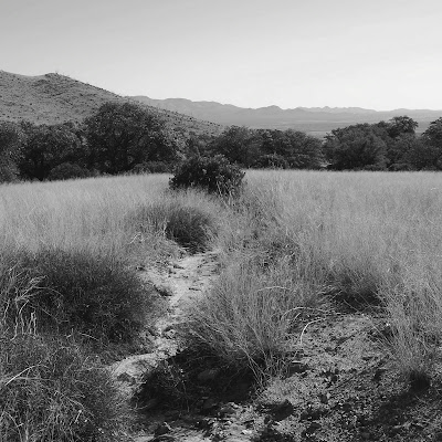
For these, I like to convert my reference photo to a black/white image; that way, I'm free to choose whatever colors I wish.

I chose a photo I took out near Coronado National Monument, south of the Huachuca Mtns., back in March.  I decided to try a square composition just for something different and so that I could alter sizes if I wanted.


Nice range of values, a foreground, middle ground and distal horizon.  Some interesting stuff .  I didn't do thumbnail sketches prior to beginning the first painting, which probably would have been a good idea.  I altered the composition a bit as I went.  

For this, I decided to stick with Unison pastels and went with an orange-yellow-purple palette, sort of a split compliment, and going strictly on values vs. colors.  It's kinda fun, color-wise.  If I can settle on a compositional arrangement I am happy with, I'll probably whip out a bunch of smaller studies in between other pieces.

Trees with grass and wash
9x9" 320-grit sandpaper

Friday, May 21, 2010

Sky Friday - A toast to Alfred Stieglitz

There have been many times when I was observing and photographing the sky that the cloud forms themselves were so compelling and beautiful as to stand on their own as subjects, freed as a subordinate of the land.   Given my proclivity towards abstractions, it was inevitable that many shots were taken with the camera well above the horizon.  Ever since I began taking these, I've wanted to do a series of them, and today seemed like a good day for a departure from the sunsets I've been posting.

Not too long ago, I was reading about master photographer and husband of Georgia O'Keefe,  Alfred Stieglitz, and was fascinated to learn that he did a series of abstracted cloudscape photos, titled the Equivalent Series.    How exciting to learn that one of the great photographers of the late 19th/early 20th century was also a cloud aficionado.

Whereas these shots were taken in full afternoon sun, against a brilliant blue sky, I find that I prefer them, save one,  as monochromatics, just as Stieglitz portrayed them.  They are posted by date taken, earliest to latest.  Location, date and cloud type are noted.  All, except for the color photo, are taken at full 18mm wide angle.

So, Mr. Stieglitz, wherever you may be, here's a tribute to you and your Equivalents.  Enjoy!

Cirrus #1
Long, sweeping tails of this graceful cloud fill the sky.  
Jonquil Hotel courtyard, Bisbee, January 26, 2009.


Cirrus #2
Wispy tails of this cloud form fern-like patterns in the afternoon sky.  
Jonquil Hotel courtyard, Bisbee, February 2, 2010.


Altocumulus
These small cloudlets form a striking pattern across the morning sky.
Jonquil Hotel courtyard, Bisbee, February 6, 2010


From the Heavens
This pair of moisture-laden cumulus congestus clouds, joined by a thin vapor veil, show dramatic backlighting from the sun.
 BLM Murray Springs Clovis Site trail, March 19, 2010


Cirrocumulus
These high-level clouds form what is known as a "mackerel sky"
Picture Rocks/Tucson, March 22, 2010

Wednesday, May 19, 2010

Marsh Inlet - pastel

Today was one of those days that was a bit of a grind in the studio...where nothing but "blah/ick/ugh" is created, despite what seems to be a good effort.   It's day two of grey skies with no sun, and that no doubt played a part, as I find it really depressing.  The weather here is a constant reminder to me that mid-July [our moving date to Durango] really can't get here soon enough.

I'd started a painting a couple days ago, based on one of the Bluff Point photos I took 2 weeks ago.  It wasn't one that made it onto the blog, but I took a similar one, of the curving shoreline and distal treeline along Brushy Pt., back in Nov.  Well, I couldn't make it work, despite reworking it twice.  So, I decided to move on to something else for the time being.

One of my favorite photos out of that lot was one that I liked because of its very abstract nature, and that's how I intended to paint it.  The design and shapes were simple, and not wanting to get overly committed to it in case it was a complete junker, I decided to use some Strathmore Artagain paper, which I haven't used in a while now.   The smooth surface of the paper forces looseness and dedicated strokes, because it just doesn't hold much pastel at all.  And, some of the softer pastels (Sennelier in particular) just form flakes and don't stick at all (white part of the cloud being the part in this painting).

For most pastels, I either use a white pastel pencil or charcoal/charcoal pencil to draw the shapes and sometimes to block in basic values.  I didn't do any preliminary blocking in - just started grabbing whatever colors suited my fancy at the time, with the only attempt at actual matching done for the water.  It was good in that it helped me get back into a groove a little bit and it's not so gawd-awful that I won't post it.  I may revisit it on a better surface and larger size and with more thought given to the colors, but in the meantime, here it is.  The Olympus did a respectable job, even in the awful natural lighting.  So, at least that's a good thing!

Marsh Inlet - 9x12"
pastel on Strathmore Artagain paper

I managed to knock out two more pastels and start on a third today.  I'll post those tomorrow.  It's supposed to be sunny, which is a good thing.

Sunday, May 16, 2010

Spring at Bluff Point - photo essay

Last November, one of my posts featured photos taken at one of my favorite places near where we live - Bluff Point State Park - and can be seen here.  I like it because it's one of the few places with wide-open space, which of course, appeals to my aesthetic sensibilities.   It has interesting shorelines, marshes, inlets, wildlife and things that make neat reflections in the water.  

Like fall in New England, spring - at least as far as the trees are concerned - transformation happens very fast.  The deciduous forests spend about 6 months without leaves, so once the chance of ice and snow is well past, they waste no time getting busy gathering energy from the sun while they can.  Once leaf buds start to occur, the process is like an explosion, and is pretty much complete within 2 weeks.   The leaves rapidly change from pale yellow and acid green to a deeper, more mature mixture of greens as the chloroplasts maximize the production of chlorophyll and other photon-capturing pigments needed for photosynthesis.

About two weeks ago, we decided to take advantage of the nice weather + weekend, and take a walk and photo shoot out along Bluff Point.  It was mid-afternoon, so not optimal conditions for excellent photos.  However, I did manage to take a few that turned out well enough to post here.  Others have far more value as a starting point for a painting.

Red Canoe
Sitting along the cove side of the Brushy Pt. barrier beach, this canoe patiently waits for its next seafaring adventure.

 
Seaweed 
These pieces of seaweed form interesting abstract shapes against the sand in this shallow section of the cove.


Coming Together
Wakes from this delightful pair of ducks form a circle in the still waters of the inlet of the Poquonnock River.


Reflections of Early Spring
This small barrier island, located on the breaker side of Brushy Pt.,  shows off its assortment of trees.  In the clear, shallow water of the foreground, clumps of dark seaweed sway with the ebb and flow of the tide.


Towards the Marsh
A marshy inlet and peninnsula form the backdrop for these strands of marshgrass and bright green shrub.

Side note: regarding future posts, I will probably have to stick with existing material for at least the next few days; yesterday, while we were out on a drive and photo shoot up some of the side roads, I was climbing up a short, grass-covered slope to get a better view of a field, when I slipped.  My camera swung forward and the edge of the lens hit a clump of grass, not even that hard.  However, it was enough to do something to the internal workings of the zoom mechanism, reducing the lens to a fixed 55mm.  That would have been acceptable, and I managed to take a few photos after that.   But, either due to me fiddling with it, or taking photos in the jammed position, the iris (?) is now partially closed.  So, it's hosed.  A new lens is in order, but I'm not going to get the same 18-55mm that came with the camera.  Time to move up to something better...and more durable!

I may have to go back to my trusty old 3MP Olympus PnS to take photos of paintings I do in the meantime.

Saturday, May 15, 2010

Poppies

During my last day in Tucson, I stayed with a friend who lives within the city itself, in an older neighborhood not too far away from the university.  It is the kind of neighborhood I'd want to live in if I were in Tucson - the homes are spacious, well-built, with large front porches and rear courtyards.  Lots of trees line the wide, quiet streets and the public easement/sidewalks are a botanical showcase of flowering annuals, enduring cacti and other desert-hardy plants.

While waiting for my friend to finish up some work-related obligations, I decided to do a neighborhood walk-about with my camera.  Everything seemed to be in bloom, so I got dozens of photos.  One of the corner houses in particular sports a garden that apparently has been there for years, and appears to run on autopilot now.  It is filled with a glorious selection of native annuals, bulbs and non-native perennials.

It is also unique in that it was filled with poppies - dozens of them, some in fun colors I've not seen elsewhere.  We have a variety of poppy growing in our backyard here in CT that produces brilliant red flowers and is notoriously difficult to photograph well.  That seems to be the way it is - poppies droop and their petals flop.  Nonetheless, I managed to get some photos that I think capture their beauty.

Here are some taken from that garden.

Red Poppy Quartet
The afternoon sun accents the brilliant red petals and textural detail of the poppy stems.


Desert Garden Medley 
Poppies, purple iris and annuals coexist together, while a brilliant bougainvillea and prickly pear cactus bring up the rear.


Pink with Shadows
Afternoon light forms a range of pinks on the ruffled petals of this poppy.


Red and White
White edging and dark filaments add more drama to this poppy, while an unopened bud and seedpod peek out from below.


Upward Glance
This bi-color poppy takes on the appearance of a colorful recliner with its petal arrangement.

Friday, May 14, 2010

Sky Friday - April 18 sunset, Tucson

Going back through the archives here for some more southwestern sunsets.  This one was taken within walking distance of my mom's house, in an area that is mostly devoid of buildings and other detractors.

No tripod here, so shots were set to one of the auto settings and a large aperture.

In Concert
These high-level cirrus clouds, with their icy fallstreak tails, appear to be moving through the sky in orderly fashion


Northern Migration
These rapidly-changing cirrus clouds add a sense of movement to the stationary saguaro still life


Clouds and Crescent Moon
The clouds appear to envelop the brilliant white moon in this wide-angle shot


Gestures
The clouds form loose, sweeping forms of color across a twilight sky.

Thursday, May 13, 2010

Monkey portrait and 100th post

I was reading someone's art blog recently who celebrated her 1000th post.  That is a helluva milestone to me!  As someone who arrived on the art blog scene much later than most, it will be a while before I reach that point, but I certainly do hope to.  But, I can still be happy that I've posted regularly enough that this post signifies a much more modest milestone - 100.  That seems like a large number to me, especially since I've only been doing the blog since Sept. '09.  I was prompted to begin a blog after realizing just how much I enjoy reading and viewing other artist's blogs.
Nelson jumps for joy over 100 posts
(he's actually just jumping for his feather toy)

I have no idea how many people read this blog, either passers-by or regularly.  I'm sure the mixed content is probably not appealing to some who like only pastels, or only landscapes, etc.  But, I'm okay with that; I can't really define myself as having one sole medium or outlet that drives my creative mind at all times.   I think for me this blog has been great because it has given me a purpose to be creative on a regular basis, be it with pastel and paper or a camera.  Or maybe some clay.  Either way, it's all good.  And for those that take the time to stop by and take a look, I appreciate it!

As I mentioned in the last post, I have been working on a pastel portrait of Monkey.  I haven't done a pastel painting of an animal since '98.  I've actually never done a portrait painting of any animal or pet that I was personally acquainted with.  Charcoal sketches and drawings - yes.  So, this is another first for me.

After doing mixed media realistic equine sculpture for the last 15 years, I am done with "realism" as far as it pertains to colors and detail.  Done.  While I can appreciate the level of realism that many artists who paint animals put into their work, that's not a direction I plan to head.  I may still do the labor-intensive, value-based graphite drawing from time to time, as there are certain subjects that appeal to me done in that manner, and it's the way that many rigorous ateliers still work, like copying the drawings of old masters.

However, I find myself these days far more interested by color, and this portrait of Monkey was inspired by the work of two pastelists whose work I admire for their fantastic portraits:  Harley Brown and Dawn Emerson.  Their paintings simply vibrate with color and energy, and that's the direction I would like my work to go.  The only way I can describe their work is as "loose precision", which sounds contradictory, but if you're familiar with their work, it might make more sense.

Here is my first step.  It's a bit tighter than I'd probably do in the future, but in this case, the detail was fun and didn't take that long.  My main concern was getting anatomy and proportions correct - without that as a base, the painting fails.  What was best was using non-doggy colors - pinks, purples, and blues dominate - it's about value, not color.  The greens for the background were chosen for their harmony with the blues of his coat, and that green represents life, energy and renewal.  

"Monkey" - 12x18
pastel on Strathmore 400-Series paper

For Roxanne, as a gift for your 40th birthday.

Love you, 

-Sonya


Sunday, May 9, 2010

Remembering Monkey

When I was staying with my sister in Bisbee this winter, I shared the house with her pack of fur-units, as I like to call them:  3 cats and a black brindle boxer named Monkey.   Unlike the cats, whose entire existence revolved around their stomachs and figuring out obnoxious new means to obtain food, Monkey existed for the purpose of going on walks.  Or, better yet - a ride in the car that would lead to something better than a walk:  an Outdoor Adventure.  Outdoor Adventures take place in new locations, usually off-leash, with sights and smells that don't exist along the usual walk around town.   For a dog, there is nothing better than this.
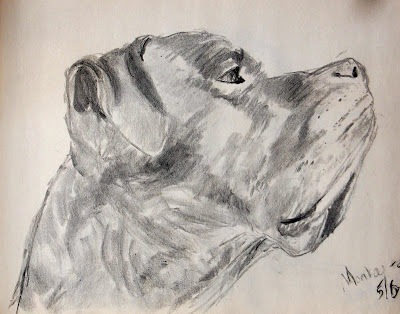
Monkey - charcoal study #1
9x12" on newsprint pad

My sister isn't much of a hiker like I am, and she also didn't have the free time to go out like I did.  When I started taking Monkey on hikes on the local trails, it didn't take him long at all to figure out the "pre-hike procedure", which would involve me first getting dressed in outdoor clothing and hiking boots.  After staring at me to be sure of my intentions, he would go over and pull his leash and collar off of their storage location on the kitchen wall, and drag them over to me on the floor.  And then he'd stand there, looking at me with a hopeful,  pleading, look in his eyes.   If he saw me grab my backpack, camera and tripod, he would start whining, because those things definitely meant an Outdoor Adventure, and Ride in the Car, vs. a mere walk.   When I would tell him he could come with me, he would start jumping up and down, doing what I called the "boxer dance".  It was hilarious seeing him get so excited.

I brought him out with me on numerous occasions on hikes and photo shoots, mostly because I was a sucker for his act, but also because of this unfortunate reality:
No es bueno
Sign at the trailhead of the Crest trail in the Huachucas

In addition to his imposing looks, Monkey would have gone after anyone attacking me, as I was part of his pack.   Thankfully, we only ever crossed paths with other hikers, so this was never an issue.  He wasn't able to go on runs anymore, but could still hike 5-6 miles, which he did on the day we hiked the Crest trail.  I'd bring his water bottle, and he loved to drink water as it was poured directly from the bottle into his mouth. 
Monkey on the Crest trail - March 18, 2010
A smiling, happy dog!

Roxanne told me that on the day I left Bisbee, Monkey was out of sorts, and kept going into my old bedroom, looking for me.  


Monkey - charcoal study #2
9x12" 

My sister got Monkey from a rescue group about 5 years ago, and his age was guessed to be around 3 years at that time.  So, he was far from a young dog, especially as boxers go.   Shortly after I left for Tucson, he started having some increasing problems with his GI system.  An evaluation revealed a large tumor in his stomach that was likely malignant, as well as severe pancreatitis.  The vet told my sister he could probably still do okay on some medications, at least for a while.  So, she sunk hundreds of dollars for medications and tests.  
Monkey - charcoal study #3
9x12" 

Alas, his condition continued to deteriorate, including trouble breathing, so on April 29, Roxanne had him put to sleep.  Even though he wasn't my dog, I grew quite fond of him and he certainly enriched my time in Bisbee much as I am sure I enriched his for the 4 months I was there.  I'm glad I wasn't there at the time; seeing the life go out of a living creature is always sad for me, especially one that was so happy and full of life not too long before.
Monkey - charcoal study #4
9x12" 

A few days before I left, I took several photos of Monkey, thinking that I'd like to do a painting of him for my sister.  I also had some photos taken earlier, of him with a favorite stuffed toy, a French-speaking rabbit:


Monkey with Henri - charcoal gesture sketch

Since my sister's birthday is coming up in a few days, a portrait of Monkey seemed most fitting.  I've found that repetition and multiple studies of a particular subject is the best way to do it justice, so I've been doing charcoal sketches based on the photos I took back in March.   Getting my drawing skills back up to a respectable level is another reason.  I'm still undecided as to whether I'll do a head portrait, or one based on the gesture sketch above.  


Monkey - charcoal study #5

So, Monkey - this post is for you.  May you continue to have Outdoor Adventures wherever you may be.  I'll miss you, buddy.

Saturday, May 8, 2010

Portrait of a '57 Chevy

Every now and then, it's good to throw out a curveball.  Something unexpected and unanticipated.  Anyone who has been following this blog, even periodically, probably has a good idea of what subject matter I'm particularly passionate about.   For the most part, that usually means subjects that have little or no human influence.

However, I do admit to having an affinity for old things constructed or crafted by human hands or ingenuity.  Something that combines form with function and aesthetics.  New is good when it comes to tools that make life or art easier, such as my iMac or Nikon DSLR.  Otherwise, I find little appeal in new:  new houses, new cars, electronics, appliances, etc.  These days, new often equates to shoddy quality and/or an uninspiring, soul-less design.

Take today's cars, for example; everyone has heard the phrase:  "they just don't make 'em like they used to", a sad testament to how quality has slipped over the decades.  Even the best aren't always that great, and are of utilitarian design and otherwise unremarkable.  They aren't built to last, being about half plastic and half computer now.  Some, like the Scion and Honda Element for example, are to me, aesthetically objectionable.

This post is an example of an automobile that was made "like they used to", over fifty years ago.  Enter the '57 Chevrolet Bel Air Hardtop.  It was designed in and for an era when driving was a pleasure, the American car companies were at the top of their game, and concepts like "oil embargo" and $3/gallon gasoline weren't even fathomable to the American consumer who loved their cars.

These photos were taken in the Lowell district of Bisbee, on my last day there.  Lowell is to the east of the large Lavender mine pit in Bisbee.  There are a few businesses open, like the Breakfast Club restaurant where my sister and I had lunch that day.   But, like the '57 Chevy, Lowell now represents a bygone era - most of the main street are buildings long since vacated, with fading paint and peeling facades.

After lunch, my sister and I walked down the main street.  This car was parked in front of a vintage Texaco gas station and garage, and as luck would have it, no other cars nearby.  Or people.  She is a real beauty - solid black, polished and gleaming, with lots of chrome, and lovingly maintained throughout the decades.  Pictures were in order, of course.

A funny bit of irony, re the new, fancy and technology:  taking advantage of those three things allowed me to transform these photos  more befitting an automobile that is 53 years old, and for that I'm grateful.

I hope you enjoy this unexpected subject matter, and let me just say that it won't be the first or the last time an old automobile makes its way into a blog post...

A Moment in Time
The Bel Air shows off her classic lines in front of the old Texaco station


Front Study
The beautifully crafted chrome grille and bumper, along with the hood and headlight chrome details, make this car a real looker.


Pump Reflections with Hubcap
Did the owner live in San Francisco at one point?  Drivers there know to curb their wheels on a sloping street like this.


Fins, Chrome and Gold
An antique filter allows the gold lettering to be appreciated on the rear quarter panel of this sleek and elegant car.

Friday, May 7, 2010

Sky Friday - Last Sunset in Tucson

I was lucky that the last night I spent at my mother's in Tucson, the sky provided the makings for a beautiful sunset.  With photography, one quickly learns that getting good, let alone spectacular, captures of such fleeting atmospheric events is a combination of planning and luck:  you get what Mother Nature decides to offer; it's your job to make the most of it.

Knowing that luck might just be on my side, I decided to drive out and secure a location free of "man-made interference" that sullies the view.  The snapshot sunsets I've taken from my mother's property always included such unfortunate detracting elements such as cell phone tower, power lines or the Chevron station's glaring sign.  Nonetheless, the first photo featured is from her property, just before I headed out in the car.

Here are selected images from the sunset in Tucson, on Monday, April 19, 2010:

Prelude
Clouds of various shapes, sizes and altitudes show off their forms in light of the sun not seen.


Window of Opportunity
The sun makes a brief appearance while splashing select parts of the clouds with color


Transition
The sun now spreads its brilliant diffuse glow across the altostratus clouds, in contrast with the pale twilight sky.


Glow - Redux
Waterman and Silverbell Peaks, to the left and right, frame the focal point of the sun's path in this 55mm shot.  The far western edges of the cloud are now a brilliant yellow.


Understudy
The final rays of the sun now accent the previously unseen textural aspects of the clouds.


Related Posts Plugin for WordPress, Blogger...