Tuesday, December 27, 2011

Winter landscape - A still life, of sorts

Intersection
11x14 inches
pastel on acid-free construction paper

I'm not sure precisely all the reasons I'm drawn to such ordinary scenes like this one, but I am.  This is also the type of thing that I would love to have painted on location, but given that this was in about 15" of snow and at least 1/2 mile down the road to Haviland Lake, which was closed to vehicle traffic, that wasn't happening.  Perhaps one of these days, I'll snowshoe in to paint on location, but not for this.

The reference photo for this was taken on Christmas day, while I was out snowshoeing.  It was a bright, sunny day with no wind.  Just perfect.  The low angle of the sun at this time of the year and mid-afternoon light of winter produces the most amazing shadows.

Here are a few other photos from the day, which was a loop including roads and a trail:

Beautiful crystals of ice form on a small creek along the trail

Creek reflections

Cattails along the edge of Haviland Lake

Sweeping tree shadows across the frozen lake

This Red Squirrel [Tamiasciurus hudsonicus] was extremely put out by my presence.    He is giving me the stink eye from high up in a Ponderosa pine 25 feet away - hilarious!


Sunday, December 18, 2011

Winter landscape - An urban landscape, deconstructed

December Morning 
12x12 inches - pastel on acid-free construction paper
© 2011, S.Johnson
Something quite different for me - a landscape with not one, but multiple elements of human presence...including some humans!

Based on a photo taken the same day and not far from the same location as the painting from the last post, this one of three gals walking along the Animas River Trail (ART).  Even as I took this quick snapshot, I knew immediately that: 1) I had to paint it; 2) it would crop perfectly to a square format.

When analyzing the photo for any compositional changes I wanted to make, I actually decided I liked just about everything (save for an off-leash dog...definitely out!), and that they were all important to the design and meaning of the painting.  It got me thinking about the importance of not blindly following a photographic reference, and asking oneself:  "is adding or keeping this element really necessary, and does it improve the painting?"

- the trail:  this multi-use paved urban trail is one of the many things that makes Durango special.  It is the source of great enjoyment and recreational value for its residents.  The path itself is the lead-in to the painting, and the non-linear curves keep the viewer from racing through.

- the figures:  the focal point.  They also symbolize the importance and popularity of this trail to its residents by their presence.  Odd number = better compositionally.   I was mindful to keep the intervals between them varied.  They were also by far the most challenging thing to paint!

- the lamppost:  adjacent to the figures, it balances them, and adds another vertical element to the painting.  Its presence symbolizes safety and comfort.

- the evergreen trees:  breaks up the purple-red-grays of the winter trees surrounding it, and helps to keep the viewer from leaving the painting by stopping the pathway, and hopefully, helps guide the viewer's eyes up to the...

- snow-covered rooftops of the neighborhood houses:  add a broken horizontal element to the painting and tie in with the snow on the sides of the path.

- the chamisa:  even with its faded flowers, this shrub is attractive.  It helps break up the rust-colored grasses and it sweeps in towards the painting.

Try covering up each of the elements with your thumb and see if you think the painting would work as well without it/them.  I don't personally feel it does, but others might feel differently.  Either way, I think it's a useful thing to apply to your own reference photos, and even during the painting process.   I actually do the same thing when I'm painting on location.

My goal and challenge with this painting was to make it look as though there is not much detail...but, yet, it required being detailed in some areas.  Does that make any sense?  Little dashes of color here and there to suggest shapes and planes.  Thin dark lines to suggest underlying tree structure.

I don't analyze my all of my paintings or references so carefully, but I thought sharing my thoughts behind this one might be of some interest to other artists; it's also the sort of thing I really enjoy reading on other art blogs.

Friday, December 16, 2011

Winter landscape - A new studio piece...finally!

First Season's Snow
14x18 inches - pastel on Somerset Black Velvet paper with Golden pumice ground
© 2011, S.Johnson
After what seems like an eternity, I'm back.  I've actually not been gone per se - just out of touch with much of everything, for lack of a better explanation.  Actually, my attentions and creative energy have just been diverted to things not art, and probably of no interest to most readers.  So, I didn't bother to share them here.

This piece was done from a photo taken 11 days ago and actually started on the same day.  It's not even that I struggled with it, because I didn't; I actually had it almost half finished after the first session, and had fully expected to finish it the next day...but, that just didn't happen.

December is always a weird month for me, and my least favorite.  While most people are enjoying the build-up to the holidays and such, I have an overwhelming desire to head off to a remote backcountry cabin, armed with nothing but art supplies, food and books, and emerge again on Jan 2.  Then, life finally returns to normal and the days are getting longer.

But, the upside of Dec is that it usually provides the first decent snow of the season, both in town and up in the mountains, which begins snowshoeing season.

For me, a day out snowshoeing is the antidote to the noisy, frenetic and spend-spend-spend mentality of the Dec holiday season, which bothers my sensibilities on various levels.  The absolute stillness of the land covered in snow calms the mind and allows one to truly live in the moment.

The landscape takes on a Zen-like quality of simplicity...

 Things ordinary become extraordinary...

Water, transformed, for a moment in time...

Sometimes, the snow offers a most curious transformation...

And views otherwise never seen are seen...

Thursday, December 1, 2011

A final plein air...for a bit - pastel, 12x12

Late Fall Shoreline
12x12" - pastel on dark brown cardstock
© S.Johnson

Yesterday was probably the last "warm" day we are going to have around here for a bit, possibly months, and while the landscape is probably at its least attractive [in my opinion, anyway] in the period after the fall color has gone and before the snow works its magic on the land, I wasn't finding much inspiration to paint on location.

But, the urge to get outside and take advantage of the gift of a beautiful, mild day made me think of what would be interesting to paint.  Answer, of course:  the river.  New location for this piece, and one I'll most certainly revisit.  One of the standout features were the reddish bare branches of the shoreline willows.  I actually think they look more interesting and attractive without leaves - quite possibly the only tree/shrub that I could say that about.  Makes for a sweet compliment with the river, too.

I had to work quickly, though:  a hogback ridge is just across the river, and at this time of the year, the sun drops behind it early.  No sun = immediate drop in temperature = painting is over for me.  So, I didn't quite finish it on location, and despite having made some compositional adjustments to the foreground rocks on location, when I got home, I didn't care for them.  The closest rock had the misfortune of looking like...a hamburger.  Partially due to its shape and partially due to me being so focused on capturing its color variations, which were striped horizontally.  I hadn't given it much thought while I was painting that it might not translate so well in the painting.   And, there was some major funk happening with some of the colors I used in those rocks.

So, I messed around with it a bit this afternoon, fully expecting I might ruin it, which happens.  Then, suddenly, things seemed to come together and I decided that I liked it, so I took this photo:


However, upon looking at the photo on my computer, I saw two things, albeit minor, that immediately bugged me, and I knew I had to fix them.   Do you see them?  Actually, others will possibly notice different things (hey, if I ever create the perfect painting, my career as an artist will be over), but for whatever reason, these jumped out as very bothersome.  Even if you don't notice specifics, I hope you'll at least agree that the first image is better.

I mention this because I think it's a good example of how looking at a photo of the painting can be a good editing/critiquing tool.  As much as I try to catch these things before I declare the painting to be finished, sometimes I just miss them.  But, they often show up in the photo.  I still haven't figured out exactly how this phenomenon works, but I am grateful for it!


Wednesday, November 30, 2011

More from southern Utah - 8x16 pastel

Passing Through
8x16 inches - pastel on museum board with Golden pumice ground
© S.Johnson
It occurred to me yesterday evening when I started working on this painting that roads are one of the few manmade elements I really have no hesitation adding in a landscape.  I'll never get tired of painting them.

Another painting based on the drive back from the Needles Overlook, along the road of the same name, which I just can't seem to get enough of.  This one made a perfect crop to a 1:2 format.

It's hard to tell from the photo because I employed blending here, but this is on a black-toned surface.  I usually mix acrylic paint in with the pumice ground, in an approximate 1:1 ratio and add a small amount of water from a spray bottle.  One or two layers and it's good to go, and because the board is smooth, the only texture I have is what I want:  from the pumice grit.  It's particularly good if you frame without a mat.

If I frame this one, I will probably try mounting it on top of a mat (since it isn't in a standard size and I can't afford to custom frame anything) with archival foam tape.  I've seen many pastels on paper with deckled edges framed this way and I like the look.


Monday, November 28, 2011

Water abstract photos in upcoming juried show

So, as I've mentioned before, I find it difficult to paint abstracts.  However, as a photographer, abstract images of nature have been one of my favorite subjects for almost two years now, with water being my all time favorite abstract "medium" to photograph.

Mosaic With Pearl
11x14 inches
© 2011, S.Johnson
The Durango Arts Center sent out its list of upcoming shows for 2012, which includes an all-abstract venue titled "Abstract Views".  I'd briefly considered submitting some paintings, but since the show is open to all media, I figured it might be better to submit some photos instead (I think they are far better than any of my abstract paintings).  

Transformation
11x14 inches
© 2010, S.Johnson
The submission deadline was a few weeks ago, and to my delight, I discovered when we got back from AZ, that two of my three photos were accepted into the show!  Those are shown above. 

The show runs from Jan 5-28, 2012 at the Durango Arts Center.

Saturday, November 26, 2011

Back from the Valley in the Sun

We had an enjoyable time down in southern AZ, enjoying the mild, sunny weather that the desert region is known for at this time of the year, and thankfully no travel mishaps (bad weather and accidents usually being the issues).

Our lodging location plans changed due to logistical reasons - namely, that the White Tanks Regional Park we'd planned to spend the trip closes its entrance after 8 p.m., which wasn't going to work for us.  So, my plans to try and get some painting in most days also changed.

But, on Wednesday afternoon, we did manage a trip out to the area north of town so that I could paint.

Morgan City Wash
12x12 inches - pastel on light brown cardstock
© S.Johnson
We decided to go back to an area we'd hiked on Christmas day last year, near Lake Pleasant.  Lake Pleasant is a large reservoir that serves both as a recreational area for boaters and as one of the water sources for the sprawling cities of the Phoenix area.  Water from the Colorado River via the CAP canal also flows into the lake.

Last year on our hike, we discovered this neat wash right off one of the roads leading to the lake, which is apparently popular with the OHV crowd and people who like to shoot at things, at least based on the number of empty shotgun shells littering the wash near the road.  Looking on the AZ Gazetteer, I discovered this particular wash has a name, albeit a puzzling one.

More interesting, however, are the wild burros that also inhabit the area.  We didn't see any on this hike, although we did hear some braying off in the distance, quite possibly this same trio of bachelor jacks I photographed last year:


I've only ever painted the Sonoran desert landscape from photos, and only a couple of paintings at that. It certainly presents its own unique challenges, especially at this time of the year when the vegetation is in its somewhat drab winter state.

And unlike the last wash I painted in Farmington, which was comprised of sand from the sandstone cliffs, these washes are often formed from completely different rock, often volcanic and more gravelly in appearance, that washes from great distances during flash floods.

Looking back through last year's photos, I realized when I got back yesterday that I had taken a photo of the exact same location I chose for this painting!  Clearly, it struck a chord with me.  It was a good thing I brought my backpacking straps along, because this was a mile from the car.

Normally, I don't post reference photos that I paint from, because it's just not that interesting.  But, this is different, and it was interesting to see that, well, not that much has changed here in a year.  The main difference is that - ironically - there is more green in the Dec photo.  And, it was taken earlier in the day.

Christmas Day in the desert
Nelson enjoys the ultimate in cat TV:  the view from the RV 

Sunday, November 20, 2011

A new discovery: painting on cardstock

Sandstone study in purple
6x6 - pastel on brown Colorbok cardstock
© S.Johnson
One of my paintings sold on Etsy yesterday, so I had to make a run to Walmart today to pick up some more shipping envelopes and other miscellaneous stuff that I need that Walmart [usually] carries.  Usually, our grocery trips to Walmart are one of those "in and out as fast as possible", but sometimes when I go by myself, I wander down some of the other isles where I occasionally find things useful for my studio and to appease my crafty side (like yarn for a crocheted hat).

Today, I visited the scrapbooking isle, and even though I don't do scrapbooking, I always like looking at the supplies and little do-dads they carry.  I happened to notice the selection of papers, which included these pads of 12x12" heavy smooth cardstock paper that came in a variety of colors, and specifically, a pad of earth neutrals which included black, two shades of brown, white and yellow.  The company is Colorbok , although their website doesn't show any of the paper products I saw.

Thirty sheets.  Acid and lignin-free.

And, the best part.....the price:


$5.00.

That's less than I paid for the single sheet of the Somerset Black Velvet paper.

Sold!

We are leaving for AZ early-early tomorrow morning for the holiday, so I couldn't dedicate an evening to trying out a full sheet.  I decided to try the dark brown paper and after hitting it with my sanding pad, I quartered it and did this quick value study to see how it handled.

It's based on a photo taken in - where else - Moab, during my plein air trip.  I had cropped the original photo, squared it, and made it b/w for a possible abstract painting, so I could ignore the local color and just focus on values.

Verdict:  Love the paper

I probably won't use the white with pastels, but it is heavier than Bristol and just as smooth, so I'm thinking it will be great for graphite drawings or pen and ink.

So, if you ever wanted to experiment with smooth paper for your pastels, this could be a low-cost way to give it a try.  They also had packs of 8.5 x 11" paper, same price, in some wonderful dark neutrals.

I'm bringing it with me on our T-giving trip, along with my easel, as I am hoping and planning to do some plein air painting while we are in the Phoenix area.  We are going to be staying at White Tank Regional Park in Wayne's brother's ginormous RV, which means I'll have plenty of Sonoran desert-y subjects to paint within walking distance.  Exciting!

I usually don't have internet access during these holiday trips to Phoenix, so I hope everyone has a great Thanksgiving, and safe travels.  I will definitely miss reading everyone's blogs while I'm out of town.


Saturday, November 19, 2011

Impending Storm - pastel

Finally able to spend some time in the studio today...

Impending Storm
11x14 inches - pastel on w/c paper with Golden pumice ground
© S.Johnson
Another painting based on a snapshot taken during our drive back from the Needles Overlook road from the Moab trip, right near the junction of Hwy 191.  Those are the Abajo Mountains to the right there.  I have a thing for these dark, brooding skies against sunlit yellow grasses, and I found myself repeatedly drawn to the photo and realized I needed to paint it.

One thing that continues to surprise me is how some of the best reference photos I have for painting are those shot out of the window of a moving car.  No careful planning of the composition, but somehow, many of them translate into what I feel are very good paintings and often with minimal adjustment.

I love the starkness of this land, and the fact there are no trees and essentially no green to speak of.  It's open and bare and the antithesis of the pastoral tree-covered landscapes of the east that many people define as "beauty".  Nothing cozy or comfortable about this, which is perhaps why I am so drawn to it. It has occurred to me on numerous occasions that I would be perfectly happy to never paint another green landscape again in my life!

Our local newsstand finally got in some copies of the Dec issue of The Pastel Journal, so I got mine yesterday.  I was reading Richard McKinley's column, which is always wonderful, and I felt he was reading my thoughts when he spoke of the "...creative malaise and diminished desire to paint" from photos in the studio after spending all summer painting on location.  Glad to know it wasn't just me!  Anyway, he pointed out that this is the time to experiment with new techniques and materials that you'd normally not want to do when painting on location.

He included a demo with a grayscale value underpainting on some Rives BFK paper and overlaying this with a clear gesso ground and watercolor underpainting.  It inspired me to pull out one of my pieces of prepared w/c paper, the same of which I mentioned in my previous post.  I didn't feel like using the cheap-o watercolors I had, so instead, I just went with a pastel and rubbing alcohol underpainting, which is how I usually paint on this paper.

However, there wasn't a particularly good layer of the Golden ground on the paper, resulting in poor adhesion of the pastels.  In his column article, Richard mentioned using fixatives, and I decided this would be the perfect time to experiment with using them.  And besides, Degas frequently used fixatives in his pastel work, so why shouldn't I give them a try?

I ended up using 2 applications of Grumbacher workable fixative to get the coverage and depth of the sky how I wanted it.  For this painting, which is essentially (and purposely) split between the land and the sky, I wanted there to be a contrast of textures between the two.  So the sky is heavily blended, and with the exception of some of the darker areas of the immediate foreground shrubs and grasses, I tried to not blend anything else on the land elements (okay, I forgot that I did blend a bit in the mountains).

I should have taken a photo of the original underpainting so you could see just how totally funky it looks in that stage before being transformed into something I am actually pretty happy with, just because I always find that sort of thing to be fun(ny).

Even if you aren't a pastel artist, if you can find a copy of this months' Pastel Journal just to read Richard's excellent article, I'd recommend it.  The suggestions he gives for experimenting could easily be applied to any medium.

Wednesday, November 16, 2011

An exercise in perseverance

Okay, so I'm finally back from my rather longish (for me, anyway) absence from the blogosphere, and really any active participation in the internet in general.  Sort of a self-imposed hiatus of sorts, due both from having a series of "meh" paintings as of late, and being too lazy to photograph and post the few that didn't immediately end up in the trash.  It used to be that I'd post those less-than-stellar pieces and discuss them, but I guess I'm feeling less inclined to do that these days.

You know the old saying:  "If at first you don't succeed, try-try again".  That's the theme of today's post, and I thought I'd share the story behind this painting because: 1) there are probably several others that can relate; 2) maybe someone else will be able to apply this to a future situation in their studio instead of throwing in the towel (which I was oh-so-close to doing).

The successful result:
Sandstone Mesa Shadows
14x18 inches
pastel on Somerset Black Velvet paper
© S.Johnson
Note the surface for this painting - black Somerset paper, which is a printmaking paper, I believe.  That's where this all begins.  On an art forum I used to read, several pastelists raved about this paper, so a while back, I decided to order a sheet, and last week, I decided it was time to give it a try.  It is an odd size - 22x30", and after doing some checking, I found that 14x18" is a sort of standard frame size, and since I wanted to go bigger for this piece, I went with that size.

After having such a great time painting Corona Arch, I decided to stay with the Moab area theme for the next painting, and settled on a photo I took from Potash Road Friday morning, on our way to Corona Arch.  This road follows the Colorado on the west side, and this view is from an area called Poison Spider overlook and looks to the east towards Kane Creek Rd:


So, I did a quick 4x6" study to work out the colors and see if it was worth doing a bigger painting:

Yeah, I think it will work...
The study was done on the smooth black paper.  Somerset paper, however, has a textured surface, much like rough watercolor paper.  As I quickly found out, pastel handles completely differently on this surface (duh), and almost right away, the painting started heading south.  Colors wouldn't blend and the  texture made it impossible to use a light touch that I'm used to.

I decided to turn the first attempt into an alcohol underwash and try again.  Here's Round 2, when I determined I hated it and contemplated tossing the thing in the trash:

Oh, the horrors!
So, I get out my trusty sanding pad to get rid of some of the texture and pastel:

Ah...much better
I'm determined to salvage this paper if at all possible, both because it wasn't cheap and because I'm going to make this work, dammit!  After considering possibilities, I decided to pull out an old standby that has worked in the past:  Golden Pumice ground.   I have transformed cold-press watercolor paper and matboard into successful paintings with this product.

The sanding removed a lot of the annoying texture and the pumice ground added the Goldilocks amount of grit to allow for a perfect amount of layering and blending.  The ghost image was washed away when I applied the pumice, and resulted in a gray, rather than black, surface.

And, since I don't believe in banging my head against the wall repeatedly, I decided to abandon the original reference and go with a photo taken late in the afternoon along a side trip we took along the Needles Overlook road.  On the way back to Hwy 191, the light hitting this Navajo sandstone mesa was amazing, and I knew I had to paint it.  The composition was simpler, which also helped.  And, glory be - I actually had compatible colors.   Success was mine at last!

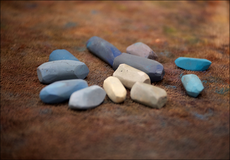
For giggles and grins, here are the pastels I used that I actually thought to take photos of before they got re-trayed:

Foreground colors

Sandstone mesa

Sky and clouds

I guess the take-home message from this is that, if you are one who experiments with new surfaces and you find they aren't working with your techniques or painting style, don't be so quick to toss it, and consider modifications that might make it useable.

Saturday, November 5, 2011

Arches and Towers of Stone

It was love at first sight...

Corona Arch
12x16 inches - pastel on black construction paper
© S.Johnson
We got back from our two-day trip to Moab in the evening, and I spent the rest of the night processing the photos from the trip (which Wayne refers to as the "Post Game Wrap-Up:  brought to you by Nikon").  We squeezed it in between the two storms that went through the region, today's of which has left about 3" of snow in town.  I wish I could say I was excited about the first snow of the season here in town, but I'm not.

Anyway, our trip was great, as expected.  It's just hard to go wrong with any hikes in the area, and I we had sort of planned the areas we wanted to hike, based on what I did and didn't get a chance to do when I was in town for the plein air event.  On Thursday, we drove out Hwy 128 to hike Fisher Towers, which is about 24 miles east of Moab.  I hadn't made it quite that far east when I was out for the plein air event.

Yesterday, temperatures were about 20 degrees warmer and no wind was predicted until later in the afternoon.  Having spent a lot of time exploring Kane Creek Rd during my last visit, I suggested we drive down Hwy 279, which follows the Colorado south and west of Moab, and specifically go hike the trail to Corona Arch, which is also short (~3 mi RT).  Actually, it's a two-fer, since it is right next to Bowtie Arch.

Most people are familiar with the arches in Arches NP, of which there are many.  Delicate Arch is arguably the most well-known arch in the country, having achieved iconic status as the symbol on Utah's license plate.  It is well-deserving of awe as possibly the only free-standing arch in the world, as is Landscape Arch, which is one of the longest spanning arches in the world.

The arches outside the park don't get nearly the attention or the visitors that those inside the park do, which is actually perfectly fine by me.   The hike to Corona and Bowtie arches was by far one of the most scenic hikes we've done in the area, and then there are the arches themselves.  You round the corner of the slickrock bench, and there they are: sculpted over millions of years out of the petrified sand dunes of Navajo sandstone.  No other type of sandstone produces arches quite like Navajo.

After taking several photos of the arches from various perspectives, I knew I had to paint Corona at least. I've not had that same urge with the other arches I've seen and photographed.  I also was thinking that I really need to get a lightweight plein air set up that will fit in a backpack so I can paint this baby on location, because, really - how cool would that be?  There is one set of metal stairs and a cable with Moki steps (areas cut into the sandstone for climbing up a steep sandstone face), but that's it as far as difficulty goes (in other words:  not a problem).

So, after doing several small color studies for more abstract landscapes (none of which were worth posting), I decided to whip this out from one of my photos.  After using a piece of the el-cheapo construction paper I bought a few months ago for some color testing, I realized it worked pretty darn good when used without sanding the surface.  As is always the case, some pastels work better than others, but for the most part, I got it to do what I wanted.  The sky was the main issue.

This would turn out even better in oils, where I could finesse the temperatures and values better.  It sort of has a graphic feel to it, which I like.

----------
Some photos from Thursday, the first day of the trip:

The Colorado along Rocky Rapids on Hwy 128

One of the Fisher Towers, as seen along the trail....

...and a close-up of the same tower a bit later with a climber peep standing on the top!  

This extreme example of a balanced rock along the trail, that I named "Striking Cobra rock"
Some of the towers along the trail 
The Colorado River as seen at the end of the Fisher Towers trail - view is to the north
The view to the south at the end of the trail - looking down to Onion Creek Canyon

Fisher Towers as seen from the trailhead in afternoon light

Half moon rising over The Titan - the tallest sandstone spire in the world at 900'
View is from Hwy 128 


Wednesday, November 2, 2011

A walk down the path of abstraction

Despite the self-imposed label of "representational artist" that I assign myself, I secretly (well, okay...maybe not so secretly) want to be an abstract painter as well.   The problem for me is that, while I have no difficulty finding abstractions in nature (clouds, rocks, reflections, patterns, etc.) and as subjects for my camera lens, my mind simply does not work in the way that I can just spontaneously create an abstract painting out of the mental aether, as it were.

So, I rely on photos to some degree as the starting point when I set out to paint something that I hope will be a little more on the abstract side of the fence.  What I love about abstract art is that it encompasses a wide range of painting styles:  that is, an abstract painting can be anything from tightly rendered and hugely detailed to a few blocks of color...and everything in between.  It really depends upon the context of the subject and what the artist intends for the viewer.

Eastward
6x6 inches - pastel on Artagain
© S.Johnson
A great thing about experimenting with abstracts in my studio is that there really are no rules.  Anything goes.  It's a great way to use many of the beautiful color-saturated pastels that normally see little time on the paper, and for me, I think my use of color is sometimes one of my weakest points as an artist.  And in some cases, the less it looks like whatever it was based on in the reference, the better.

In September
6x6 inches - pastel on Artagain
© S.Johnson
Color.  Value.  Design/Composition.  Edges.   Just like a representational painting, an abstract painting needs these elements in order to be successful in my opinion.  Of course, "successful" is a somewhat nebulous term in itself, and is open to interpretation.  For some, that might be a sale; for others, it might be accolades from fellow artists.  For me, it's generally:  "Did I accomplish what I wanted to with this painting, and am I satisfied with it?"

High Country
4x6 inches - pastel on Artagain
© S.Johnson

These are a fun break from the pieces I usually do; I spend far more time considering the four elements I listed above than doing the actual painting, which in these three paintings, were supposed to be very loose.  The last one was done as a "memory painting" - another exercise I've found useful:  study the photo but do not refer to it while painting.

If you find yourself getting into an artistic rut, feeling burned out from your current painting style or subject, I'd recommend taking a walk down this path, if even for a brief time.  For those used to doing realism, it probably won't be easy at first.  But, I can almost guarantee it will be fun, you might find something useful for your primary style of work, and who knows:  you might end up adding abstracts to your repertoire!

--------

We are heading up to Moab early tomorrow for two solid days of slickrock and canyon hiking adventures in the small window before temperatures drop into the 40's.  Everyone have a great Thursday and Friday!

Tuesday, November 1, 2011

Painting in New Mexico with the PAP4C

Well, I can now officially say I've painted on location in all the Four Corner states:

Along The Wash
12x12 inches - pastel on Artagain
© S.Johnson
Today was the next-to-last official paint-out held by the Plein Air Painters of the Four Corners for the year.  Since the fall color is now history in the Durango area, today's location was moved south into an area right near Farmington known as The Glades.  Primarily known as an OHV (off-highway vehicle) site, it is mostly low sandstone cliffs along a wide wash.  

Lori and Sharon and I went down together, and initially we weren't sure the area had much appeal for painting, as the light seemed very flat, but we finally settled on a small spur road leading to one of the countless natural gas pads found in the area.

I immediately gravitated to this wash and shadowed sandstone with all the desert scrub (pinyon, chamisa and sage).  Originally, I hadn't planned for there to be so much of the wash in the painting, but as is sometimes the case, the composition deviates from what I originally frame in my viewfinder.  Before our group critique, I showed it to Lori, who agreed that cropping some of the bottom off would be good.  However, at the critique session, everyone pretty much liked it as is and didn't think it needed cropping.

I did play around with cropping the photo and am undecided, since the crop didn't improve the painting to the degree I thought it would..either way, I love this very desert look and I think a few of us will probably come back down here over the winter on warm days to paint - the light got better and better as the day went on, which is often the case in the winter months when the sun is near its lowest angle in the sky.

More photos from today's paint-out, which turned out to be a beautiful, warm day:


Lori 
Sharon


Related Posts Plugin for WordPress, Blogger...