Tuesday, August 31, 2010

Abstracted Cloudscapes - #3 & 4

Here are the next two in the cloudscape series.

Sunsets are, to use the Forrest Gump phrase, like a box of chocolates:  you never know what you're going to get.  Having observed (and photographed) now dozens of sunsets, there are times I figured it was a wash, only to see something spectacular.  Other times, the sky has all the makings for a beautiful sunset, and for reasons pertaining to optics, cloud type, and the cloud's location in the sky relative to the sun, it's a bust.

Having a west-facing deck means that I am privy to sunsets every night of the week.  We've watched as the sun has been increasingly creeping up the side of Smelter Mtn. as the autumnal equinox approaches.

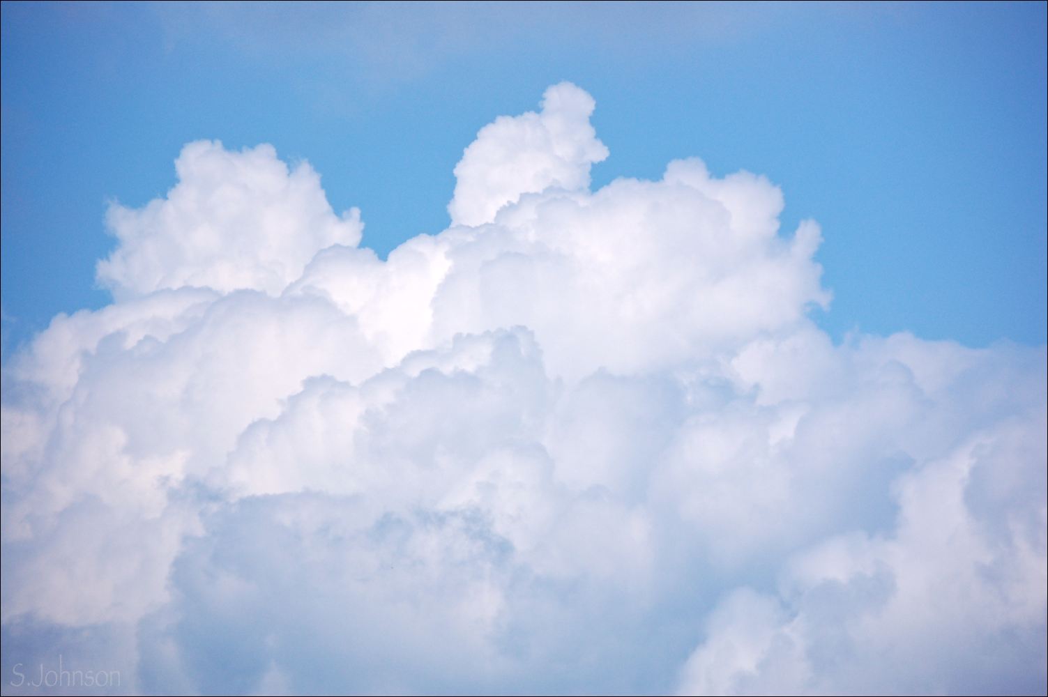
Number Three is based on a photo taken recently of a sunset from our deck;  I cropped the already zoomed image a bit more to render it to two large masses and a smaller mass.  The colors on these sunset clouds are simply amazing - dark purples, blues and reds for the body of the cloud that faces away from the sun.  Along the bottom edge, the longer wavelengths of the sun's visible spectrum of light pass through the cloud vapor, going first from pale yellow to a salmon/pink, to finally intense crimsons and oranges.  Finally, these fade to increasingly darker shades of purple.

Further to the west and thus lower on the horizon, distal clouds await their turn to transition to brilliant colors.

abstracted cloudscape #3 - sunset understudy
pastel on Strathmore 400-series paper (black)
12 x 12 inches
SOLD

It was fun using the high-chroma colors for the lower edges of the clouds here.  I find that there is often a huge discrepancy when I step back from the painting to compare it to the photo.  In this case, the subtle blues and pinks of the mid-section of the middle cloud are probably a bit too blue and too light (at least they are in the photo on my monitor).  And, there's always the issue of the clouds looking stiff, despite my efforts to prevent this.  I tried to keep finger blending to a minimum here, relying primarily on scumbling and layering of colors to try and achieve the effects I wanted.  I think a sanded paper surface would probably work better, allowing for more layering and perhaps less unintentional smudging.


abstracted cloudscape #4 - cirrus, racing
pastel on Strathmore 400-series paper, sanded
12 x 12 inches

The photo that this painting is based on was taken along Hwy 80, between Bisbee and Tombstone, in late winter, and from the window of a car while driving.  The cirrus clouds appeared to have such movement, with long, sweeping fallstreaks and hooked ends.  

For this piece, I think I sanded the surface too aggressively.  The result is that it was almost like painting on a sheet of cloth - the pastel just wouldn't lay down.  This was particularly an issue with the blues I used to do the sky, and it made blending and layering impossible, so that part looks pretty awful.  I decided this would be a good time to  experiment with workable fixative, something I seldom use, to see if I could add up the layers of pastel a bit more.  Didn't work so well.  So, no more of that.  I think the sweeping motion of the clouds themselves is a bit better than in the first cirrus painting, so that's good.   I thought about my former days as a surgical resident, with my attending telling me to hold the scalpel blade lightly - "don't grip it!"  Same goes for holding a pastel - lightly held, it allows for lighter, more gestural strokes.  Some areas of denser clouds towards the bottom called for the pastel to be applied with more pressure, and there are two shades of light gray used in addition to white here.  


Monday, August 30, 2010

Abstracted cloudscapes - #1 & 2

As I mentioned in my last blog post, I decided to try something different for the series of cloudscapes I've decided to do.  I'd planned on posting these yesterday, but the photo of the second was really awful, so I'd planned to re-shoot it today.  It's been raining most of the day today, so instead, I just did some additional pp to it and now it looks much closer to the actual painting.

In considering how I wanted to approach these paintings, I realized that trying to decide on a format (landscape or portrait, and ratio) was a bit inhibiting as far as how I chose what to paint.  So, I solved that issue by going with a square 1:1 format.  In addition to lending a consistency to this series, a square also is ambiguous in its presentation:  it literally doesn't take sides.

I went through hundreds of photos and selected about 20 that offered a variety as far as colors, shapes and overall design features went.  Using a square crop, I chose what I thought was the most interesting composition from each photo.   This lends a very abstracted quality to them, placing them out of the usual context as being connected with the land, and usually, they are just a portion of a cloud.  As of the four I've completed to this point, they are done in a loose but realistic manner as far as colors and form go. 

I'll post them all here as I complete them - probably 2 at a time, since that's how many I've been doing a day - until I'm done, or have otherwise reached some natural conclusion for the series.  

Since this series is really more of an exploration and experiment for me, I'm trying to not get caught up on how well they turn out.  What I've also been doing is post-analysis of each one, to determine what I do and don't like about it, how well things work (surface, palette and blending techniques) or don't work, and what I need to do differently in future paintings.  

I expect I'll learn a lot from these, and perhaps some will be keepers.

abstracted cloudscape #1 - cirrus afternoon
pastel on #320-grit sandpaper
8x8 inches

These are cirrus clouds, a high-level cloud composed of ice crystals.  Cirrus can take many shapes and are usually characterized by long, wispy tails, called "fallstreaks", that are shaped according to the direction of the wind.

The photo this particular painting is based on was taken in the late afternoon, resulting in some warmer colors throughout the clouds - yellows, pale lavender grays, and even a darker reddish-purple in some of the more dense sections of the clouds closer to the horizon.

Cirrus are probably the most graceful of the cloud types, with long, sweeping curves.  In this painting, the movement looks stiff.  Plus, the main cloud is too dense.  I think part of the problem is that I blocked in the blue sky instead of covering pretty much the entire surface of the paper with it, and lightly layering the clouds in on top.  As these clouds seldom have sharp edges, I did a lot of finger blending to blend and soften them.  This also worked well to help define the swirls of the clouds in the lower third of the painting.  


abstracted cloudscape #2 - stormy underside
pastel on Strathmore 400-series paper
12x12 inches

This is a pretty close crop of the underside of a rain-laden cumulus cloud approaching sunset.  The darkest values are un the underside of the cloud, where no direct light is coming.  Slight tonal variations are visible in the forms of blues and purples based on the density of the cloud and the light coming through it.  The middle 1/3 of the painting is a distal layer of the cloud - lighter in value and with a curving shape.  The lighter section superimposed upon it are small "accessory" clouds that often accompany a cumulonimbus.  These are much smaller and thinner, and thus, much more light passes through them.  Finally, the lower edges of the cloud are in oranges and yellows, indicating that it's near sunset.  

I actually really like the palette for this.  I had to dial down the contrast and lighten the shadows significantly on the photo to get it to resemble the actual painting.  Even still, the painting looks far better in person than the photo.  Trying to get the loose, tattered shapes for the small accessory cloud, and layering the colors for the luminescent quality was probably the biggest challenge.  I was partially successful, I think.


Saturday, August 28, 2010

Cloudscape #3 - a quick study

Missed yesterday's Sky Friday post; we decided to go on a 7-mile hike up into the mountains near Silverton, which ended up being an all-day affair with driving.  I had some photos picked out, but I'll just wait.

In the meantime, here's the latest cloud piece.  It's a departure from the previous two in that: 1) it's not based on a photo; 2) it was done fast-fast - about 22 minutes.   It was completed Thursday.

I'd call it a "plein air hybrid" - the cloud pictured was outside my studio window in mid-afternoon.  So, that was my "model".  However, I decided to go with a more sunset type palette with the colors.  Not necessarily 100% realistic, but I was going from a combination of memory and imagination for the colors.

It's on a dark blue sheet of Colourfix paper - my least favorite surface to paint on.  However, as I've done in the past, I used sandpaper on the surface, and that improved it significantly.

Looking at it the next day, I didn't like it very much, and I'll probably re-use the paper at some point.  But, I thought I'd share it anyway, and I'll probably put it aside for the time being instead of immediately stripping it.

I've been considering the direction I want this series to go, and after looking through some online and printed sources for inspiration, I've thought of something I think will make these work a bit better.

I'm off to work on the idea, and hopefully, will have something to post tomorrow.

Sunsets in My Mind
pastel on Colourfix paper
9x12 inches

Thursday, August 26, 2010

Dreamscape #2 - pastel

A second in an indeterminate series of cloudscapes.  The goal with this one:  looser and more abstracted.  I also wanted to show a variety in the direction and shape of the colors and strokes used here.  Some areas are blended to give a sense of soft atmosphere, while others remain as scumbled layers.  I also avoided using any of the same colors I used in the last cloudscape - it's all too easy to get into a rut with colors.  So, these are Unisons and some Senneliers primarily, with a white W&N I had.  It might be a bit busy, and I added the darker purple at the bottom later, which I probably could have left out.

Looking at the photo of the painting, it might work better if I removed even more of the wispy vaporous clouds in the upper left side; I adjusted those from the reference photo as it was.

"Dreamscape #2 - 12x16"
Strathmore 400-series paper, sanded

Now, maybe time to use a warm palette and do some sunsets.

Wednesday, August 25, 2010

Dreamscape #1 - pastel - SOLD

It's back to clouds for me for a bit, partially because I'm sick of green.  Tired of painting (or trying) to paint landscapes with lots of green and tired of looking at it.  Not so much when I'm hiking or outside, but just as it pertains to subject matter for paintings - I need a break.  Green has never been one of my favorite colors and that's probably why I struggle with using it in paintings.   I'll probably appreciate it more when it's full-on winter here and everything is covered with snow.

In the meantime, I'm back to one of my favorite obsessions:  clouds!  Being one of those "clouds only" images, it thereby obtains an abstracted quality, which I'm always drawn to.  In this case, though, I went down the path of more realism, similar to the cloudscape "Serenity" I painted a couple of months ago.

Like Serenity, this is more detailed out than my recent paintings.  I really spent time studying the photo and paying close attention to the subtle color and value nuances within the cloud, and my goal was to render them as accurately as possible.

Clouds are amazing things - seemingly solid, but yet they are not.  Seemingly weightless, but yet a small cumulus cloud weighs more than an elephant with its combined water weight (thank you to my Cloudspotters's Guide for that piece of trivia).  Light has interesting effects on clouds, lighting some areas deep within the cloud and yet other areas along the edges show the deepest shadows.

These features make them a challenge to paint convincingly, but a fun challenge for me nonetheless.

As usual, my MV Thunderstorm Gray set is what made this painting possible; for one painting clouds, it's a requisite part of a pastelist's palette.  I have a few Unisons and open stock MV's that I used as well.

Dreamscape #1 - 11x15"
pastel on 140# cold press watercolor paper with Golden pumice ground
SOLD

Tuesday, August 24, 2010

Skies over Horse Gulch - pastel

I think I've finally gotten out of my non-painting rut.  This was started and 95% finished last night, not long after I completed the last painting.

Horse Gulch is the name of the amazing area of open space, all public use, that is a block away from where I live.  In an article in the Durango Telegraph - a free weekly magazine - it described the Horse Gulch recreation area as "Durango's Central Park".  It's got 30 miles of trails that run through a small valley filled with sage, wildflowers and scrub, and surrounded to the east by a series of mesas.

A few weeks ago, I went on a trail run up the old road that goes along Horse Gulch itself (a small creek that parallels Raider Ridge to the west) and brought my camera.  Monsoon clouds were in abundance, adding to the picturesque views of the land.

There's no doubt that Horse Gulch will be visited regularly as far as subject matter - it instantly became a favored location, and its proximity to our place makes it an easy access if I wanted to bring a small plein air set along.

After finding success in improving the surface of the Canson paper, I decided to try it on the Artagain.  The result was that it dramatically improved the paper's ability to both layer and blend, and here is the result.  Since I really like working on a dark/black surface, I'll be doing this for all paintings I do on Artagain.  The paper still has its limitations, and I'll probably not use it for paintings I think are going to be "keepers", but that could change as my painting skills continue to improve.

"Skies over Horse Gulch"
9x12" on Strathmore Artagain

Monday, August 23, 2010

Alpine Meadow - pastel

Here is today's painting, based on one of the many photos I took on our hike last week along the Colorado Trail, up by Molas Pass and near Molas Lake.  It starts around 10,000', so no pines, or even aspen - just spruce.  The trail heads east and drops down about 1700' to the Animas River, crossing the DSNGRR (Durango-Silverton narrow-gauge railroad).

"Alpine Meadow"
9x12" on Canson M-T

When in Telluride this past Friday, pastelist Bruce Gomez working on his easel right on the sidewalk in front of the gallery his work is sold in.  Of course, I couldn't help but stop and watch for a bit, as his work was stunning!   I asked him what surface he was painting on, as it had a sueded look, highlighting the luminescence of pastel.  He said:  "Watercolor paper sanded with #80-grit sandpaper".  No underpainting or anything.  He was using a 2" paintbrush from the hardware store to both blend the pastels and dust them off.  Have a look at his website to see his beautiful pastels.  

Anyway, that was inspirational, and I decided to try sanding some Canson paper to see if that helped.  The above painting is the result, and I have to say that it did definitely improve the surface and ability to apply more layers.  Earlier today, I went and purchased two sheets of 22x30" cold-press Arches watercolor paper to try as a surface; I'm always up for trying something new, and this is a fast (and cheaper) way to try a larger piece.  


Sunday, August 22, 2010

Trip to Telluride and plein air painting

On Friday morning, Wayne and I headed out for an overnight camping trip near Telluride.  Right off Hwy 145 a few miles south of Telluride, the campground (Sunshine) is situated within an aspen forest around 9,000'.  Wayne had stayed there before years ago, and we had been looking forward to returning to this area ever since we had been through last year on a drive.   It's less than 2 hrs. away from Durango and an unbelievably scenic drive.  We'll be back for a fall color trip in a month or so.

On Friday, after securing a campsite, I had the realization that we'd forgotten a key element necessary to any camping trip:  my sleeping bag.  Oops.  Considering the prospect this might now be downgraded to a day trip, we nonetheless decided to head into Telluride and see if we could get a bag that wouldn't cost a fortune at some pricey outdoor shop.

As luck would have it, a quick chat with some friendly locals pointed us in the perfect direction:  the hardware store!  Ace hardware had just what we were looking for:  a 25 degree bag for less than $30.  The trip being salvaged, we headed back and grabbed our respective gear:  my camera and some bare-bones plein air supplies, and Wayne's fishing gear.  Destination:  Trout Lake.

I didn't want to be bothered with the heavy easel and full set of pastels, so I grabbed a small clipboard, my set of 96 Nupastels, and a pack of #320 sandpaper to paint on.

"Near Trout Lake"
9x11" pastel 

Since for me, plein air painting is more to practice and work quickly than to create some masterpiece, I wasn't going to worry about the outcome.  Having a somewhat limited selection of pastels also forced me to make do with what I had and experiment more with scumbling and blending.   I suppose it doesn't help that I decided to choose a challenging area to paint; how to choose what to include?  

I sat on a rock with the clipboard in my lap and the pastels right next to me on the shore of the lake and painted away.  Not sure how long I spent on it; maybe an hour?  I was lost in the process and it was fun. 

Anyway, it turned out much better than my first attempt at Haviland Lake,  so I'm pleased.  I did rework a bit of it earlier today, just to add the really dark greens of the shadowed areas of the spruce forest.  There's not the sense of depth that I'd like, again, due to palette limitations, but I could see redoing this at some point into a larger studio piece.  

Here are some other photos of the area and the campground area.  I'll save others I took of the amazing hike we did yesterday for another date.  These were taking using the awesome new zoom lens I bought off eBay last week:  a Nikkor 18-70mm 3.5-4.5 DX ED.  The quality of the photos vs. my old 18-55 was immediately apparent; it's nice glass, and I was really missing the ability to shoot wide-angle landscapes like this:

Trout Lake and Yellow Mountains
This is the stunning view I had to paint from.


A family of Canada geese moved into the lake as I approached the shore, slowly making their way to a human-free location.  Shot w/ the telephoto lens @ 200mm.

Parasailing and waxing gibbous moon over Telluride

Alpine pond by the campground - love the aspen forest!

Morning light, aspen and wildflowers at Sunshine campground.  This was 10 ft. from our campsite.


Friday, August 20, 2010

Sky Friday: July 27 sunset

One of the many, many perks about where we live is that the deck from our bedroom faces due west.  The sun sets in the center of the bowl formed by Smelter Mtn. to the south and Perins Peak to the north.  Being in monsoon season, the evening sky is often covered with stormclouds, either coming or going, so we haven't been getting too many colorful sunsets.

Going back through the photos I've taken, I realized that this set, taken on July 27, was one where we had some good color going on.  We had a simply amazing sunset 2 nights ago; that will be for another day.

Sunrises and sunsets were something I never saw from our place in CT.  In fact, I never saw a single sunrise the entire time I lived there.  Sunsets I saw on rare occasion; you had to make a special effort to go somewhere to see them, where trees and buildings weren't totally obscuring the view.

Now that I have a "deck with a view", it means I'm grabbing my camera a lot.  Incidentally, these were all shot with my 8-y.o. Olympus 3.1MP p&s, since my DSLR lens didn't have any wide angle capacity.  It takes surprisingly good photos given its age and small sensor size.   Good news is that I purchased a much higher end lens from eBay (used, and less than half of what the same lens costs new) that's a much broader zoom - 18-70mm.  I could tell the difference in the quality of the lens, the glass, and the resultant photos immediately.  

Coming into the light

Over Smelter Mtn.

Sunset diffusion with tree 

Final light


Wednesday, August 18, 2010

Pennsylvania Farm #1 - pastel

Here is the third in a series of paintings from the cross-country drive across the farmland of I-80.   I have no idea how long this series will last (probably a few months, at least - I'll keep painting as long as I'm inspired by the reference material I have), but I'll probably aim to do it sequentially, by state, from east to west.

One ubiquitous feature along the farmland of the northern midwest and high planes are cornfields.  They are everywhere.  If one visiting this country from somewhere far away did not know better, he or she would think that all we eat is corn.  In a sense, this is true; corn and corn derivatives find their way into more of our food than one can possibly imagine.  Having read Michael Pollan's amazing book The Omnivore's Dilemma, I was already well aware of this.  Nonetheless, it's something amazing to behold as you drive across the US.

So, obviously, it will stand to reason that many of the paintings will have cornfields as the subjects.  I found them fascinating.  In some places, they make up perfectly straight, even rows on level land, and perpendicular to the interstate.  Elsewhere, the rows followed the contour of the land, over gently curving slopes, or down a hillside.  Often, a cornfield would be right up against the edge of a stand of trees, making the most use of free land not covered by buildings or trees.

This painting was edited slightly from the reference photo; extra buildings were left out.  I did keep the main barn and two others.  I liked the geometric shapes and bright contrasts of the roofs against the darker trees and curving landscape.  Also ubiquitous to farms are the grain silos, apparently referred to by corn farmers as "bankruptcy tubes".  They come in a variety of shapes, sizes and constructs.  Here, we have a solo silo behind one non-descript building.

"Pennsylvania Farm #1"
11x15" on 140# watercolor paper with Golden pumice ground

I started this with a quick pencil sketch on the untinted paper.  I usually use charcoal, but I was thinking that getting the buildings accurate as to shape, etc, would be better with pencil.  I blocked in the basic shapes and colors of the sky, tree line, and fields, and finger blended them in.  Later, I decided to use an alcohol wash to turn it into a more permanent underpainting.  This surface lends itself well to underpaintings.  

Then, I went back and began working back to front, leaving the buildings for last.  I am trying to avoid putting lots of detail into my landscape paintings, but I felt some was necessary to depict the edges of the cornfields in the foreground.  Not sure sure about the lower left hand area; I may rework it and tone it down.  

I'll probably alternate these with a series of local landscapes, of the trails, forests and mountains where we have been hiking, and probably more skies - they have been tremendous!

Tuesday, August 17, 2010

Two from Pennsylvania - pastel

Ever since I took those 1000+ photos on our drive out here, I've been thinking I'd like to do a series of them.  Mostly barns and fields, as those were the things that for whatever reason I found most appealing, but there were random sky photos that I took as well.

I have been caught up doing other things and not painting lately - save for the single plein air piece - and it's been bothering me.  I need to sit down and write out a schedule for myself to paint and/or draw every day.  Really, there is no excuse.  You don't improve by merely "thinking" about painting.

So, last night, I finally plugged in my flash drive into the studio laptop and decided to just *do something*, painting-wise.

These were the two results.  Both are done from shots taken in Pennsylvania on the day we left.  It is late afternoon, although the first one looks more like a sunset, it's really the dramatic effect of the sun partially hidden by a large cloud.  The colors were wonderful, but the camera never quite captures them...esp. when I am shooting from inside a moving car.

I did a small value study/composition sketch in pencil for this, leaving out some trees and adjusting the slope so it wasn't heading in the same direction as the cloud angle.  Otherwise, the goal was fast and loose for both of these.  They weren't planned as keepers, so they aren't on fancy paper.

Late Afternoon - Pennsylvania
9x11" - #320 sandpaper

The second was done from a really blurry photo of a field.  I liked the abstracted shapes and simple colors - the sky was overcast.  The really bad photo ended up being just perfect for an abstracted landscape.  Stratus clouds (low-lying clouds, aka "fog") filled the sky, and mist added to the aerial perspective.  It's in contrast to the above image.  

I probably did this in 15-20 min. at most.  It is on black Artagain paper, which is what I use when I am not wanting to commit to a painting.  As usual, its smooth surface doesn't allow for much blending or layering, but that's okay.  The foreground slope had some type of vegetation on it - probably wildflowers  and such - but in the photo, they are merely blurred colors.  I liked that, so I did the same on this painting.  I just started pulling colors out - whatever suited my fancy - and went for it.  

Pennsylviania Field #1
9x12" 

Now that I've hopefully broken out of my non-painting rut with these studies, I can now settle down and do some more purposeful paintings on some better paper with more planning.  I wasn't in the mood to do that last night, but these paintings were just what I had in mind.


Monday, August 16, 2010

Colorado Wildflower series - #2

The wildflowers - they just keep coming!  Every hike we go on is a new discovery for flowers - I find it so exciting to find a new species that I've not yet seen, and capturing its beauty with the lens of my camera.

With a relatively short growing season, particularly at the higher/alpine elevations, the flowers need to get busy quickly before freezing temps and snow come in the fall.  The high meadows have produced spectacular displays of mid to late summer flowers.

Here is another set, with names and interesting trivia where noted.  With the exception of the first photo, all were taken along the Engineer trail, leading to Engineer Peak.

Cutleaf coneflower [Rudbeckia laciniata] with bee
Purgatory trail


Dusky Beardtongue [Penstemon whippleanus]
This attractive member of the Snapdragon family was found along the sloping hillside near the trailhead.


Monkshood [Aconitum columbianum]
These aptly-named flowers are found along streams and moist habitats, and is a member of the Buttercup family.  All parts of the plant are poisonous.  


Nodding Sunflower [Helianthella quinquenervis]
This perennial member of the Aster family is common along higher elevations.  They arise from rhizome rootstock and grow in groups.  


Chainpod [Hedysarum occidentale]
This member of the Pea [Fabaceae] family is so named because of its unusually-shaped seedpod. 


Subalpine Larkspur [Delphinium barbeyi]
This showy member of the buttercup family is found along moist meadows, usually amongst other wildflowers, and grows in large patches.  All parts of the plant contain alkaloids which are toxic or fatal to humans if consumed.  Best not to even touch the plant, in fact.  

Saturday, August 14, 2010

A belated Sky Friday (or: Sky Saturday)

Well, I'd meant to post these yesterday, but then, we left for a hike up in the mountains that took up most of our day.  With all good intentions, I was going to post them after I got back.  But, between a poor nights' sleep and a ~8 mile hike at 10,000' elevation with 1,700' up and down...I was a bit tired.  Add a beer to that, and I was done for the night.

Anyway, I've been wanting to post these - they are a small sampling from our drive across the country.

One from several of the states we drove through (not counting CT, NY, NJ, IN or IL, as nothing interesting going on in the sky there).  These are all "sky only" photos, lending them that abstract feeling that I am so fond of.  All were taken while driving and usually at the shortest focal length my lens allows:  55mm.  I've missed my wide-angle lens so much that I finally broke down and bought a used Nikkor 17-70mm DX on eBay.  It gets good reviews, and will be my landscape/walkabout lens.  It should arrive sometime next week.

Shown from east to west:

Pennsylvania
Morning light creates dark edges on this huge cumulus cloud top, giving an appearance of large cottonballs with lavender and pink tints

Ohio
Mid-afternoon, south of Cleveland and north of Akron, light defines the texture of this cumulus cloud system

Iowa
Higher altocumulus clouds are in the background, while more cumulus take up most of the sky


Nebraska
Loose clouds form vertical and horizontal shapes in the near sky, while higher cirrus form an edgeless background, muting the blue of the sky


Colorado
Near the I-80/I-76 junction northeast of Denver, this pair of contrasting clouds forms an unusual shape

Sky Fridays to resume on their usual day next week.

Thursday, August 12, 2010

Plein Air at Haviland Lake

On Tuesday afternoon, Wayne and I finally did what we'd been talking about for the better part of a year while we were back: an afternoon of fishing (for him) and plein air painting for me. It was simply awesome.

Haviland Lake is about 30 min. drive north of town along Hwy 550, nestled next to the Hermosa Cliffs at 8200'. It's surrounded by mostly a Ponderosa pine forest, with some spruce and fir thrown in. Along the slopes of the Hermosa cliffs to the west, large stands of aspen break into the evergreen forest. Mesozoic era sedimentary rock - sandstones and limestone - form the upper cliff edges, laid down millions of years before the Rocky Mountains came into existence. They sit atop older redbed shale layers that form the long slope now covered with trees.

The weather: perfect. Dry, with a slight breeze, and temps in the mid '80's. No bothersome insects, just lots of large dragonflies dashing around the lake edge. Masses of ever-changing cumulus congestus clouds filled much of the sky.

Probably 10 years ago, when I was living in Flagstaff, I purchased a French-style plein air easel with the intent to go painting outdoors. Well, that never happened. I did haul it out to AZ this winter with the same intent, but never used it outside.

In fact, in the past 20 years, I've only done one plein air painting and that was done on the back steps of my mom's house back in Tucson this spring. So, it was a historic moment, of sorts, to finally use my easel for its intended purpose!

I brought all 3 of my handmade pastel trays (foamboard, tape and T-pins) in their box, and used some of the Golden pumice ground + watercolor paper I'd made.  After doing a quick casing of the area, I quickly a prime spot for painting, and went to work.  Luckily, it was only about 200 yards from the car, so it didn't make the two trips lugging everything over there that unbearable.

I didn't do any preliminary sketches for composition, but instead used my thumbs and index fingers to form a viewfinder (free and always available - can't beat that!) and establish my composition.   It came out mostly as I'd hoped.

As is often the case, the most difficult part of the process was simply trying to match local colors.  I found I was lacking some important colors:  darker blue-grays for the trees of the distal slopes.  Scumbling colors to try and obtain what I was looking for didn't work.  So, as a result, the cliffs are too light, value-wise.  And, the water is too dark.  

Here is the "finished" painting, after approximately 2 hrs. of work.   No color correction, so it's a bit washed-out from the actual.  Painting the middle distance of evergreens was always a good challenge - not easy to do.  The clouds...next time, I'll probably wait until the end to work on the sky, unless there are some to-die-for clouds going on.  When I painted them, they mostly filled the sky, which I knew I didn't want.  So, they are somewhat contrived.  Next time, I'll sit and do a dedicated painting of just the clouds.

I'm also not happy at all with the water; I think I should have just ignored what conventional landscape instruction says (that the sky is *always* the lightest value), because that was not the case.  So, as a result, the painting lacks the impact that the view had, as my values for everything are simply too close.

Here is a photo, taken when clouds happened to have the middle ground trees in shade, of the basic view I was seeing.  What this 55mm shot doesn't capture is the area of the cliff that rose up before dropping down to the view shown.


This was taken after I'd already done the shadows on the left, so there is significantly more of the cliff in shadow in the photo.

I am undecided as to whether I'll just bin the painting or try, for practice's sake, to rework it and see if I can fix some things.

Regardless of how the painting turned out, the trip and the process were a success, at least as far as this being the first time I've done a full landscape plein air painting before.  Can't expect much more than that.  I would like to hope that after I have 100+ plein air paintings behind me, they will look significantly better.

Also from the trip:

One of the two beautiful rainbow trout that Wayne caught that we had poached on the grill on the campground.  I gave my thanks to the trout for its offering as nourishment.

By the time I'd finished my painting, the sun was just about gone behind the cliffs, making any sort of meaningful photography of the local area nearly impossible.  But, I did take a walk over to the dam area of the lake, to go check out some hollyhocks, which seem to be one of the favored flowers of the higher elevations in the west/southwest.


And finally, a silhouetted shot of one of an unknown species of raptor as it flew across the lake, calling out to its mate:


All in all, it was a perfect day.  It's what Wayne and I have been planning for and dreaming about ever since we moved to CT.   I feel an excitement and sense of joy and well-being that I've not felt in close to 4 years.

It's good to be home.

Saturday, August 7, 2010

Colorado Wildflower series - #1

Yikes - a week since I last posted here.  Given how much material (photos, anyway) I've obtained in the past week, that makes no sense.  I've been meaning to post; in fact, I was trying to select photos for a Sky Friday post yesterday, got a bit overwhelmed by my choices, went on a 7.5+ mile hike in the afternoon, and got nothing posted.

I've also been doing the unpacking thing, and had to repair my beloved Danish modern studio table that suffered a broken leg during the move (even well-built furniture cannot withstand a heavy box of textbooks falling on it from above...).  Pastel trays are on the table and the laptop is set up to view photos for painting reference.  And yet, I've painted not a thing.  I keep thinking I will, but then I do other things throughout the day, and nothing happens.

Anyone else have this sort of thing happen to them - a stall-out of sorts, for no real tangible reason?  Ugh.  It's frustrating to say the least.

I've been busy organizing and re-naming all the photos I took during our drive out here, in preparation for doing a series of paintings.  That's almost done, but it's a tedious and time-consuming process that I can only handle doing in batches.

Also, we have been going on the most glorious and amazing hikes many of the days, and that's also taken up a fun part of my time.  In stark contrast to CT, where I actually did not enjoy being outside, here I just want to be outside hiking all day.  It's glorious to be back in that physical and mental environment.

At any rate, material is building up and needs an outlet.  So, for starters, here is a series of photos taken of CO wildflowers.  Each hike we've been on has allowed me to capture more and more of the botanical loveliness offered up in this state.  I've referred to an identification guide purchased last year - Wildflowers of Colorado, by Don Mammoser, as well as http://www.swcoloradowildflowers.com/, to try and identify the flowers.

For all you wildflower aficionados, I hope you enjoy these - more will be on the way.  The location of the photo is noted as well.

Harebell [Campanula rotundifolia]
location:  Purgatory trail


Wild geranium [Geranium richardsonii]
Purgatory trail


Cutleaf coneflower with bee [Rudbeckia laciniata]
Purgatory trail


Rocky Mountain bee plant [Cleome serrulata]
Hwy 285 near Buena Vista

Smooth Blue Aster [Symphyotrichium laeve]
Purgatory trail


Unidentified
This plant, with clusters of white flowers, was found along the wet soils of small streams along the Purgatory trail.  
Related Posts Plugin for WordPress, Blogger...