Showing posts with label 6x6. Show all posts

Friday, August 24, 2012

More from Conejos - plein air pastels

I was able to photograph and do some minor tweaking to one of the paintings from the trip, and because the storm system still lingers in our region, I haven't been out painting since we got back.  So, here are the other three, because I got nothin' else right now.

Conejos Reflections - 12x9"
pastel on black cardstock

The first painting on the trip, from a short (1.5 mi) hike along the main trail.  I brought along my folding table and camp stool from Walmart - the second one I've owned - to paint.  Unfortunately, as with the first one, one of the legs has torn through the nylon corner, making it uncomfortable to sit on and resulting in a sore back (and groin) for the next 2 days.


Rock Study - 6x6"
pastel on brown cardstock
From camp.  Sarah, who makes a good living as an equine sculptor, had been wanting to try pastel/landscape painting for a while, and I thought this landscape still life would be an excellent subject to start out with.    So, we sat and painted these rocks and willows between rainstorms.  I wish I could have gotten a photo of the golden-colored marmot that made these rocks his home.

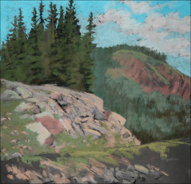
Rock slope study - 12x12"
pastel on black cardstock

Another from our campsite, with Sarah, on another day.  Unfinished, and an example of how I got sort of sloppy with my composition.  I always use a viewfinder, but this one got away from me.  It was also a reminder that one needs to take ownership of the view nature presents, and adjust accordingly.

Had I been putting more thought into this, I'd have completely left out the distal mountain (which is the same as in the diptych I posted) and eliminated all but a sliver of the lower slope/road.   The focus was intended to be on the rocky slope with the trees on it; the distal mountains add nothing but clutter.  I just fell into the "lazy" trap of painting what was in front of me...for shame!

I mention this, and post it, because I think as artists, we tend to have the unspoken expectation that all of our paintings should have successful outcomes (that is:  a painting that is fit for selling).  Sometimes, however, there is much to be gained from the paintings that don't work.  A self-critique of "why didn't this work?" is useful; if we're lucky, the same mistake perhaps won't be repeated again.

Sunday, July 29, 2012

Quartet of plein air paintings - pastel

Today, I was on a roll, and pushed my plein air total for 2012 past 70.

First, the large one, from a park south of town:
"Passing To the North" - 12x12", plein air
pastel on black cardstock
Then, smaller, 10-minute cloud studies:  one at the same location as the above painting:

Cloud Study with Slopes - 6x6"
And, two more at home, from inside my studio looking west:

Cloud Study - from deck - 6x6"
And east, with an attempt at the moon:

Waxing Gibbous Moon with Cloud - 8.5x11"

Tuesday, July 24, 2012

Painting and hiking around Lizard Head Wilderness

Back from our trip.  I spent part of the afternoon doing finishing touches on two of the paintings, by which time a monsoon storm had moved in, forcing me to wait until today to photograph them.

From this trip, I learned how to work around heavy monsoon activity:  1) paint near the car; 2) wait for any window of opportunity, no matter how small, to head out with the easel; 3) be prepared to return at a different time when the weather is amenable, to finish; 4) small paintings at camp.

First up, is my favorite from the trip.  Started Sunday afternoon during a short break in the weather, and finished up yesterday morning before we headed home, it was a "two-for-one", so to speak:

San Miguel Colors - 8x16", plein air
pastel on board with Golden pumice ground + black acrylic
© S.Johnson
This is painted from the area I mentioned in my last post:  "the meadows".  The meadows themselves were striking, with a variety of summer grasses and small meandering stream passing through.  Hills with scattered groups of spruce/fir, and aspen lead up to the base of the southern edge of the San Miguel range.

I'm always struck by the colors of the mountains within the southern San Juans (of which the San Miguels are part of).  A geology query of the San Miguel range tells me that the colorful purples, greens reds and yellows are due to the sandstones, breccias, tuffs and claystones of the San Juan Formation and Telluride Conglomerate.  Volcanic intrusions into these sedimentary layers, referred to as "stock", are what form the mountains themselves.

So, having the colorful southern edge of the mountains combined with the meadows was like being handed a gift as a painter.  But, I had to work fast:  less than 40 minutes after I set up my easel and began painting, rain started suddenly, and I was thankful I was set up 2 feet from the car...and not painting on LaCarte paper.

view from the driver's seat...two minutes earlier, I had been painting
Earlier in the day, I'd painted just down the road from this rainy view - a cabin complex situated at the end of the meadows.  I got most of it finished on location before the rain started, and pulled it out later at the campsite to work on it more between rains.

 Morgan Cabin and Dolores Peak - 12x12", plein air
pastel on black cardstock
I didn't take any photos of this cabin, but at some point (as we will be returning to this area - a new favorite for everyone), I plan to revisit this building complex from a different compositional approach.

Finally, two small pieces done from the seated comfort of our campsite yesterday morning - fun and fast, while I chatted with Sarah, and before I headed out to finish the San Miguel Colors painting:

Mountain Morning - 6x6", plein air
pastel on black cardstock
Morning Sky - 6x6", plein air
pastel on brown cardstock

Saturday was spent hiking (and dodging lightning storms).  The Kilpacker trailhead was a mile up the road from our camp, so the four of us headed out on our chosen methods of transportation:  foot and horseback.

Morning along the trail

falls along Kilpacker Creek
Sarah and Jypsi in the meadow near the Navajo Lakes trail junction
Ominous skies and tree appropriate to the mood along the steep switchback section of the trail (Sarah and Todd opted to turn back before this section, thinking it might be too narrow and of loose scree)
Navajo Lake, from the basin, almost 6.5 miles from the trailhead.  Mt. Wilson,
one of CO's fourteeners, is visible from the saddle 
We were lucky that the thunder and hailstorm we got caught in on the way back didn't last more than about 25 minutes before fading off to the west.  Lightning flashing overhead, followed by immediate loud cracks of thunder, were a reminder that hiking in the high country during monsoon season is not to be taken lightly.

Approaching the trailhead (cars in stand of trees to right), with another storm over the Yellow Mountains.  Thankfully, we were back to the RV by the time this 3-hour rainstorm hit us.

More photos from the campsite:

Saturday sunrise 
Dramatic afternoon light over the Yellow Mountains (the same in the small paintings above)

Tuesday, May 8, 2012

Plein air studies in pastel, 6x6 inches

Four small studies done at Santa Rita park.  Two days' worth.

I don't spend more than 20-25 min. on each of these.  The goal is to work quickly and not fuss over details.  I also try not to duplicate sky and cloud colors if I'm doing two back-to-back.

Passing Clouds - 6x6"
pastel on dark brown cardstock
Cherry Tree
Pastel on dark brown cardstock
Cloud Study #1
pastel on light brown cardstock

Cloud Study #2
pastel on light brown cardstock

Wednesday, April 18, 2012

Southern Utah landscape in oil - 6x6 inches

Not part of the official road trip series along Hwy 160, but based on a highway snapshot nonetheless...

Against Brooding Skies
6x6 inches - oil on 1/4 wood panel
© 2012, S.Johnson
From a shot taken on the way home from our Moab trip 2 weeks ago.  There is something about pale sandstone rock against darker skies that always appeals to me.

Paint was pretty tacky and difficult to work with, but I was more interested in experimenting with color mixes for this landscape, since I'm contemplating taking my oils along on our upcoming trip to Cedar Mesa/Comb Wash on Friday.

Wayne just purchased a used 24' motorhome, which allows much greater options for taking my plein air painting operations on the road.   The possibilities are exciting!


Tuesday, April 17, 2012

Another cloudscape in the road trip series - oil, 6x6

When all else fails, there's always a familiar subject to fall back on...
Cumulus to the North - #12
6x6 - oil on wood panel
© 2012, S.Johnson
So, the past week hasn't been a high point as far as painting goes.  Last Tuesday, I went out with the 4C group and painted at a lake near Farmington, NM.  About 4/5 of the way into the painting, I just sort of mentally checked out and couldn't finish it.   Couldn't resolve how to handle some of the elements, didn't have the right colors/values/etc. in my pastel set, and I just lost all desire to finish it.

At the critique, surprisingly, everyone loved it and offered up suggestions on addressing the issues I was having with it.  So, I didn't toss it right away.  Tried working on it the next day, and it ended up in the trash.  I was left with no interest in painting for the next few days, and another winter-type storm rolled in, killing off any possibility of painting outside until today, even if I'd wanted to.

So, last night, I decided I should at least do something, and these 6x6 oils have always proved to be, regardless of outcome, a good way to spend an hour painting.

Cottonwoods are starting to green up along the Animas, so I may head out today and try painting by the river.  Or not.

I've come to recognize that these artistic "lulls", if you will, are just part of the process.  They used to bother me, but now they don't.  I just try to find other creative ways to spend my time if I don't feel like painting.  It's funny how many artists will write on their blogs about these periods, and how it almost feels like they forgot how to paint.  That's sort of how I feel at the moment, and I know it's 100% mental.


Monday, March 12, 2012

Two more Road trip series, and a local painting - 6x6 oils

A trio of paintings from the past 2 days....

Above Black Mesa - #9
6x6 inches, oil on 1/4" wood panel
© 2012, S.Johnson
Yesterday's painting, which has a composition that is unconventional, but I was nonetheless drawn to it.  There's no foreground or real focal point - just three basic shapes of different colors and values.  It has an abstract feel to it, which is probably why I like it.

Clouds Over Organ Rock - #8
6x6 inches, oil on 1/4" wood panel
© 2012, S.Johnson
This painting was actually started (and mostly finished) before the large pastel posted a couple of days ago.  However, there were some minor things that bugged me about it, so I did a couple of touch-ups to it when I pulled out my oils again 2 days ago.

Dark Skies Behind Horse Gulch
6x6" oil on 1/4' panel
And this was a quickie I did on Friday afternoon.  Horse Gulch is the amazing trail system a few blocks east of where we live, and the north-facing mesa still had a lot of snow.  This is the view outside my upstairs window, and when I saw the dark, brooding sky behind it in the afternoon sun, I knew I needed to paint it.  I debated about whether to add the rooftops of the houses, but I'm glad I did - they are a part of what defines this as "Durango".

Wednesday, February 29, 2012

Road trip series: Monsoon skies, oil, 6x6

Paintings from today and yesterday evening...

Cumulus Tower Over Black Mesa - #6
oil on wood panel - 6x6
© S.Johnson
A composite of two photos taken moments apart - one for the land and the other for the more dramatic cloud.  If there is one thing that never ceases to amaze me, it's how rapid the build-up of these summer monsoon clouds happens.  When a cumulus cloud is taller than it is wide, it is known as a "cumulus congestus".  Next stage:  cumulonimbus (raincloud).

This view is to the west, approaching Kayenta, around noon.

Cumulus to the South - #5
oil on wood panel - 6x6
© S.Johnson
These clouds are nowhere near those in the above painting; they are building up miles away to the south, probably over Second Mesa and the Hopi reservation.  The landscape itself is different as well; orange sandy dunes lead to a tilted slab of white Navajo sandstone, with more pink dunes and a wide, sweeping plateau.

Friday, February 24, 2012

Road Trip series #4 - grazing horse, oils, 6x6

Here's today's painting from the Hwy 160 leg of the series...

Open Range
6x6 inches - oil on 1/4 Sande board
© S.Johnson
Originally, I was going to stick with posting every other day, and to include up to two paintings.  But, with this particular painting, I thought I'd share a bit about my approach and thought process for it.

First off, here is the craptastic reference photo I used:


Certainly not a showcase of my photography skills, but when you're rolling along at 70mph, the opportunities to photograph things like a grazing horse are a bit...limited.  Anyway, there is something about the Rez horses that I find compelling, and I could do an entire series of them.

Despite my many years doing equine art as mixed media sculpture, I have to admit that I'm not a fan of much 2D equine art.  It can easily run off into the realm of kitsch or cloyingly sentimental, and honestly, I don't ever want to be accused of painting anything like that.

There's nothing cozy or pastoral about this scene, so I felt safe painting it.

As far as composition and design concerns go, I knew I wanted to do a square format.  I experimented with various crops, but decided there was something about having the horse heading out of the picture that spoke to me.  He is uninterested in human presence and is choosing to leave on his terms - not ours.

Since resuming studio work from photos, I've definitely moved away from faithfully following the reference photo.  So, of course, the ugly barbed wire fence and piled-up tumbleweeds were out.  More visible sand and a lead-in through the grasses to the horse was added.  However, sometimes, just by random luck, the photo has neat stuff that I keep.

Notice, for example, the distal mountains and how the line of the ridge almost follows that of the horse's back, and then curves down like his neck?  And that the slopes there all sweep towards the horse?  That repetition of line is a neat thing, and so I consciously kept that.

Anyway, I don't plan on going into such detail with each painting, I promise.  But, since there was a bit more to this painting than just a grazing horse, I thought I'd share a bit of the "behind the scenes" thought that went into it.  Because, well, I love reading about that stuff from other artists!


Sunday, November 20, 2011

A new discovery: painting on cardstock

Sandstone study in purple
6x6 - pastel on brown Colorbok cardstock
© S.Johnson
One of my paintings sold on Etsy yesterday, so I had to make a run to Walmart today to pick up some more shipping envelopes and other miscellaneous stuff that I need that Walmart [usually] carries.  Usually, our grocery trips to Walmart are one of those "in and out as fast as possible", but sometimes when I go by myself, I wander down some of the other isles where I occasionally find things useful for my studio and to appease my crafty side (like yarn for a crocheted hat).

Today, I visited the scrapbooking isle, and even though I don't do scrapbooking, I always like looking at the supplies and little do-dads they carry.  I happened to notice the selection of papers, which included these pads of 12x12" heavy smooth cardstock paper that came in a variety of colors, and specifically, a pad of earth neutrals which included black, two shades of brown, white and yellow.  The company is Colorbok , although their website doesn't show any of the paper products I saw.

Thirty sheets.  Acid and lignin-free.

And, the best part.....the price:


$5.00.

That's less than I paid for the single sheet of the Somerset Black Velvet paper.

Sold!

We are leaving for AZ early-early tomorrow morning for the holiday, so I couldn't dedicate an evening to trying out a full sheet.  I decided to try the dark brown paper and after hitting it with my sanding pad, I quartered it and did this quick value study to see how it handled.

It's based on a photo taken in - where else - Moab, during my plein air trip.  I had cropped the original photo, squared it, and made it b/w for a possible abstract painting, so I could ignore the local color and just focus on values.

Verdict:  Love the paper

I probably won't use the white with pastels, but it is heavier than Bristol and just as smooth, so I'm thinking it will be great for graphite drawings or pen and ink.

So, if you ever wanted to experiment with smooth paper for your pastels, this could be a low-cost way to give it a try.  They also had packs of 8.5 x 11" paper, same price, in some wonderful dark neutrals.

I'm bringing it with me on our T-giving trip, along with my easel, as I am hoping and planning to do some plein air painting while we are in the Phoenix area.  We are going to be staying at White Tank Regional Park in Wayne's brother's ginormous RV, which means I'll have plenty of Sonoran desert-y subjects to paint within walking distance.  Exciting!

I usually don't have internet access during these holiday trips to Phoenix, so I hope everyone has a great Thanksgiving, and safe travels.  I will definitely miss reading everyone's blogs while I'm out of town.


Wednesday, November 2, 2011

A walk down the path of abstraction

Despite the self-imposed label of "representational artist" that I assign myself, I secretly (well, okay...maybe not so secretly) want to be an abstract painter as well.   The problem for me is that, while I have no difficulty finding abstractions in nature (clouds, rocks, reflections, patterns, etc.) and as subjects for my camera lens, my mind simply does not work in the way that I can just spontaneously create an abstract painting out of the mental aether, as it were.

So, I rely on photos to some degree as the starting point when I set out to paint something that I hope will be a little more on the abstract side of the fence.  What I love about abstract art is that it encompasses a wide range of painting styles:  that is, an abstract painting can be anything from tightly rendered and hugely detailed to a few blocks of color...and everything in between.  It really depends upon the context of the subject and what the artist intends for the viewer.

Eastward
6x6 inches - pastel on Artagain
© S.Johnson
A great thing about experimenting with abstracts in my studio is that there really are no rules.  Anything goes.  It's a great way to use many of the beautiful color-saturated pastels that normally see little time on the paper, and for me, I think my use of color is sometimes one of my weakest points as an artist.  And in some cases, the less it looks like whatever it was based on in the reference, the better.

In September
6x6 inches - pastel on Artagain
© S.Johnson
Color.  Value.  Design/Composition.  Edges.   Just like a representational painting, an abstract painting needs these elements in order to be successful in my opinion.  Of course, "successful" is a somewhat nebulous term in itself, and is open to interpretation.  For some, that might be a sale; for others, it might be accolades from fellow artists.  For me, it's generally:  "Did I accomplish what I wanted to with this painting, and am I satisfied with it?"

High Country
4x6 inches - pastel on Artagain
© S.Johnson

These are a fun break from the pieces I usually do; I spend far more time considering the four elements I listed above than doing the actual painting, which in these three paintings, were supposed to be very loose.  The last one was done as a "memory painting" - another exercise I've found useful:  study the photo but do not refer to it while painting.

If you find yourself getting into an artistic rut, feeling burned out from your current painting style or subject, I'd recommend taking a walk down this path, if even for a brief time.  For those used to doing realism, it probably won't be easy at first.  But, I can almost guarantee it will be fun, you might find something useful for your primary style of work, and who knows:  you might end up adding abstracts to your repertoire!

--------

We are heading up to Moab early tomorrow for two solid days of slickrock and canyon hiking adventures in the small window before temperatures drop into the 40's.  Everyone have a great Thursday and Friday!

Saturday, May 21, 2011

Kitten and his toy - DPW challenge, 6x6 oil

My Favorite Toy
6x6"
oil on 1/4" board


As a devoted cat lover, I couldn't resist painting this week's Daily Paintworks challenge subject of this adorable tabby kitten, posted and hosted by Dreama Tolle Perry.   Dreama says this could qualify as a still life as cats spend so much time sleeping!  I would be inclined to agree.  And, the legless "bread loaf" position is always a favorite resting position for felines.   Cats are simpler to paint when they look like a bedroom slipper.

Nelson has his favorite toy, which he carries around and brings up on the bed with him.  So, I decided to use one of the toys in the other image she included for the challenge and add it to my version.

On a semi-related note, I went to our local art store yesterday and purchased some Grumbacher refined linseed oil.  This, as per my previous post/rant about the paint problems I was having.  I used it for this painting, and I believe I may have solved my problems with the tacky, sticky paint; a small amount worked very well to soften the stiff W&N Artisan oils, and never tacked up.  I was even able to do some minor adjustments to the painting this morning as the paint was still wet.   So, I will conclude that the walnut oil I was using was probably the culprit in my troubles.

I also purchased a small jar of Gamblin Neo Meglip, as it sounds like something I'd like.  It is a synthetic, modern replacement for the original meglip medium, a soft gel produced from boiling lead in linseed oil combined with mastic varnish and used by painters like Turner to achieve the luminous quality of his work.  Unlike other glazing mediums, such as Liquin, this maintains the body of the paint.  I'm excited to try it, and will report my impressions here when I use it.

----------
And, since we are on the theme of animals, here are some photos of Canyonlands creatures, from our trip.  No mammals or birds, unfortunately, but the warm weather brings out the little reptiles of the desert out for basking and feeding

Unidentified species, posing for a photo
Lizards always delight me when I see them on hikes.   Some dash off immediately, and others, like this one,  maintain a cautious eye while maintaining their position.
Bee Fly - Heterostylum
I saw several of these fascinating insects on our hike, and I became somewhat obsessed with getting photos of them.  They have these incredibly long pollen or nectar-gathering proboscis, and never actually land on the flowers; their long legs appear to stabilize them while they are feeding.  As scary as these look, they are harmless and do not sting.  

Common Sideblotched Lizard (Uta stansburiana)
Unidentified species of lizard

What on earth is this??
While checking out the one and only location of water along the hike, I noticed what first appeared to be a piece of grass or a thin twig floating in the water (not flowing), but then watched as it began to move and twist itself into loops and knots!  It was close to 12" long and 2mm in diameter.  I did an internet search, but can find nothing.  It was the only one of its kind in the water.  Some type of desert worm?  
Eastern Fence Lizard (Sceloporus Undulatus)

Monday, May 16, 2011

Still life of glazed clay vessel - 6x6 inches

Glazed Vessel
6x6"
oil on 1/4 wood panel

Painted sometime last week from a wonderful little glazed vase that I purchased not too long ago from the DAC gallery shop one day when I was volunteering.  It was made by a local ceramic artist Sherry Potter Walker; unfortunately, I cannot find a website for her work.   It has this beautiful mosaic of glazes in purple-blues, blue-greens and earthy browns, and even though I knew it was a test of my still life skills, I couldn't resist painting it.  

It wasn't easy to paint with its high-gloss reflections.  The twin white shaped white spots are the reflection from my lamp, and the light curvy rectangular shape to the right is the window next to my studio.  

When I first painted this and photographed it, the photo was so horrendous due to glare from the paint and brushstrokes that there was no way I could post it.  Now that it's dried, the glare has gone, and photographing it outside on a small easel helped a bit.   Still looks better in person, where the shadows cast by the vase can actually be seen.

This was the first time I've ever incorporated tube black into a painting.  It was a staple of my equine art days, but something I haven't felt necessary to use in 2D work.  It definitely has its uses periodically.  

---------
On a completely unrelated note, someone posted this video to an outdoor forum I read, and I just had to share it.   These kinetic wave sculptures are simply astounding, and you will not regret spending 10 minutes watching this.  The artist, who lives in the Bay Area,  is a mathematical and artistic genius; Da Vinci is probably channeling through him.  

The fact that he uses found or recycled materials for many of his sculptures makes them that much more wonderful:


Monday, May 9, 2011

Paint your fruit and vegetables - still life paintings in oil, 6x6

Salsa Lessons #2
6x
 oil on 1/4" wood panel

Everyone remembers the reminders from mom to "eat your vegetables", and "an apple a day keeps the doctor away", right?  Maybe the same applies to painters:  painting vegetables is good for you, for challenging one's observational skills, color mixing abilities and compositional eye.

This weeks' DailyPaintwork Challenge is "Paint Your Vegetable", hosted by Diane Mannion (see a link to her blog in my blogroll list).  

This painting was probably harder than any landscape I've ever done, which probably sounds absurd, but it's true.  The fact it is difficult means it is pushing me outside of my comfort zone, which is a good thing.  I have been humbled by vegetables - the onion in particular.  

And, since the vegetables weren't enough of a beat-down, I followed up with dessert:

Cantaloupe Cross-section
6x6 inch
oil on 1/4" wood panel

I love the patterns formed by cut sections of fruit and vegetables, and this cantaloupe was sitting in the refrigerator, beckoning.  The fruit itself was easy to paint; it was the cast shadow and reflections on the wooden box that were a bear.  I'm not very happy with them, but this was literally as good as I could get them.  

One of the frustrating parts of the whole "learning curve" process is when your finished result falls short of your expectations and your abilities.  But, it's the reason we all keep plugging away.  

Palette used here:  alizarin crimson, brownish madder, cadmium yellow light, cadmium red medium, cadmium red dark, yellow ochre, ultramarine blue, sap green and a new Grumbacher "soft white", which is a mix of titanium and zinc whites.  


Wednesday, May 4, 2011

Mortar and Pestle still life - oil, 6x6"

Mortar & Pestle in Marble
6x6"
oil on 1/4" wood panel

Every serious cook needs a mortar and pestle in his or her kitchen!  This one, made of white/gray marble, doesn't get as much use lately as it did in the past, but I will never part with it.  I will say that it was a challenge to paint, but it was a great exercise in doing ellipses - something I haven't painted or drawn in ages.  And, of course, being able to really observe the true values and subtle colors and reflected light that photos seldom capture accurately.  

Another limited palette here - burnt sienna, ultramarine blue and white, with a touch of yellow ochre.  I constructed a 3x3" viewfinder out of a piece of foamboard to assist with composition, and actually taped it to my small tabletop easel.  Worked great.  

I tried to keep the strokes on this loose, but I keep having issues with my paint getting tacky during the painting process.  I've been using M. Graham walnut oil as a medium, and am wondering if that is the problem - it is fine immediately after mixing with the walnut oil, but then gets sticky and doesn't spread well after about 5 min.  Exasperating, to say the least.

One thing I did discover that was the best way to clean my brushes is simply on a bar of Ivory soap after wiping as much paint off as possible.  I have tried removing paint with unrefined linseed oil, followed by washing with dish soap, but that often left the bristles stiff after they dried, indicating I didn't remove all of the oil or paint.  I do have Turpenoid, but I'd prefer not to use it if I don't have to, and it seems to drive paint up into the ferrule, which I have always had a problem getting out.

Tuesday, May 3, 2011

Still life with tomatoes and a jalapeno in oil - 6x6

Salsa Lessons
6x6
oil on wood panel

This still life painting, featuring a group of tomatoes and a sole jalapeno, came together after a trip to the grocery store today, as well my need/desire to not paint from photos for a while. The local plein air group is supposed to meet this Friday, and I hope I'll be able to join them.  In the meantime, I was finally able to use this attractive white bowl I bought not long ago.  

I also tried out a new red for this - Grumbacher napthol red.  It's similar to the cad red medium I use, and I added some cad red dark and yellow, along with burnt sienna and ultramarine blue to paint it.  Nothing like some vegetables in complimentary colors to challenge one's painting skills...

On an unrelated note, I was pleased to learn that the floral pastel painting I posted yesterday:  "Family Gathering", was accepted into the annual gallery show at the Durango Arts Center:  "Durango Blooms:  Flowers in Art".  It is the first time I have entered my work in a juried show, and the response was much greater than they expected, so many works did not get included.  The artist's reception is next Friday, May 13 - fun!

---
Today's photos:

Lenticular-type clouds in the afternoon sky

The view from our new deck:  Animas river that runs through town

An action shot of a big orange-banded bumblebee partaking in the flowery goodness of a tree right off our lower deck.  He is so fuzzy - I just want to pet him.


Related Posts Plugin for WordPress, Blogger...