Showing posts with label floral painting. Show all posts

Monday, June 20, 2011

More outdoor pastels - ACEO, 16x12

After the recent plein air work I've been doing, I can't seem to find the desire to sit inside and paint, so today seemed like a good day to do some quickie florals and a tree sketch.  These are in the round brick wall garden located about 40' from the condo, in a grassy median strip on our street.  A large selection of marigolds, petunias and pansies were planted a few weeks ago, replacing the tulips that bloomed in early spring.

ACEO floral trio
2.5 x 3.5 inches each
pastel on black Strathmore

My pastel palette is lacking in saturated purples and violets needed to paint some of the flowers, but that will change in the next few days when the open stock pastel order I placed with Blick comes in.  I ordered over 60 pastels - mostly Mt. Visions, and a few Richeson Handmade - but I also ordered some of the Ludwig intense dark violets.  Almost every pastelist I know raves about these colors in particular, so I had to give them a try.   They are unlike anything in my current collection.  

And, then a study of this fascinating tree that is right across the street:

tree study
16x12 inches
pastel on Strathmore charcoal

It's nothing to write home about, but t'was good practice nonetheless.  The tree, in addition to having smooth white bark with the dark scarring, has these reddish strands of leaves(?) that hang down like thin fronds of hair.  It's quite remarkable, and very tall.  I have no idea of its identity.

-------
And, in keeping with tradition, here are some photos taken at Santa Rita Park, last weekend, in the community garden:

Yellow and pink columbine

Clematis


Pansies?

Purple & Blue - unidentified


Crimson and white columbine


Beautiful bi-color bearded iris


Tuesday, June 7, 2011

A quartet of ACEO wildflowers

These were done back in early May, as a possible entry for the DAC Durango Blooms!  juried show.  I opted to enter the daisy pastel instead.  All are pastel on black Strathmore

Blue Flax
3.5 x 2.5 inches (ACEO)

Nodding Sunflower
Coulter's Daisy


Rosy Paintbrush


Saturday, May 14, 2011

Durango Arts Center artist's reception: Durango Blooms!

Durango in Bloom!

Yesterday was the artist's reception for the Durango Art Center's month-long exhibit of floral art.  As I'd mentioned in a previous post, this was the first time I've ever been part of a juried show, so attending the reception as one of the included artists was a novelty, and quite fun!

These DAC show receptions are always well-attended, and this one was no exception.  I had the pleasure of meeting some new artists and conversing with a few others I've met before.  Gallery rules prohibit photography of the artworks, but I thought I'd have no problem soliciting individual artists for photos of them beside their work to share on the blog, and I was indeed correct.

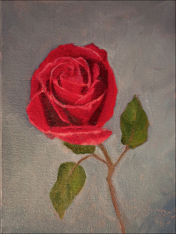
My painting "Family Gathering"


Here are few of Durango's fine artists and their works.  I wish I could have gotten more, as there was an amazing amount of wonderful work in all media that I would have loved to share.

Pat Smiley with her beautiful pastel painting "Tenderness", which won the pastel award for the show

I first met Pat a couple of months ago when we were hanging the DAC Member's Show, and she is part of the plein air group I plan to go out with on Fridays.  She also works in oils, but not surprisingly, pastel is her medium of choice.


Kathleen Shepard with her two paintings, L-R, "Hope (for Nathan)" and "Lady Slipper Dance".   

Kathleen explained to me the time-consuming process she uses to create these Art Nouveau-inspired mixed-media arts (colored pencil and pen (l), and pen and marker (r)), which includes the use of blueprint paper for the originals.  The photo doesn't show the detail in these paintings, but you can see the fancy matwork on the larger painting - done by her husband who owns a frame shop in town.


Sue Giddings and her lovely watercolor "Garden Symphony"

This was one of my favorite pieces in the show, and not surprisingly, won the watercolor award.  Sue has been painting watercolor for years, but since her recent retirement, she's been able to devote more time to her artwork, and is having more work accepted into juried shows as well.

Eric Pahlke and his two photographs, top to bottom:  "Tulip and More" and "A Daffodil Among Us"

Eric and I worked the wine table from 7-9, and as photographers, we spent the time chatting about everything photography.  Like me, he's also a member of the Durango Camera Club, and like me, he often forgets to go to the meetings.  He shot these two colorful photographs of flowers in a glass vase against a sheet of black velvet with natural light and minimal PP.

It was a fun evening, and the reception also coincided with the monthly Gallery Walk, and with absolutely perfect weather, it was a great evening to be out in town viewing artwork in various venues!

Thank you Pat, Kathleen, Sue and Eric for allowing me to use these images of you and your work for my blog!  If you'd like a copy of the photo, please email me and I'd be happy to send you the file.


Monday, May 2, 2011

Daisy floral painting in pastel - 11x14

Family Gathering
11 x 14 inches
pastel on black matboard

Another floral painting, on a new surface: black matboard.  Our local frame shop carries pre-cut 11x14 pieces of their archival matboard for $2, so I picked up a piece to experiment with.   The nice thing about  working on this surface is that it simplifies framing as no mat or mounting is needed.  It was perfect for the project I had in mind.

I love daisies - they are so cheerful and even though they are a non-native flower, I still enjoy seeing hem in large meadows up in the mountains.  This painting is based on a photo I took on some hike last year.  I  realized that I really liked the simple design.   The individual flowers are interesting to me because they are in all different planes, and have these wonderful cast shadows, adding to the depth and dimension of the image.  And the out-of-focus background is the perfect abstract accompaniment to keep the focus on the flowers.  

Here's how it looks in a small gold frame, unmatted (complete with regular glass and part of my arm, face and camera lens in the glare):


I decided that I didn't care for the intense blue sky on the Hollyhocks painting, and was able to make adjustments yesterday.  I grayed the sky down a touch, and added another layer to the flowers, making some value adjustments along the way.  I think it is much improved.

Hollyhocks, redux - in gold crackle frame from Dick Blick

I decided to try some of the pre-made Simpleton plein air frames that Dick Blick carries.  They are affordable and since I try to paint in standard sizes, I can easily swap out the paintings for exhibitions and to show what a painting for sale looks like in a frame.   I got a Logan point driver and some other framing supplies, and now I can do framing at home.  For someone a limited budget, it's a good option.

-----
Sunset from 2 nights ago:

Saturday, April 30, 2011

Hollyhocks with sky - oil painting, 12x9

Hollyhocks Know No Bounds
12 x 9 inches
oil on board

Finally, a new painting to post after a much longer than expected absence from blogging and the studio.

Actually, I shouldn't say that I haven't been painting...I have, but not much and it's not been a noteworthy showing.  We moved last Friday, and I always underestimate how out of sorts I am after any relocation.  Unpacking and the general clutter and disorganization that accompany a move make it difficult for me to sit down and paint, even though I got my studio set up rather quickly.  

I did manage to do four more ACEO's of The Tree series earlier in the week.  However, I just couldn't get around to photographing or posting them.  Perhaps because of all the amazing work I'm seeing other bloggers post lately just made me take a pass on that.  I did finally take photos, and may post them at some point, simply because this blog also serves as a journal and documentation of my work - good and not so good.

And, I even attempted a plein air pastel painting of one of the tulips in the raised garden right across from our new place.  It went straight into the trash, and I learned that my Nupastel set isn't coming with me the next time on the next flower plein air trip.  It's been far too windy and cold recently to consider a dedicated trip outside to paint, but hopefully this dry cold front delivered to us by the pacific northwest will leave and give warmer temps and calm air very soon!

This painting is today's keeper after yesterday's "three strikes and you're out" studio effort to paint a group of tulips on an 11x14 panel.  If you have to wipe something three times because it isn't working, it's time to move on.   Unlike the smaller surrealist-edged florals I've done, this one is based on two photos.  The beautiful crimson hollyhocks just needed to be freed from their ho-hum garden existence and visit the sky.  

Does it work?  I hope so.  Maybe it's hard to tell with this photo, which is just awful.  The camera sensor just doesn't take kindly to these bright colors and has created a variety of unsavory optical effects, not helped at all by the glare of wet paint.  Just believe me that it really does look much better in person.  I also hope it is dry by Monday.  A new frame awaits.  

To push the drying on this (nothing like waiting until the last minute to get something done), I broke out my unopened jar of Liquin.  I got hooked on using Liquin back during my equine art days, but since I'm not painting in thin layers and glazes anymore, I haven't used it for landscape painting until today.   I don't think I'll make a habit of using it unless I do decide to try glazing techniques.  

I'm hoping my studio dry spell is over, because I have tons of ideas bouncing around to work on.

-------

Some random photos taken recently:

My beautiful Easter cactus posing on our deck today.  I've thought of painting it, but it's so busy that I'm sure I'd just end up wiping the result

Nelson performs his daily sunbeam meditation on the guest bed

April 26 sunset from our new deck.  Perins Peak and Smelter Mtn. are no longer in the view, but Twin Butte is


Sunday, March 27, 2011

Colorado Wildflowers #1-5 - ACEO


---


Montage of Colorado Wildflowers #1-5
Each 2.5 x 3.5 inches
soft pastel on black Strathmore paper
SOLD

These were so fun to do!  The size is perfect, the paper and pastels cooperated, and now I have five little botanical paintings of some of the amazing wildflowers found in Colorado.   I think I will try to do a few of these every day - they are a great way to combine drawing and painting into a regular thing in addition to whatever else is going in the studio.  

A truly bizarre thing happened when I was taking photos of these earlier today, though.  I normally take my photos outside, and place the painting on the ground, and hold the camera directly above it to take the photo.  It's simple and depending on light conditions, I can take pretty darn good photos like this.  

Anyway, I took the last 3 down to photograph on my front step, and set them all on the clipboard.  Unsecured.  I didn't really appreciate exactly how windy it was outside, or I would have taken the photos one at a time clipped to the board.  So, no sooner had I taken the first photo, a wind gust blows two off the board.  I quickly grab them and then note that the Aspen Fleabane (which is accidentally mis-titled here as "Arctic Fleabane") has blown away in front of the garage.  

In the time it took me to place the two paintings inside and go back to grab the other, it had disappeared. Gone.  Absolutely nowhere to be found.  I literally searched the entire parking lot, under all the cars, the street, and everywhere within a 100-ft. radius, and it was simply nowhere.  Unbelievable.  Well, that's a mistake I won't make again.  So, I had to re-do it.  Probably v#2 is better anyway, but still...


Thursday, March 24, 2011

Rose - floral painting, 6x6

tags:  original art - pink rose - oil painting - alla prima - surrealism
--------


"A picture is first of all a product of the imagination of the artist; it must never be a copy." -Edgar Degas


Rose, Enjoying a Day at the Beach
6x6
oil on wood panel

Here's the latest floral painting that I mentioned in the previous blog post.  It's admittedly off on a tangent, perhaps a weird one, but I decided to post it anyway.  For my FB studio page entries, I've taken to posting quotes along with the painting.  I decided to include the same quote for this post as well, as I think it's apropos for this painting in particular.

I don't think that all art has to be beautiful, serious or even have a point.  Sometimes, it can just be funny.  Did you laugh when you saw this painting, or did it elicit an eyeroll?  If you smiled or laughed, then thank you - that's what I was hoping for.   It doesn't have to make sense.  

I almost wiped this; the rose was exceptionally difficult to paint, but I forced the issue and now I think it mostly resembles a rose.  It is far removed from its original location in a home garden along New London Rd in Mystic, to this imaginary beach.   We are back to overcast skies and some snow flurries here today, so a cheery flower at a beach sounds pretty good right about now.


Tuesday, March 22, 2011

Coneflower, Approaching Sunset - floral series - SOLD


Coneflower, Approaching Sunset
6x6 
oil on wood panel
SOLD


I'm really enjoying this informal floral series, I must say.  Flowers are much trickier than landscapes to paint (for me, anyway) because of their distinct shapes and structure, and they allow me to dig into my collection of oils and use colors not found in the arid landscapes, and challenge my color-mixing and matching skills.

And, I like paring these essentially realistic flowers with simple, abstract backgrounds.  A good balance for the direction I'm trying to head with my work.  Purple coneflowers (Echinacea purpura) are a popular perennial found throughout the east and midwest, but they don't grow out here.   

The palette for this was cadmium orange, cadmium yellow, thalo violet, alizarin crimson, Van Gogh cobalt blue and white.  I mixed most of these colors together for the "mother color" to use in the background.  Creating a mother color is one of the easiest ways to harmonize a painting.

On an unrelated note, I recently set up a shop on Etsy to sell some of my work.  I don't think that many viewers and followers are buyers, but I thought I'd mention it, or if other artists like to do trades.  There is a widget for the store in the links column.  

---
On the theme of sunsets, here is a photo from one of last week's sunsets.  The sky has been cloud-covered since Saturday, so nothing since then.  

March 18


Sunday, March 20, 2011

Hibiscus Nocturne - floral series

Tags:  floral painting - oil painting - alla prima - fine art - orange flower - 6x6 - hibiscus flower

"Hibiscus Nocturne"
6x6 inches
oil on wood panel

Another floral, this time using a square format*.  Mother Nature figured out that orange and fuchsia pair up beautifully together with this variety of hibiscus.  It's based on a photo I took last year in Tucson the day before I returned to CT.  In mid-April, the home gardens in the desert are exploding with glorious color.  

The bright color of the flower suited itself well for a darker background, which decided it needed to be a nocturne.  Moonlight is filtering through some clouds up there in the corner, I think.


*Inspired by the large number of daily painters utilizing this size to paint on, I recently made up a batch (32, to be exact) of panels on a lightweight wood panel I found at our local Home Depot.  Unlike the MDF boards I've been using (and still like), this light-weight plywood-composite type board doesn't flex.  It is 1/4" thick, making it nice for frameless display as the edges can be painted almost like a mini gallery wrap canvas.  

I used a utility knife to carefully score and cut the 12x12" panels I had cut at the hardware store into the 6x6" size.  I used wood putty along the sides to give them nice, smooth edges and then used 2 coats of alkyd primer on each, hitting them with a quick sanding after they were dry.  I have begun applying a clear polyurethane sealant to the back of both the MDF and these plywood panels to protect against moisture issues and improve durability.  

Thursday, March 17, 2011

Iris Portrait

Tags:  floral art - iris - blue flower - surrealism - oil painting - 6x8 - alla prima - original art
------

Back to oils and florals for a bit....

Pale Blue Iris & Pink Sky
8x6 inches
oil on board

I love irises.  They are probably my favorite flower, and I developed somewhat of an obsession with them during the time I was living in CT.  In late May through early June, I would cruise both my neighborhood and the downtown home gardens with my camera, taking photos of every beautiful variety I could.  Bi-colors, bearded, dwarf, native, cultivated....I love them all.  

As luck would have it, a neighbor a few doors down from us also seemed to have an obsession with iris, and each spring, his garden would have new cultivars to photograph and enjoy.  His wife told me that he had a special fondness for purple iris varieties.  This particular iris is from his spring garden last year.

I knew this would be a challenge to paint - all those creases and folds and subtle variations in hue and value could result in a major frustration.  I just approached it as nothing more than a series of abstract shapes.  A limited palette worked perfectly - cadmium yellow light, alizarin crimson and Van Gogh cobalt blue.  I mention the brand here because Talens/Van Gogh is actually a student-grade oil.  I didn't know this when I bought it, and the pigment is actually ultramarine blue.  However, its low tinting strength - normally a negative and one reason I don't use student-grade oils - turns out to be its best feature.   

It turned out better than I thought it would, and I purposely tried to keep blending and excessive brush-strokes to a minimum.  The background was done as the suggestion of a landscape - looks a little bit like a mesa...hmm.


Sunday, March 6, 2011

Tulip Trio in Pink

tags:  pink tulip - floral art - original oil painting - 6x8 - surrealism - for sale - alla prima
---------

Tulip Trio in Pink
8x6 inches - oil on canvas panel

Yes, another floral in oils has somehow slipped in between the architectural pastels.  It is, after all, almost springtime and these beauties will begin emerging from winter dormancy within a month.  I painted this yesterday, on a whim, after going through my many reference photos of flowers and selecting some for a series of 6x6" wood panels I have recently made up, and decided to keep this in a portrait format.

Have you ever had a painting just wander off in its own direction as you painted it?  This was one of those paintings.  The original photo was taken against a shingled wall and building base back in Mystic last April - ugly, but I loved the flowers.  I originally planned on a neutral background, similar to the rose portrait painting I did last month.  Somehow, it evolved into something resembling a simple abstracted landscape.  I pushed paint around, removed some, added more, switched colors and finally decided to stop.  I can't stop thinking that it might look really, really cool with some clouds.  Or a completely out of context mountain range in the distance.  

I don't know if it works or not, but for some odd reason, I like it.  I do love the color harmony I get with oils; this has thalo violet, cadmium red medium, permanent rose, sap green and a pale cobalt blue hue with white.  

Back to the pastel Ancient Architecture series tomorrow.  


Monday, February 14, 2011

Portrait of a Rose

tags:  floral painting - red rose - 6x8 - alla prima painting - original art - for sale - flower 
---

Portrait of a Rose
8x6" - oil on canvas panel


Another Daily Paintworks challenge I couldn't resist.  This weeks' challenge is "A Valentine's Day Rose", hosted by Qiang Huang.   I probably should have gone down to the grocery store and ante'd up $5+ for a single red rose to paint from life, but I wasn't feeling that ambitious, so I went with a photo.

I absolutely love flowers, and while they have always been a favorite subject to photograph, I can only recall only one floral painting I ever did, and that was in pastel about 16 years ago.  So, this marks both the first time I've ever painted a rose, or a flower in oils.

I always thought roses seemed very difficult to paint, so complex, and I wasn't sure I'd ever even want to paint them.  But, a single rose sounded like it might be doable, and I loved the simplicity of it.   And, it gave me a chance to pull out some of those cadmium reds and the Alizarin crimson that I seldom use now.  I definitely why Qiang says it is easy to overwork a rose painting.  I can also see why this flower in particular lends itself so well to Flemish painting techniques and glazing; the hardest part was getting the darks dark enough and not losing the edges while doing value adjustments in alla prima.

I'm probably close to wrapping up the winter series I've been working on, and maybe I'll take on some more florals, including some in pastel.  I've been wanting to paint flowers for some time now, and this was a good incentive to give it a go!

---------
Everyone is probably getting sick of the winter and snow, but here are a few from our snowshoeing trip at Andrews Lake yesterday.  My hand is doing great - thank you again for all the well-wishes - and it didn't prevent me from using either my poles or camera:

Waxing half-moon over the Grenadier Range
Andrews Lake is directly in front.

Wayne surrounded by aspen, fir and spruce
And, look - there's the moon...again!


Aspen trunks and shadows
More interesting abstract shapes formed by these beautiful trees.
Related Posts Plugin for WordPress, Blogger...